Today, you’ll draw a line in the sand, look at its length and height and commit to always consider it! Best opener ever – I know – but seriously, this is something a lot of people don’t pay attention to. Line height and line length are crucial if you want to set your text properly, and in this article and video will tell you what you should pay attention to when setting it.
TL;DR: For reading text on desktop devices, the ideal line has a length of 60 to 80 characters with a line height of around 1.5 to 1.6. It always depends on your typeface, and the shorter the line, the lower the line height can be, especially for headings. Over all, make it as compact as possible but as loose as necessary.
This article is the second part of my miniseries about the basics of setting your text right, and follows the one about font size. There, I already covered the concept of the holy trinity of typography – font size, line length, and line height. So let’s move on to worship the duality of the two latter. I will mostly focus on setting continuous long reading text for web design, but I’ll also cover mobile, touch on headings, and other display text as well.
What’s the goal behind it all?
The goal with well set text is an even typographic color. And by color I don’t mean blue or red, I mean that you want your text to be inviting to read, not too dense and not too loose. You’ll get what I mean when you take a look at the examples below and pay attention to what you feel by just looking at them, not necessarily reading them. If you read this article on a phone, you might want to rotate it to landscape orientation, since the line length is oriented towards desktop screens here.


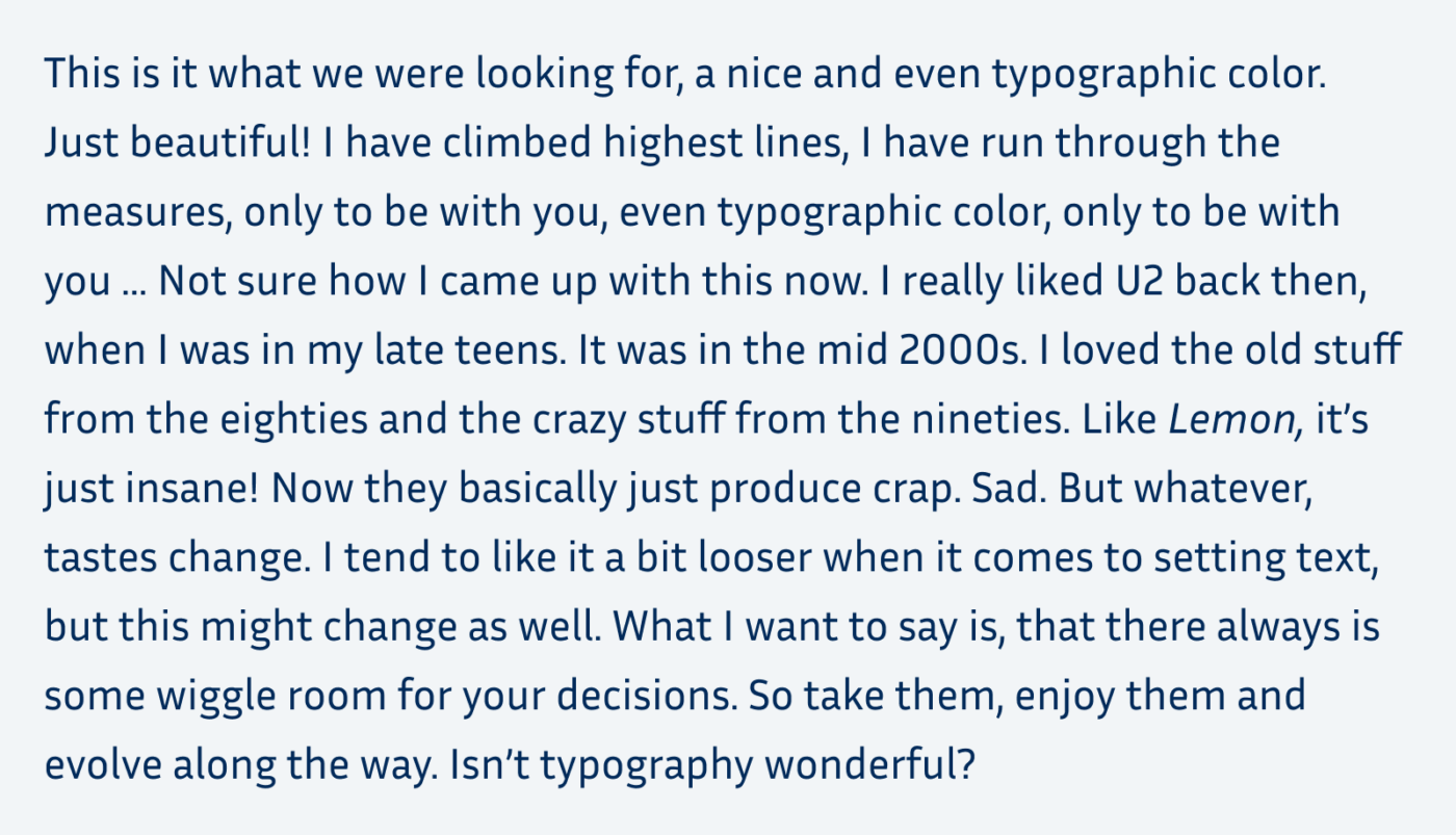
All the examples above are set in the same typeface, Inria Sans, at the same font size and have roughly the same line length of about 75 characters. The thing that differentiates them is the line height. So you see how much influence it has, how compact or airy you set your text.
There is no magic number that will always look right
But for many typefaces, there is a range of numbers that will look okay, often better than the browser defaults. I’ll share mine with you at the specific points of the article. But what I most want this article to be for you is an eye-opener. If you’re new to the subject, or you lack confidence in it, I want to guide you through the process and teach you what you should pay attention to. Why it looks better or more appropriate in a certain way. Typography is more art than science, all my advices here are guidelines base on my experiences as a UI designer for the past 15 years. In the end, always make your own decisions.
Choose your typefaces first
The first step should always be choosing appropriate typefaces for your different kinds of text (display text, body text, and functional text). Why? The visual appearance and the metrics of each font can be different. In some cases, it is obviously different, like when switching from a monospace font to a proportional serif font. In other situations it is not, like when switching from Helvetica to Arial – which you would never do, because you would never have used them in the first place, right? But the risk is always having to adjust everything again. So decide upon your typeface first, then tinker with setting it. This will save you a lot of time and hassle.

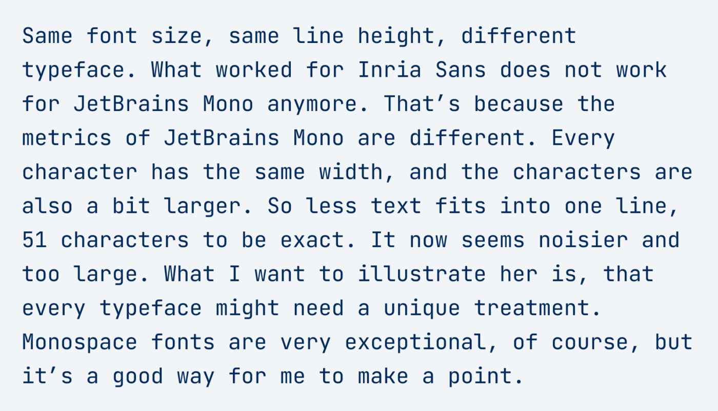
So before we really dive into it, here’s the over all process again:
- Choose an appropriate typeface
- Set it in the right font size
- Pick a decent line length
- Adjust the line height accordingly
Then set your measure, aka max-width
In typographic terms, line length is called measure, and traditionally we want to avoid very long lines. For reading text, the ideal line is said to be around 60 to 80 characters long. Please know, this is not backed by research, shorter lines do not seem to increase reading speed, as Mary Dyson points it out brilliantly in her recent in depth article Line length revisited. Nevertheless, these 60 to 80 characters are something we might be familiar with from books, and relating to that is not a bad idea. And even if it was not for the reading speed, the reason why you want to set a max-width is, that it becomes more compact, and you can base the line height on it later in the process.
When you set your text in relative units, like rem, you can assume that one rem is approximately two characters wide. This means you can set your max-width between 30 and 40 rem. Decide on what looks better on the right margin of your left aligned text. In what situations do most words fit into one line, and you will achieve this even typographic color we are looking for?
Of course, this depends on the language your text is written in. English has shorter words than German, so a slightly longer leading might be beneficial. Always avoid lorem ipsum in your designs. If it’s available to you, use the actual text for your design. If not, use a draft or at least a dummy text in the language the text will be.
As Kim pointed out in a comment, I should not leave unmentioned that there exists a characters unit in CSS. The ch unit is based on the width of the 0. The advantage here is, that you don’t have to take the font size into consideration when setting the max-width, it could look like:
p {
  max-width: 64ch;
}
A reason why I don’t pick it, is because I set the rest of my spaces in rems and wanted to stick to them. But there are definitely cases where it will be helpful!
Set the line height according to the line length
Leading, that’s the fancy typographic term for line height, always goes hand in hand with measure. And you should almost always adjust it. Depending on the user agent, desktop browsers use a default value of roughly 1.2. For body text, this is obviously too little.
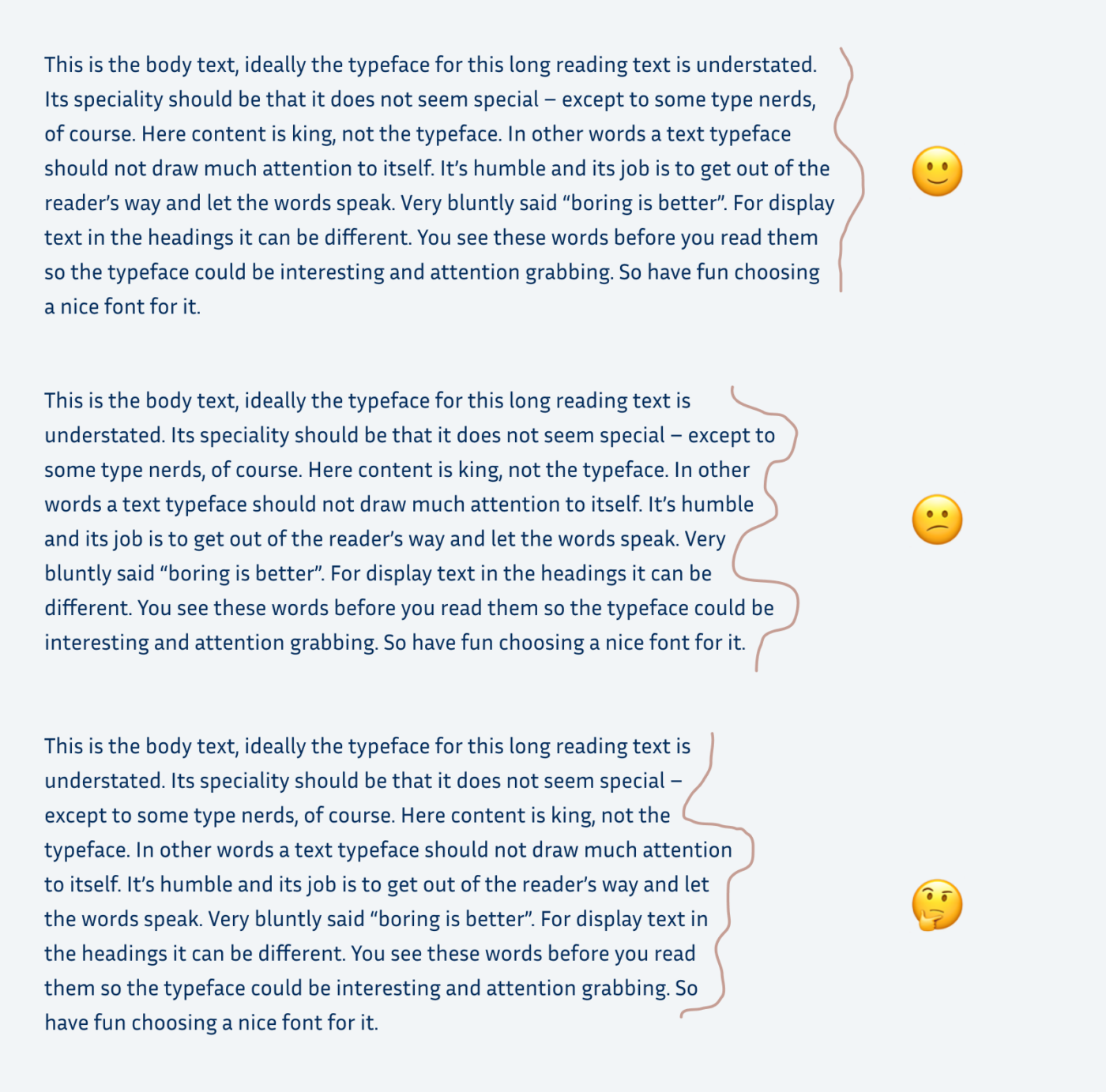
Longer lines need more line height, shorter lines need less. When long lines are too close together, it’s harder to catch the beginning of the next one. This effect shows itself in paragraphs with more than ten lines. You lose orientation, feel the urge to use a ruler or highlight the text with your cursor, or to just seek revenge for this experience. Because it is not your fault, it is bad typography’s fault. I’ll repeat the examples from the beginning of the article to show you that.

With a measure of let’s say 34 rem, and the font size set to 1 rem, the line-height could be something like 1.6. This looks clean, open and friendly in the typeface I choose.

Now we come to the part where line height and line length are connected to each other. What looked too dense with a line height of 1.2 in a wide column, almost seems okay in a narrow column. You will most likely not lose your orientation when reading this, because the way to the next line is shorter. Nevertheless, it is not ideal either and still seems very dense. With an increased line height to a value of 1.35 it looks much better.
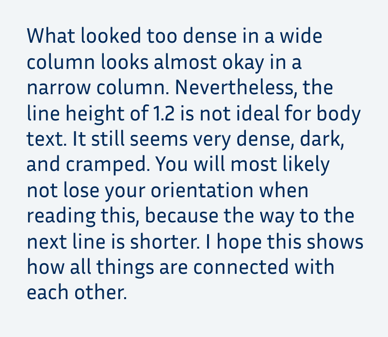
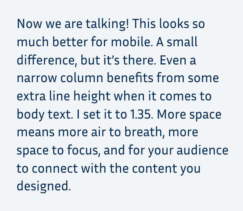
And when you take a look at what worked for desktop with a line height of 1.6 it’s not that ideal on mobile again. There, it’s too loose but still better than the first version with a value of 1.2.
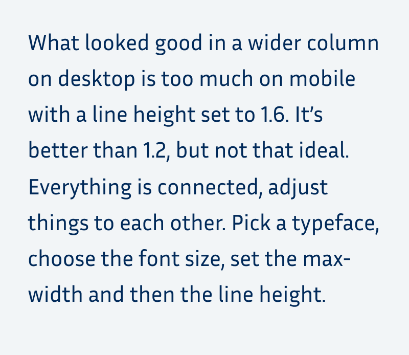

I hope this made it clear, how it all connects. If you want to play around with the settings, you could use my example on CodePen for that. And there is the perfect triangle game by Matej Latin that illustrates how font size, line length and line height are interconnected in an interactive fun way. Try it out! And thanks to Paul for sharing it in the comments, where you can also see how I scored 😂.
What does this mean for mobile and app design?
On a phone, measure is not that important, since the screen is very narrow anyway. Don’t set the text too small (14 to 15 px minimum). Then you automatically won’t fit that many words into one line. This means your column might have a width of something around 20 to 25 rem. Now you can mostly fiddle around with the line-height. The narrow column, is more forgiving, especially when it comes to larger line heights. I’d go for a value between 1.3 and 1.45, again, depending on the typeface.
If you have to use one value for desktop and mobile, I’d go for around 1.5. It might be too little for desktop and too much for mobile, but it’s better than the default. And sometimes it’s not possible due to technical limitations to adjust it.
In an ideal world, you could make the line height fluid and locked to the column width. There are techniques for that, and I’m thinking about creating some content on this as well. If you’re interested or have any great resources about it, let me know in the comments!
Pimp my Type on Patreon
Get several benefits while supporting my content creation.
Join Patreon
Different kinds of text need different line heights
This article was mainly focused on body text, but now let’s just briefly cover the other kinds of text.
Headings
Headings should be set compact, a lot of websites tend to forget about that. When set at a larger font sizes than the body text, they could have a line height of around 1.1. Just make sure, that the ascenders and descender won’t overlap. Always look at your headings with line breaks in between. You never know when it will be too long and go across multiple lines. I focus on that in this typographic review of a fashion website.

Other display text
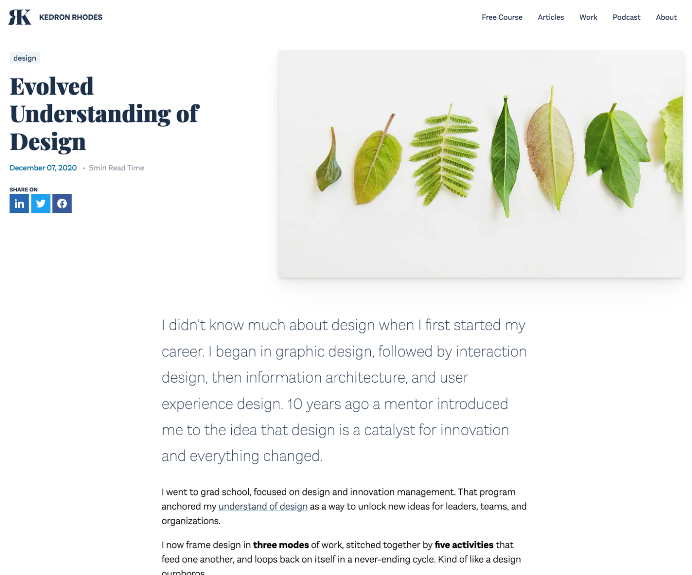
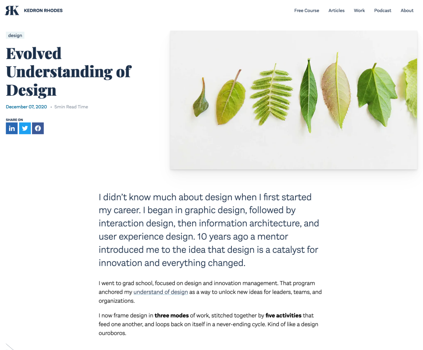
Like a lead paragraph that is set in a larger font size. When you fit less text into one line, you can decrease the line height as well. I show this in a review of a blog here.
UI Components
Short info text, notifications, buttons, or navigational elements, benefit from a shorter line-height as well. They are set in a smaller size, a value of 1.2 to 1.3 is something I often use. In rare cases, like with buttons, I set it to 1, so no line height at all. This way, they won’t use up that much space, which is always helpful when it comes to UI design.
If this article was helpful to you, let me know and share it with a friend who might benefit from it! If you have any questions or additions, I’m happy to read them in comments.

Very well written, thank you for refreshing and updating my knowledge. You are very considerate of readers getting an overall understanding while talking about the very necessary and also the somewhat nerdy details. Very entertaining, as always.
Also I want to thank you for bringing up LEMON by U2, which I haven’t listened to in ages. I too was into them once and completely forgot about Zooropa, so thanks! “Dressed up like a car crash” … wow. The pathos, the nostalgia!
Oh, Patrick! Love that you actually read that copy 😂! Yes! I think I’ll have to listen to Achtung Baby again.
Just have a look at the perfect triangle game: https://betterwebtype.com/triangle/
How cool, Paul! I know and honor Matej, have his book, but I did not know the game! Just quickly clicked through it – scored 49/100 😂 LOL. Should have taken a little more time to do it. I added the link to it in the article!
I was a bit surprised that you didn’t mention that it is possible to set max-width to the `ch` unit in CSS. `ch` is “The advance measure (width) of the glyph “0” of the element’s font.” according to MDN, which means that you don’t have to take font-size into consideration, when setting the width.
Thanks for the addition, Kim! I first heard about it from Manuel Matuzović, skipped it to keep it brief. But yeah, why not adding it back in. Just updated the article.
Great overview of some basic principles for legible text. I appreciate how you emphasize the necessity of observation in tandem with adjusting elements rather than providing a single number. It’s also helpful how you show ranges of possibilities rather than a single “right” answer. Including the tighter leading of display type was a useful reminder.
Thank you, Matt, for sharing how you received it. This was exactly my intention – wanting to support people in making their own educated decisions. 🤗
Coming here for Christmas 2021 because lonely and covid just to say I put in the effort in reading that first dense paragraph so maybe this virtual hug I am promised makes me a little less lonely.
(Okay it’s not that bad, but let’s go back to reading!)
Big – big – big hug! And get well soon, Wouter 💪!
danke für diesen interessanten Artikel.
Was ist denn ihre Meinung zu Schriftgröße und Zeilenhöhe beim Fließtext auf der Seite https://osteopathie-stumpf.de/
danke schon mal für Ihr Feedback
Danke für die Frage! Erstes schnelles Feedback – Größe ist okay, Zeilen sind etwas lange, bei manchen Überschriften ist es merkwürdig, warum sie kleiner sind. Den Blocksatz würde ich wegnehmen. Trotz Silbentrennung ist der mobile sehr kritisch, weil dadurch große Lücken zwischen den Wörtern entstehen. Aber ich nehme es im Detail gerne für das nächste Mal Pimp my Type Live, im Februar auf, wenn das für dich passt?
Hi Oliver!
Vielen Dank für deine Meinung!
Ja, wenn du möchtest kannst du das ganze für das nächste pimp my type aufnehmen.
Hallo Oliver,
ich habe meinem Bekannten, der die Website erstellt hat, über deinen Kommentar und deine Empfehlungen informiert.
Er hat gemeint, dass die Zeilenlänge für ihn eigentlich noch in Ordnung gewesen ist, aber er hat sie nun doch etwas reduziert.
Die Schriftgröße der Überschriften wollte er eigentlich schon längst überarbeiten, weil das so natürlich noch nicht gepasst hat, aber das hat er dann wohl doch vergessen. Diese sind nun etwas größer. Oder deutlich größer.
Der Blocksatz wurde bei den Smartphones und ähnlich kleinen Geräten entfernt. Das mit der Silbentrennung funktioniert leider eben eher schlecht als recht um bis jetzt war die Hoffnung da, dass das ganze nun bald ähnlich gut funktioniert.
Ob die Seite aber für dein pimp my type live so geeignet ist, da bin ich mir jetzt nicht mehr sicher.
Gib doch bestimmt interessantere Internetauftritte
Eine gute Zeit und alles Liebe wünsche ich dir
Simone
Stimmt, jetzt passt es im Großen und Ganzen eh. Also vielleicht ein andere Projekt dann mal für PMT Live 😉.
A long time ago, I remember hearing anything between 1.2 and 1.5 was an acceptable range for line height, but as you say it really depends on the typeface. Over the years I’ve come to use 1.5 as a baseline for regular text, and a custom line height for headings.
Your screenshots were a great addition to this article. Sometimes it’s hard to guage the difference in spacing when coding, but seeing them side by side you can really tell the difference.
Thanks for your comment, Steve! I’m glad you found the comparison helpful. And 1.5 is also my starting point in most situations when it comes to desktop full width columns of 70 characters.
Great article! I usually add -0.02em or so letter-spacing to larger headings as the gaps between the letters become more pronounced as the text gets bigger.
Very cool, thanks for sharing, Ben! 🙌 That’s about the value I’d also use and a whole topic of it’s own, that I’ll definitely cover in detail in in upcoming video or article!
Wonderful article. Thank you for the overview.
Thank you, Julian! Glad you found it helpful! 🤩
Hello sir good day! I just want to thank you for a very informative article. One of the best articles about line length and line height on the internet so far.
Thank you, Dexter, for sharing that with me! Could it help you in a particular situation? If so, what was it?
Hi Oliver – great article – thank you. A lot of web designers I work with struggle to achieve the optimal line length in their DESKTOP layouts without feeling compelled to fill in the “gaps” either side with images or additional content. As you know, some web-page components have naturally narrow columns of text (e.g. proof points), making it easy to achieve the recommended line length. However, others (e.g. page introductions) comprise text and nothing else. You either have to run the text across the entire width of the page or – to reduce the line length – find some other element to put alongside the text, so the page looks reasonably balanced (seldom a good solution). Can you suggest any workarounds – a way of achieving a readable line length in DESKTOP web-page components that are exclusively textual (i.e. containing no images, icons or other graphical elements ) while still maintaining good visual balance? (This is obviously less of an challenge in tablet layouts and not an issue in mobile layouts.) Thanks!
Good question, Bryan! In my designs I actually always introduce a max-width, and then the text block is either centered or left aligned, depending on the layout. Centered often is the preferred method, but I tend to not fill the space with wider screens. But one thing I do is scale up the font size as a whole, since I assume that with a wider screen, its further away from the spectator (more about this in my font size article).
hi there, thanks for sharing this article, it’s very comprehensive and add depth and method to the equilateral triangle of the perfect paragraph.
I liked that you mentioned the color of typography. I interpreted it as the texture and contrast between foreground and background that we are looking to optimise.
Wouldn’t be the case then, when picking the font, to consider not only the typeface but also the weight? In other words a bolder text should have an increased leading?
If so, this can also be true for optical illusions. As we perceive a white text on a dark background chunkier, should we increase the leading for it accordingly?
thanks
Good question, Gianluca! The weight ist definitely important when picking a typeface. It should have sufficient contrast to be readable enough against the background. When setting light text on a dark background, the weight can be decreased a bit to make it not as bright. I write a bit about this here with Action Text. I would not increase the tracking with bolder type, if the bold weight is intended to emphasize certain parts of the text. But if you have an example, share it, and I’ll take a look. I think that’s easier 😉.
hi thanks for getting back to me.
I found this page
https://99designs.co.uk/blog/tips/6-tips-line-spacing-typography/
the point n4 examplify well what I had in mind. of course then assuming I have at the same time blocks that alternate dark and light backgrounds how can they both sit on the same baseline grid? damn typography can be hard 😜
I see. Well, when it’s a lighter weight than you might have to adjust the tracking to make it use up the same space as the regular weight. Or you’re using a typeface with a specific style for that (like Darkmode or Action Text) or one with grade.
Yes, it can be hard. But in most cases these are the tiny details that will not have the most impact on the overall impression. So don’t be too hard on yourself and enjoy the process 😉.
I’m an editor who rarely, if ever, emails or comments on posts. I needed this information! Thank you for an excellent article in the internet sea of posts.
Thank you, Michelle! I’m curious, what are you currently working on where it helped you with?
Thanks for the great article. Off-topic, my main takeaway from reading this is how much readable an article can be when blockquotes have a background color!
Thanks, Robert! You mean my examples? At least they separate themselves a bit more from the other content 😉.
Hi Oliver,
i understand the ratio between font-size and line-height. But i don’t unterstand well the ratio between line-height and line-lenght. I tryed to find some webpages where I can get some infos but it’s no easy. Can you help me
Of course, Henz! So when you have shorter lines (around 30 characters), you can make the line-height more compact, like 130% or 1.3 times the font size. The longer your lines get, the higher your line height should be, so that it is easier for the eyes to travel from the end of one line to the beginning of the next. At a length of 60 to 80 characters it could be something like 150% or 1.5 times the font size, even more. Does this make it clearer?
Really clear and informative article. I can see myself recommending this to others. Were you ever able to work out a solution for fluid line height locked to the column width? I’d be interested in reading more about that.
Unfortunately not for now. But I’ll dive into it someday in the future, for sure 😉.