Display text is the kind of text that should attract your readers and represent the atmosphere of your project. What you should consider when picking a typeface for it and what different kinds of display fonts there are, I tell you in this post and video.
TL;DR: Have fun picking a cool typeface for your headlines or pull quotes that represents the vibe of your project. Don’t use it for body text, only use it in large sizes.
What is display text?
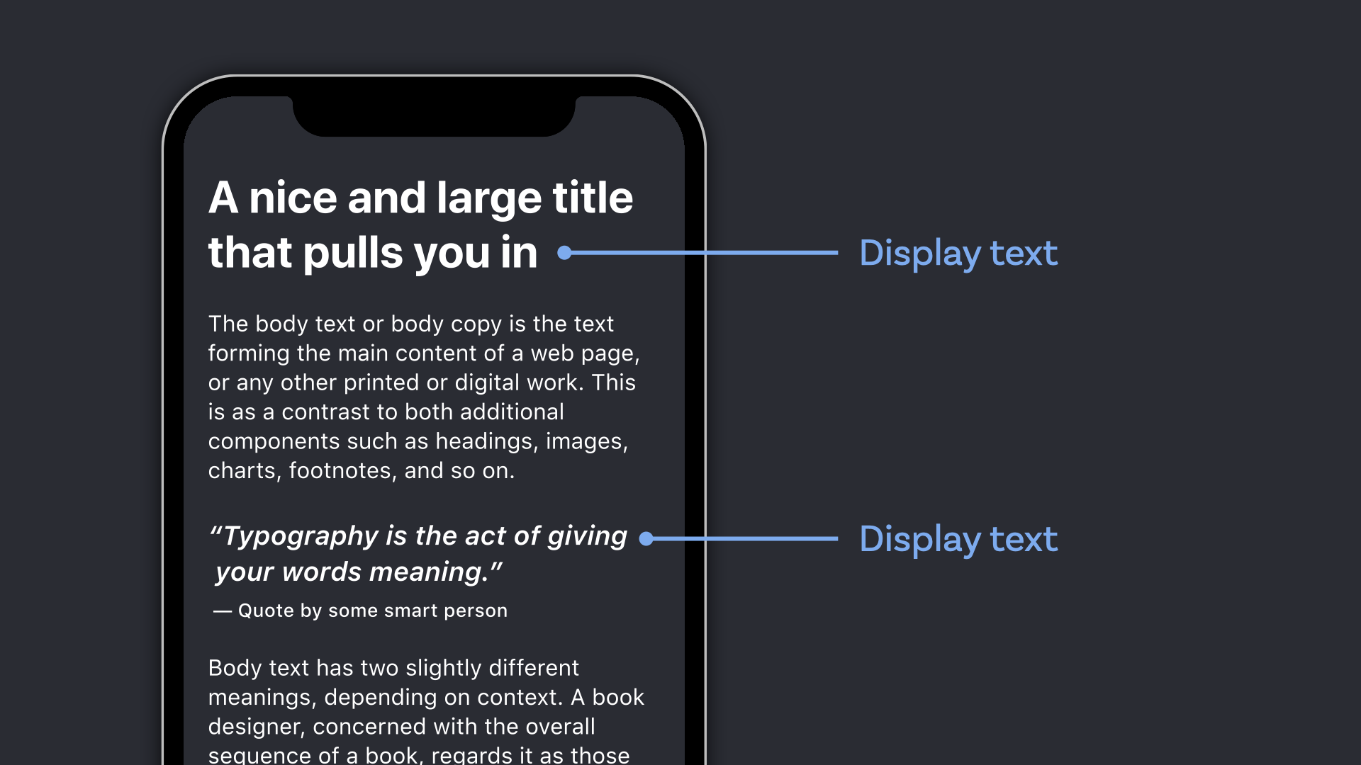
I simply have to agree with Richard Rutter when he writes in his book Web Typography: “Display text is all about seduction. Its purpose is to draw your reader into the content.” As the name suggests this kind of text is set in larger sizes, aka display sizes, which are starting at 20 px and therefor are mostly used for:
- title or headlines,
- initials, or a prominent lead paragraph,
- or maybe a pull quote.
Readers see these words before they read them. And this makes it a great opportunity to set the tone of voice for your website, app or digital project very obviously. But it’s not just about the vibe or feel, it’s also about conventions for that particular industry or topic and setting up expectations for the content.
How to pick a good display typeface
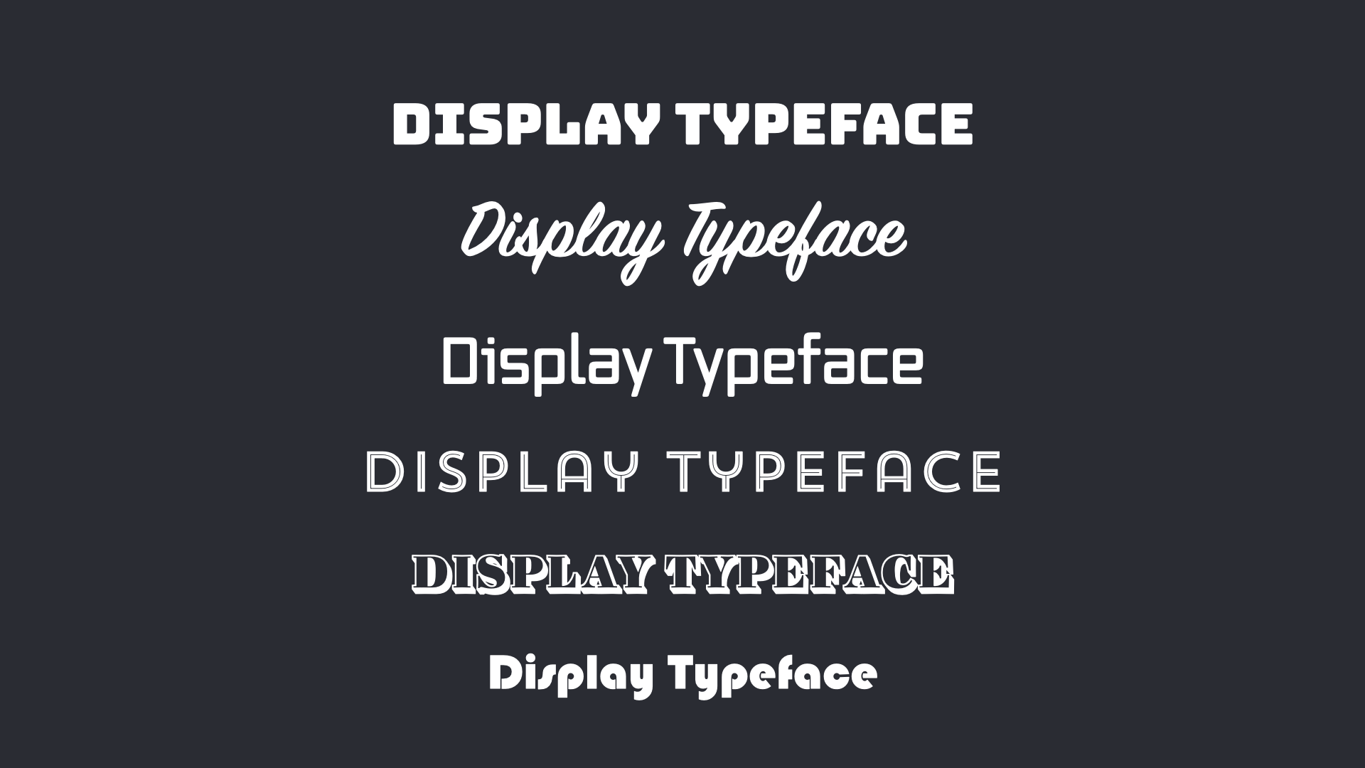
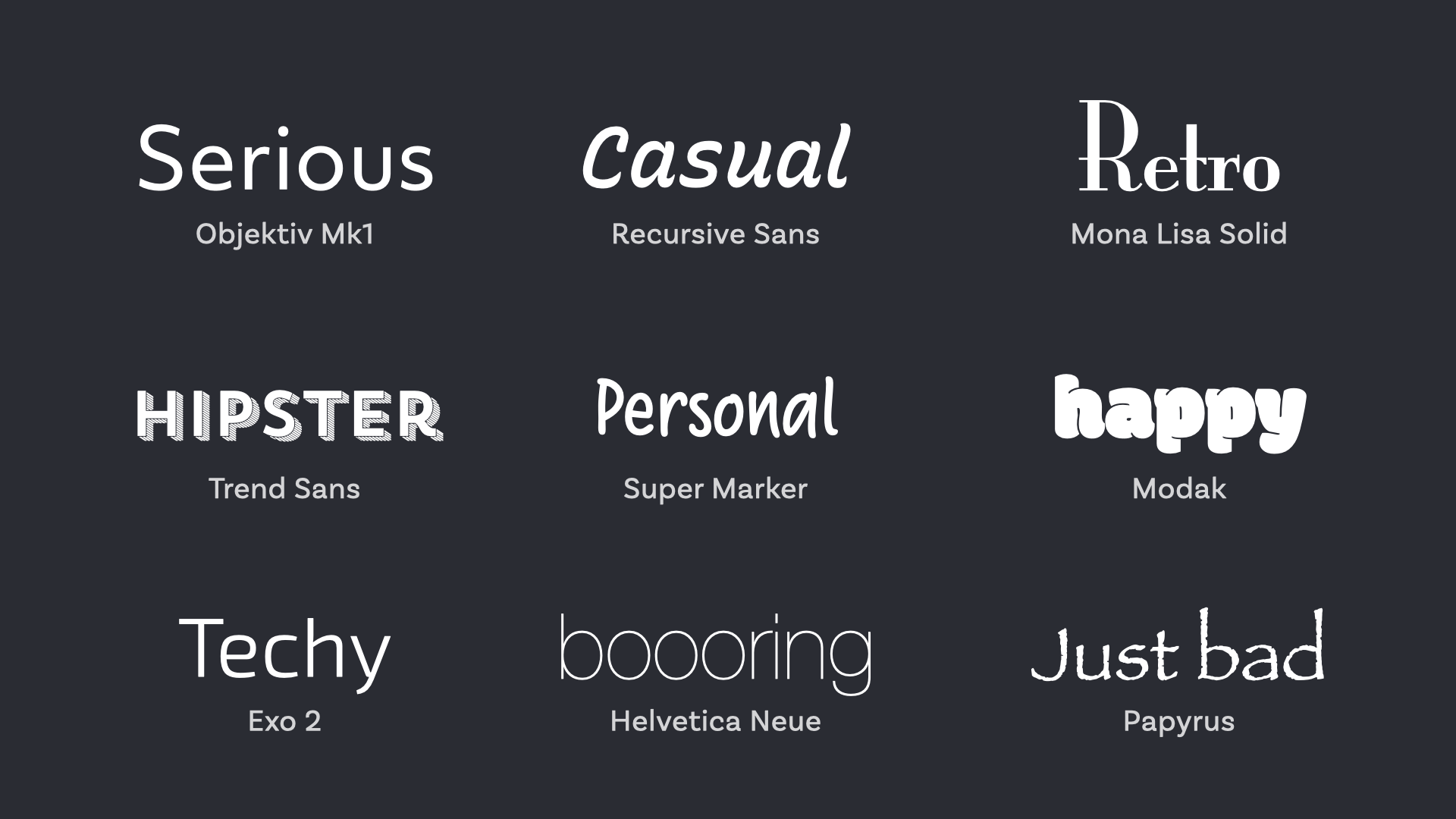
My advice is to have fun picking a display typeface. Look for something that suits your project. It can go from ornamental, spacy, minimalistic, crazy to all sorts of styles. Follow your gut feeling and enjoy the process! Either it fits your project or it does not. Of course, you can use your text typeface for display purposes as well, but maybe experiment with a different style or weight there? As long as you set it big enough, it’s readable and fits your theme, you’re all good. Only avoid using too eye-catching typefaces for long reading text in small sizes.
Display fonts are not only thematic or ornamental
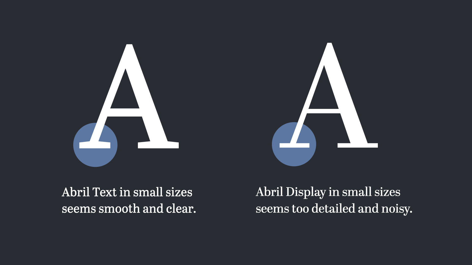
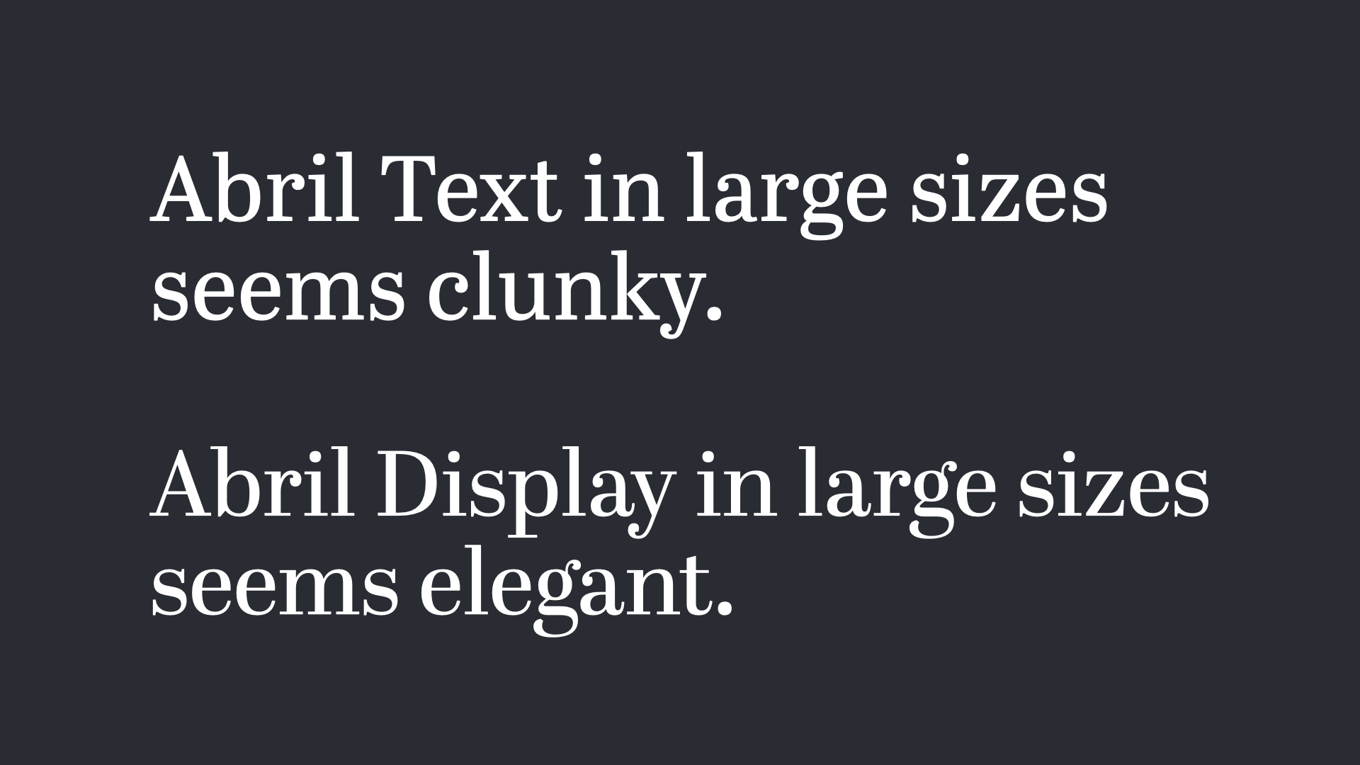
For some typeface that seem less striking there are special display styles – a version of the same family that is designed for lager sizes. For example the beautiful typeface Abril comes as Abril Text and Abril Display. Abril Text has sturdier strokes, stronger serifs and is less delicate. The text appears darker and with less contrast which makes it comfortable for continuous reading in text sizes (around 16 to 24 px). On the other hand Abril Display has more contrast, straight serifs and is tighter which makes it suitable for headlines and larger sizes.
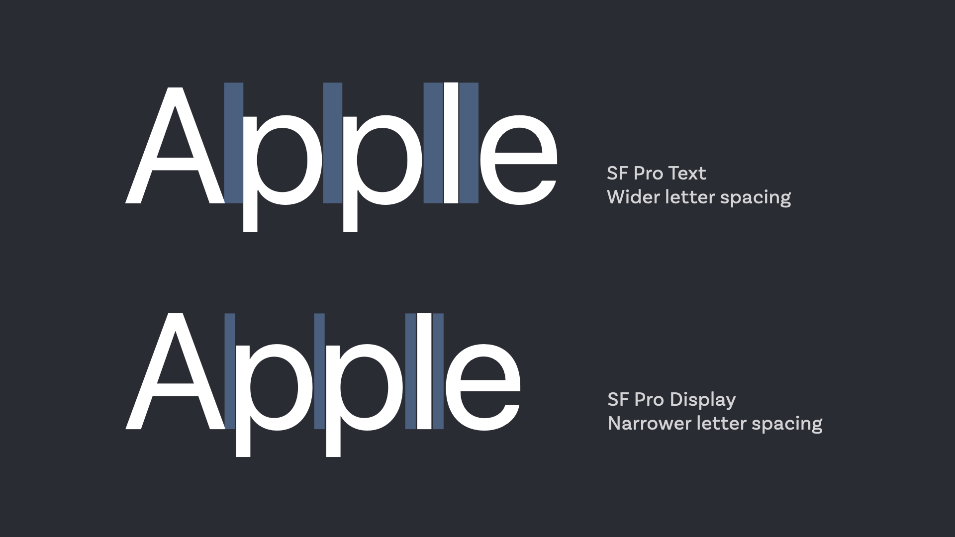
There are also display styles where the differences are not that obvious (if you saw the differences with Abril as obvious, then welcome to club, beautiful type nerd). For Apple’s very functional SF Pro used in iOS and MacOS, mostly the letter spacing changes since words set in larger sizes can be set a bit tighter than in small sizes.
Last but not least the body text on this website is set in my beloved Bressay. But for the lead paragraph I switch from Bressay to the more detailed Bressay Display for screens wider than 1024 px. I do that because the font size increases to 24 px for that paragraph then.
Enjoy choosing a font for display text. Go for what feels right and give your audience the opportunity to connect to your project with distinctive typography.
I’m curious, what is the last display typeface you picked for what kind of project and why? Leave it in the comments below!
Gutenberg.
I used it for an art exhibit called FREEDOM: The Summer of ’64
About integration in Mississippi. Black and White Photos
I wanted a bold, distressed type that looked like old poster headline type.
Nice choice! Thanks for sharing, Randy!
Nocturno Display.
I used it in the visual identity for a leadership development program called Kløkt (“Cleverness” literally translated from Norwegian). Some keywords for the atmosphere and vibe of the project were experience, knowledge and human warmth(as a contrast to the sharp, cold and “corporate” visual conventions in the industry). I thought the Old Style characteristics and the elegant curvy lines of the typeface would balance professional weight with humanness.
What a gorgeous typeface, Emil! I love it 😍 Love the sharp edged of the overall warm appearance. Thanks for sharing it!
Hi, great article. I have one question though. Let´s assume you have website and you use a neo-grotesque as your body text and maybe a Serif for your headings. Where would you put a display font. Or would the display font be used in every heading?
I would use it for larger text, which naturally might be the headings. You could also use an interesting neo-grotesque for the headings, like Inter Display with tighter letter spacing, and then a serif font for the body. You decide. The display font usually sets the scene, the body text then completes it.