Last week, I celebrated 2,000 amazing subscribers to the Pimp my Type on YouTube with the first Pimp my Type live stream! I reviewed 10 different projects, but I gave myself only 200 seconds for each.
About 50 people were watching, which I really did not expect! If you could not make it, I now added chapter marks to the individual reviews, and here I also share some before and after screenshots. Happy to hear your thoughts about this format in the comments!
1. Daniel Shires – Portfolio Site
Suggestion: For body text, better use the Regular weight instead of Medium. Jump to that chapter or visit website.
2. Highland Style Co. – Web Shop
Suggestions: Increase the font size of the body text, increase the line height and decrease the line length. Jump to that chapter or visit website.
3. HexaPDF – Software
Suggestions: Set max-width to 1200px add margin to the feature boxes, make the license text only 6 columns wide instead of 12. Jump to that chapter or visit website.
4. Advait Sangle – Personal Site
Suggestions: Load the font via web fonts, reduce links in the navigation, reduce the <h1> font size, make the background less visible, change the button style, and add another typeface for the buttons. Jump to that chapter or visit website.
5. Forever Jekyll – Theme
Suggestions: add more margin-bottom – same as the line-height, to each html element, except for the lists. Jump to that chapter or visit website.
6. Kedron Rhodes – Personal Blog
Suggestions: make the lead paragraph stronger, add more margins before headings. Jump to that chapter or visit website.
7. Event App Design
Suggestions: emphasize the important information by making it stronger. Jump to that chapter
8. Chris Bailey
Suggestions: Increase the contrast for the navigation and date, decrease the contrast for links and other text highlights. Jump to that chapter or visit website.
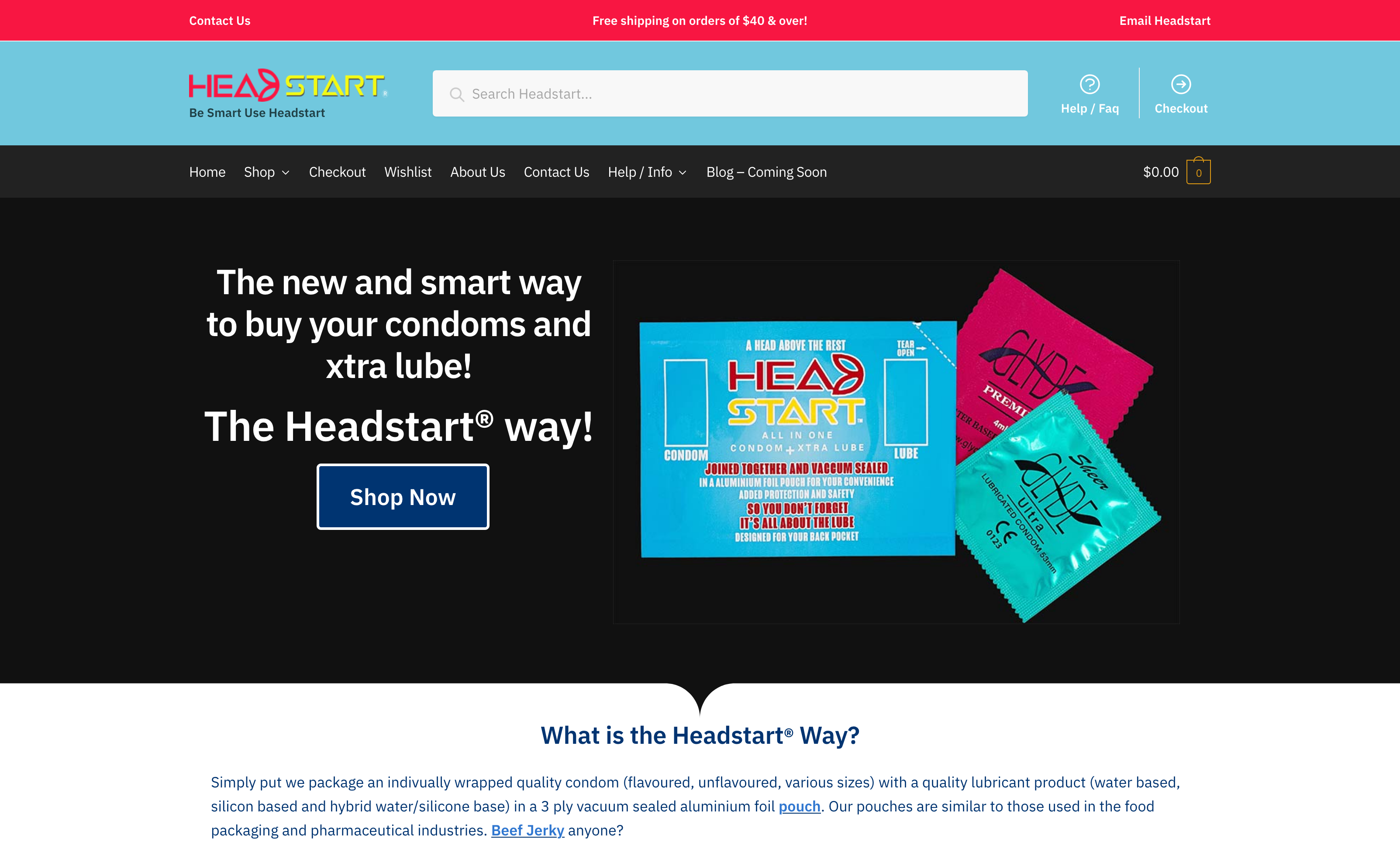
9. Head Start Condoms – Web Shop
Suggestions: Reduce elements, use lesser banners, decrease line lengths, homogenize illustrations. Jump to that chapter or visit website.
10. Font pairing list sneak peek
These two typefaces don’t go well together. Jump to that chapter to find out why.
