What should you pay attention to when choosing a font for your user interface or app? In this article and video I cover what to look for. I also pick on Hellvetica (yes, Hell-vetica) so you won’t pick it as a typeface for your functional text.
TL;DR: For your UI or app select a typeface with clean distinctive characters (Il1 test), open shapes, little contrast, and set it legible, so it works in tiny sizes.
User interface text is functional text
The term functional text summarizes everything that’s not display or body text. It’s short text that serves a specific purpose and might be mostly applied in a user interface or app design. You might find it in:
- Labels
- Alerts
- Navigational element
- Captions, and so on.
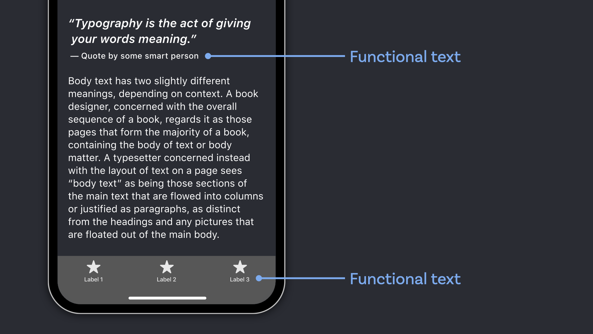
It is mostly used in small sizes, so in 10 to 12 px it still should be readable. But how can you be sure the typeface you chose fits these circumstances and your app or UI will perform great?
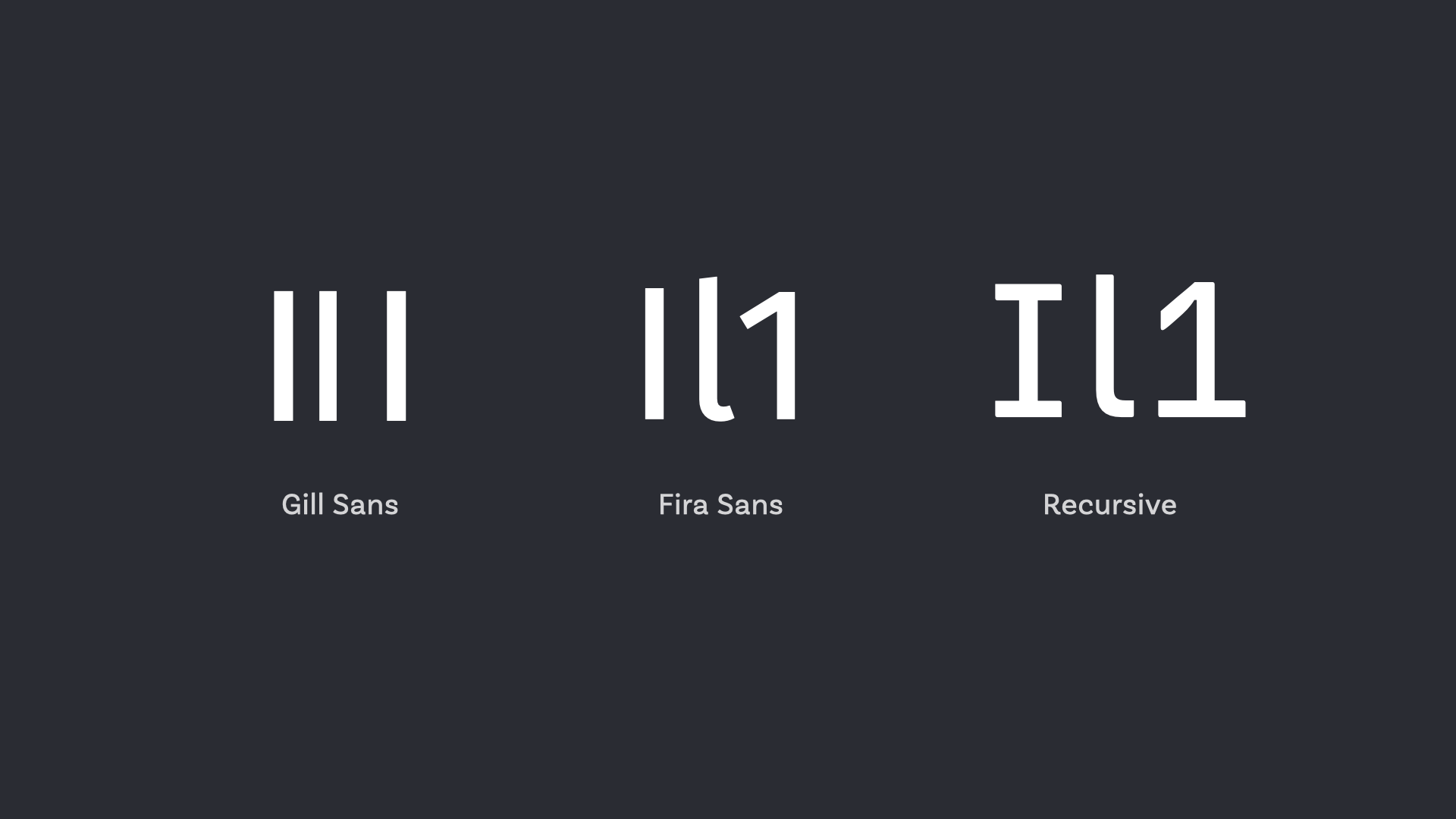
Go for clear distinctions
Clarity is key. Functional text is not long reading text, so context might be different or missing. The typography of your labels or the caption of charts should leave no room for interpretation. To assure that your typeface works well do the Il1 test (capital I, lower case l, and the number one). If these three shapes are easy to distinguish you found a good typeface.
Look for open shapes
The apertures, these are the openings between the counter and the outside of the letter, should be open. This makes them easier to read in small sizes. In the example below you see that Helvetica as very closed apertures compared to PT Sans on the right side.
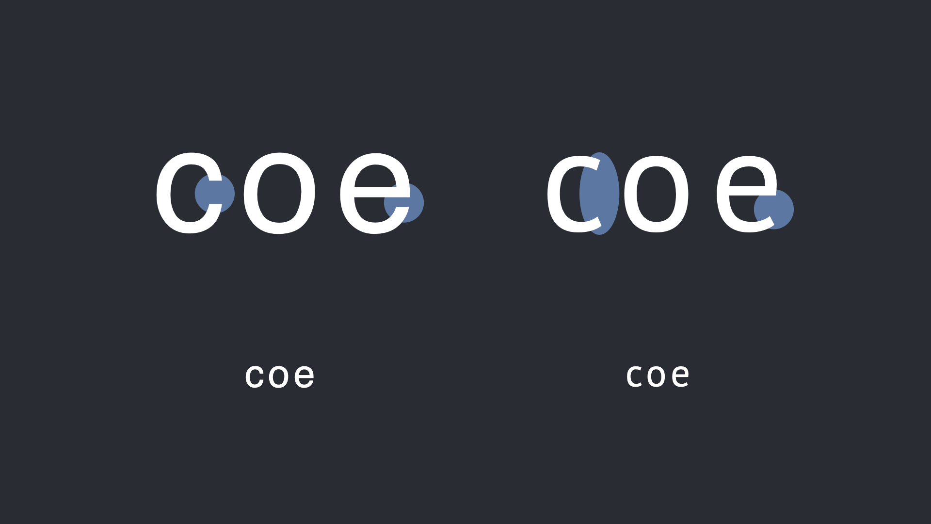
This is the major reason why it was a horrible decision to use Helvetica as the UI font for Mac OS 10.10 Yosemite back in 2014. Luckily it got replaced by SF Pro.
Little contrast is better
Look for typeface with even, sturdy strokes. This does not necessarily mean it has to be a sans-serif (some subtle slab serifs could work as well), but in most cases it might be.
Set things legible
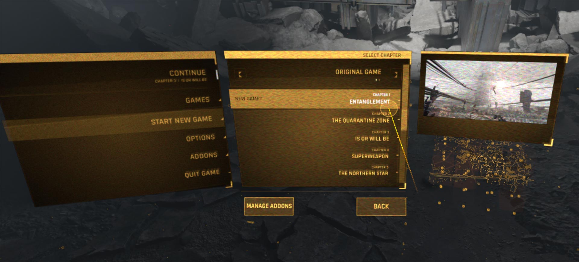
Letters set in all caps are harder to read, since they create less distinct letter shapes. When there are no ascenders and descenders the outer shape of a word is always a long rectangle. The menu in Half-Life: Alyx VR gives you typographically the same shivers down your spine like the game play. It’s incredible hard to read making it extra horrific to pick something.
Go deeper and evolve
Get a practical take on choosing fonts for UI Design in the free UI Typography webinar, and a deep dive into it with the UI Fonts Checklist.
After display text and body text, this was the third part of my three part series about how to choose a proper typeface. I also cover why your font choice matters and gave a primer on the 3 different kinds of text. Any feedback or suggestions for future topics? Happy to read them in the comments below!
Also note that fonts like SF Pro support accessibility out of the box and do dynamic type based on the user’s accessibility setting. Can’t stress enough how important this is getting, with seniors increasing font size on their iOS devices. It does mean you’ll somewhat be limited to certain system fonts, but for apps in which usability > branding, this shouldn’t be an issue. 🙂
Thank you for this comment, Robert! I absolutely agree, dynamic type is a great feature, not only for a11y, also for readers over all. It’s on my list to dig into this topic and how to deal with it with custom typography. If you have to replace or rebuild the dynamic type functionality for the selected typeface.