
My thoughts on Inria Sans & Inria Serif
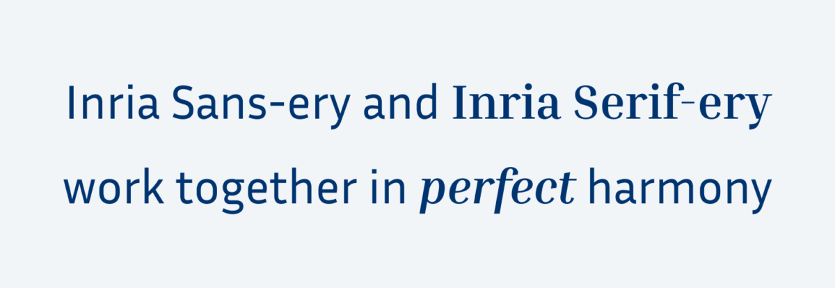
I love a good type family, and Inria is one of them. A type family is a collection of fonts that cover more than one style. In Inria’s case it is sans-serif and serif. This makes it a practical choice for beginning but also experienced typographers, who are looking for a nice combination, but don’t want to spend too much time pairing fonts. Inria was designed by Black Foundry from Paris for – surprise – Inria, a French national institute dedicated to computer science and research in automation. And a slightly technical feeling it conveys.
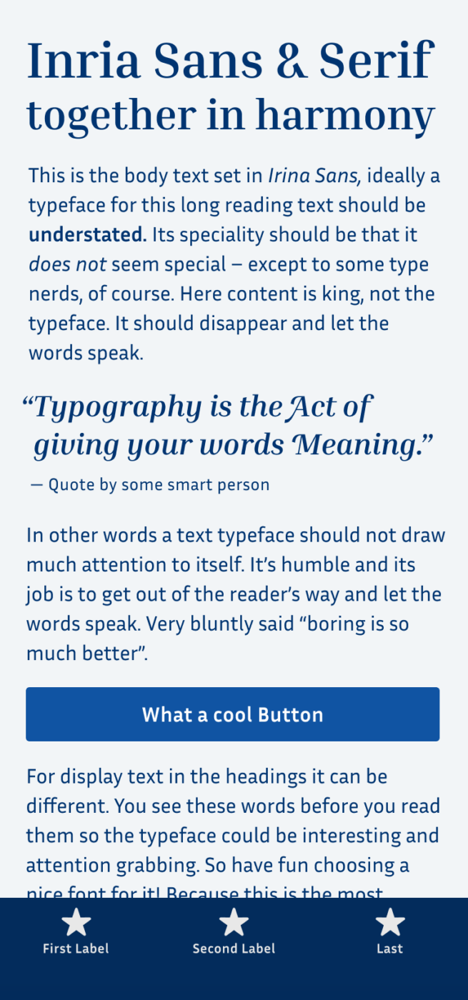
Inria Sans has a very clean and friendly look. It’s squarish and rather condensed design make it suitable for UI or mobile design when you have to fit more words on a tiny screen. Even in smaller sizes it remains it readability. The bold weight is pretty light which could be a bit too subtle for strong emphasis, as you can see in the sample text on top.
Inria Serif is more contrasting and beautiful for display text and running text as well. I adore the thin straight serifs that give you that fancy Didone feel, like it could be on the cover of Vouge, just more contemporary. I would not use this style for functional text though, it might be too delicate for small sizes.
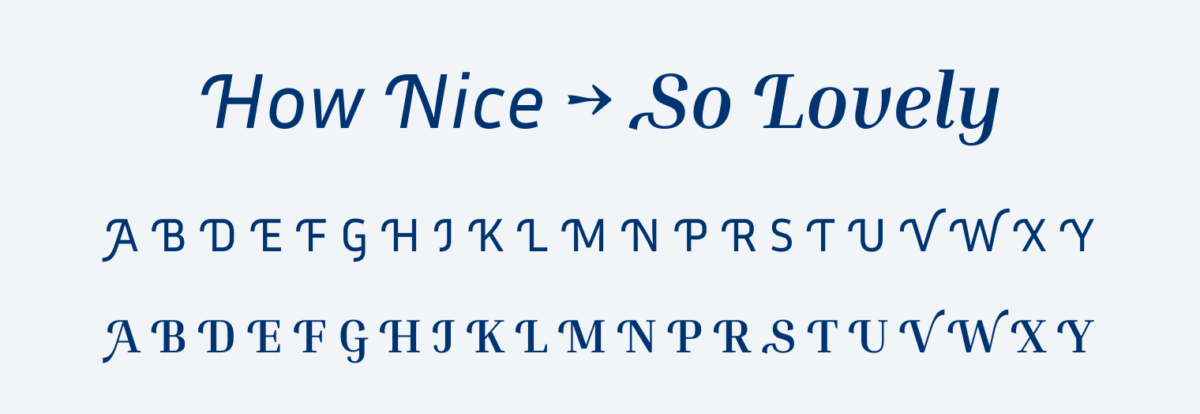
If I had one wish it would be that Inria Sans would come with a medium weight. This would be super handy for UI design in smaller sizes when bold is too much and regular too light. Overall I appreciate the stylistic alternates for most capital letters that add a nice swash to it.
Recommended Font Pairing
Looking for a different mood in your headings? Pick rational and confident The Neue Black, but als playful BioRhyme works well.

- Headings
- Copy
- UI Text


Learn more about pairing typefaces using the Font Matrix.
I totally agree with you, these two fonts go together like the famous fist on the eye. Thanks for the post \m/
Yay! 🙂
Just because two typefaces share a name in front of their Sans or Serif, that is no promise they pair well, right? It takes some degree of thought, planning, and effort to make the pairing unnoticeable —except to trained eyes like Oliver, right?
So thank you for giving me a note for my “design” book. Every little bit helps.
Absolutely. It always depends on how and where you apply it. You obviously need a reason to mix typefaces, you should not just do it for fun.