
As we’re approaching the end of this year, I want to pass the last 48 Font Friday recommendations in review by giving you my personal top 3 fonts for display text. Everything that is set large, shows character, and stands out. If you’re not sure what to pay attention to when choosing a good typeface for display text, there is an in depth article and video about that.
This one was particularly hard, because there are so many good fonts, but they always have to fit the project. So I just followed my heart. What was your favorite typeface for display text in 2021? Let me know in the comments!
3. Mayenne Sans

Sans-serif display typeface
1 Style
Bold
License
Free
Why I picked it
The super expressive look and tight metrics make it ideal for impactful titles or headings. My heart shines when looking at the tremendous x-height, how short ascenders and descenders are, and how contrasting it is. Full Mayenne Sans review
2. Arida
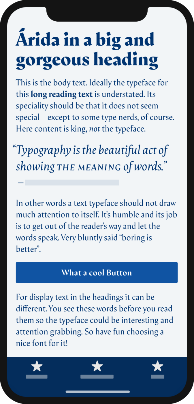
Serif typeface
by Alfonso García, at Latinotype
6 styles
5 weights, from Regular (with a matching italic) to Black
License
From $ 39 (web), $ 390 (app)
Why I picked it
Arida has a lot of alternate characters, lovely small caps, and shows a gorgeous contrast in the stronger weights. It will work for body text as well, but the larger, the more you see its calligraphic nature and fall in love with it. Full Arida review
1. Style Script

Script typeface
by Robert Leuschke, at Google Fonts
1 style
Regular
License for web/app usage
Free
Why I picked it
Good script typefaces are hard to find, this one is even a free font! A ton of OpenType features can change the appearance of Style Script from very formal and skillful to more casual and approachable. Full Style Script review
Great review for the end of the year! Looking forward to the next 2! Happy Holidays!
Happy to hear that, Connie! 😃
Habe kürzlich auf einer Website die folgende Schrift, die bei den Überschriften verwendet wurde, entdeckt:
https://www.fonts.com/de/font/creativemedialab/prettywise
Sehr funky! Muss man mal probieren, wie die mit verschiedenen Texten geht. Aber hat auf jeden Fall ziemlichen 70ies Vibe ✌️😂
Wie wäre es, in einem Artikel den Leser dazu auffordern, ihre drei besten Schriften für Überschriften zu nennen?
Danke für den Vorschlag, ich hab das jetzt mal so gemacht, dass ich hier fragen, was die eine Lieblingsschrift ist 😉.
Meine Lieblingsschrift ist Windsor
https://www.myfonts.com/fonts/urw/windsor/
Oh, ein wunderbarer Classic. Ich mag die auch sehr!