
My thoughts on Action Text
I became familiar with Erik van Blokland with FF Beowolf, know as the first dynamically generated typeface back in the 90ies. His name stands for quality and versatility, and a particular character in his designs. Action Text is a rather narrow sans-serif that perfectly adjusts to its surrounding. It saves you space, especially on mobile design, and still is super legible, which makes it suitable for any kind of text, from display sizes to tiny functional text.
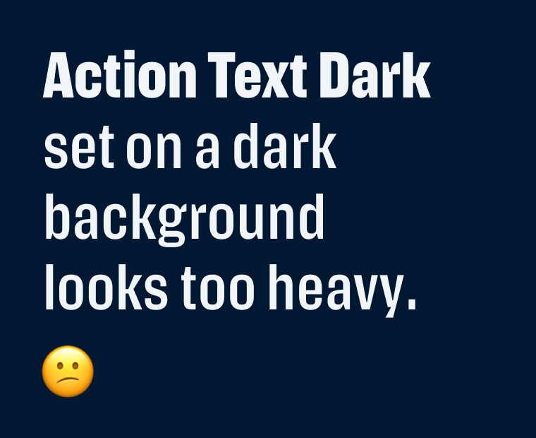
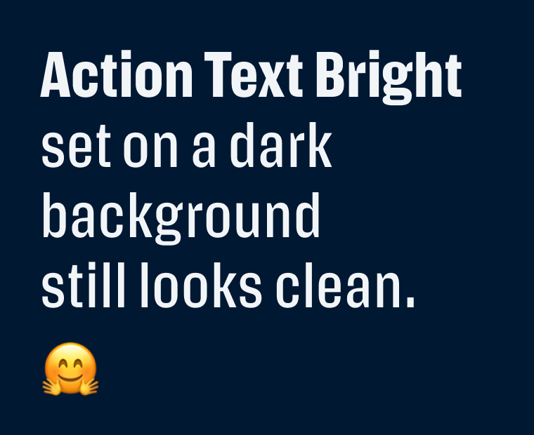
To me, its superpower lies in the two different grades the Action Text family is divided into, Bright and Dark, which have been drawn on the same set of widths. This allows for text to be switched between the two grades without any reflowing of text, and it’s always optimized for its surrounding. I already wrote about this concept with the typeface Darkmode. Since dark themes are so popular, it makes Action Text an ideal typeface for these situations. The only confusing thing here is, that you should use the Bright grad on dark background and vice versa.
Font Pairings with Action Text
Action Text is a rational, slightly contrasting, narrow sans-serif typeface. Pair it with rational Easy Grotesk for playful body text or headings.

- Headings
- Copy
- UI Text

Learn more about pairing typefaces using the Font Matrix.
What do you think? Is Action Text something for an upcoming project? Tell me in the comments below!
This is a serious league font! It’s a little more masculine than feminine. Action Text embraces its quirkiness (see x, r) with stability in cohesive heights all through the row.
My thought on its superpower… Utility! It’s applicable, in all kinds of digital media. I’d say, a digital-first aesthetic.