
My thoughs on Bricolage Grotesque
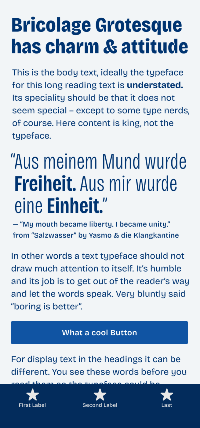
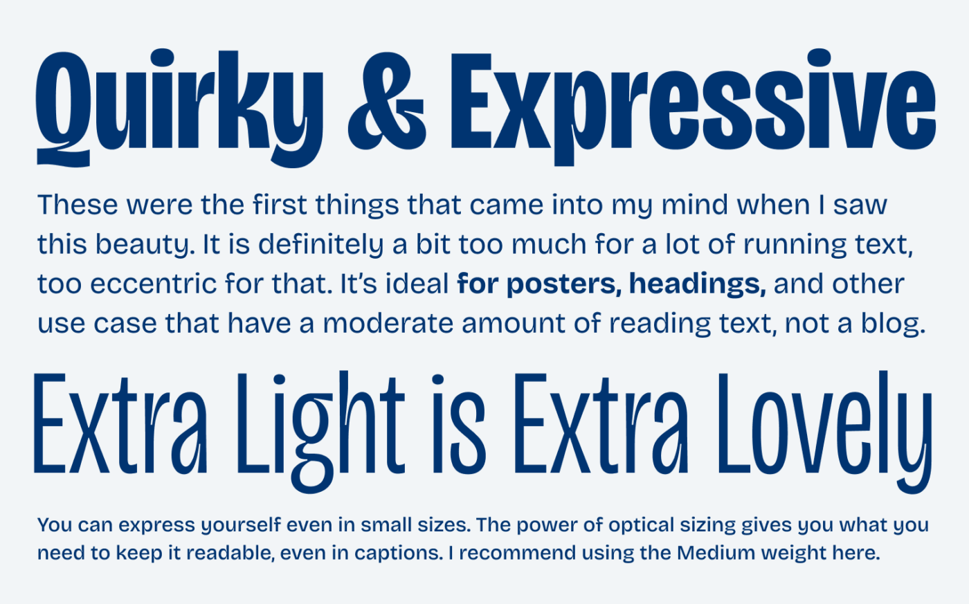
Mathieu Triay created a typeface that immediately fascinated me! The free font with the beautiful name Bricolage Grotesque is a contemporary, eccentric blend of many influences. It certainly has a vintage vibe, can be loud in expressive titles and headings, but also tame its temper in copy or smaller text.
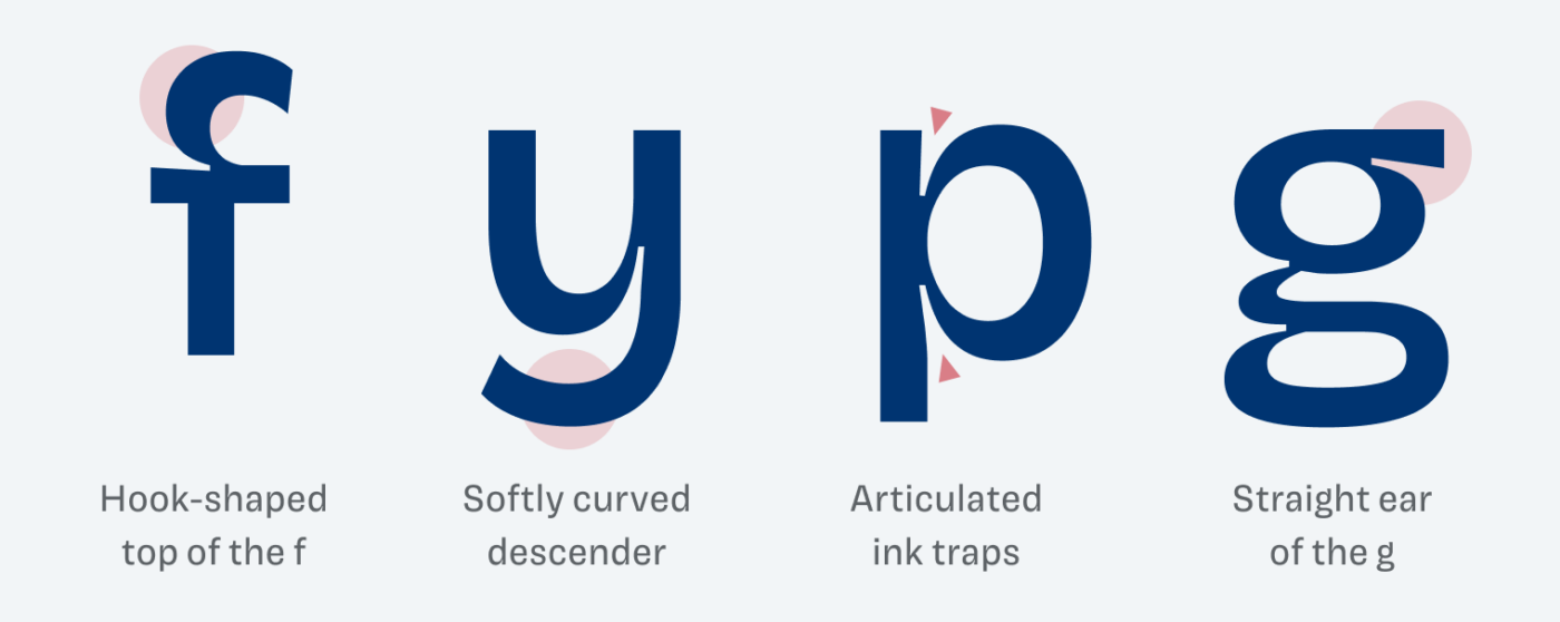
Some of its peculiarities are the well articulated ink traps, an organic flow that shows in the descender of the small y or the ampersand. But also a certain strictness in angled cut off terminals (see f, s, a, e) and a lot of quirkiness, like with the hook shaped top of the f.
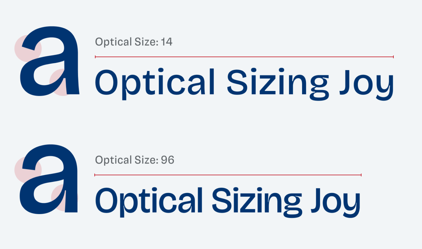
To be that versatile, Bricolage Grotesque comes as a variable font with a weight, width, and optical sizing axis. Optical sizing means that it adjusts the amount of detail and spacing to the specific size it is set in. The smaller, the more spaced out it is. As it grows, the spacing becomes narrower, the ink traps finer, and the apertures more closed.
It is absolutely worth checking out the beautifully crafted microsite, the design notes and beautiful personal backstory of Bricolage Grotesque. Learn about its origins there, but also on the September ’23 Font Friday Video Digest on Patreon.
Recommended Font Pairing
Bricolage Grotesque is a rational, slightly contrasting, sans-serif typeface. If you want to use it for expressive headings, but it’s a bit too distracting for a lot of body text, it pairs well with quite similar Massillia. Rational serif typefaces like Gelasio or Spitzkant also make a great match.


Learn more about pairing typefaces using the Font Matrix.
I can’t wait for a project where I can use this beautiful typeface before everyone else does. What about you? Tell me in the comments!
Nice, but would have been more than twice as nice if it included italics.
We can hope that it will come at some point. Since it’s Open Source, it is definitely possible to contribute.
This is a good one but I prefer Gangster Grotesk. When using and older style grotesque/gothic, I want the eccentricity to stand out – the only reason I use them. Ganster is less accessible though: not on google, have to sign up to a newsletter to get it, and a custom licence (which is OK for me but maybe not everyone).
If you’re accepting nominations, I’d love to hear your opinion of Radio Canada. OK, it’s another plain, readable font but I wonder whether there’s a reason it’s relatively unpopular that I don’t see. I think it has a lot going for it.
I like Gangster Grotesk, it has got a different flavor, a bit stricter and sharper. Also really beautiful landing page, but what else can you expect from FreshFonts 😉!
Thanks for the nomination, I’ll check out Radio Canada! It is a great typeface, I don’t see any disadvantages at first sight, I just guess that the Grotesk style sans-serifs are still more in fashion right now. Even though we are riding this wave for a looooong time now 😅.
ilisarniq by the same foundry as Radio Canada is an interesting. Free font. With Latin alphabet and Syllabics characters. There are various Canadian initiatives looking at more culturally expressive fonts.
https://www.coppersandbrasses.com/typefaces/ilisarniq/
‘
See the lovely video from Typotheque for some background and discussion of their work ..
https://www.youtube.com/watch?v=B4HQy2WXfc4
I am using this one for a new identity for a school. I will be happy to share. 🙂 What do you think about combination with lato? I need Sans Serif and it feels like it works nicely. 🙂
Nice! Please, Jan, go ahead and use the feedback form! About combining it with Lato, I’m not sure. Lato is dynamic from its from model and Bricolage more rational. But eventually it will depend on how you use it and for wich kinds of text. So just send it over and I’ll have a look 😉.
I might be wildly wrong here, but wouldn’t it be a Rational contrasting sans?
Not at all! I’d say “slightly contrasting”, could always be more, but not a linear sans-serif as I wrote. Thanks for your comment, Pawan!