

My NN Konrad font review
The traditional and peculiar serif typeface NN Konrad lets us dive into type history. It is a contemporary take on the first printed roman typeface. As you might know, the Gutenberg bible is set in blackletter. In 1463, two of its printers ended up in Italy, taking the knowledge of printing with movable metal type with them. There they cut a new hybrid typeface that oriented more towards the roman shape typed we know today – the starting point for NN Konrad.

While NN Konrad is clearly designed for long reading text, It is interesting enough for large text, since the slight contrasting and details are put into spotlight there. You see the blackletter influence in the abrupt modulation of round shapes, like the “o” or “Q”. There, another highlight shows: the charming gap before the diagonals connect. You can see this at the “R” or “k” as well.

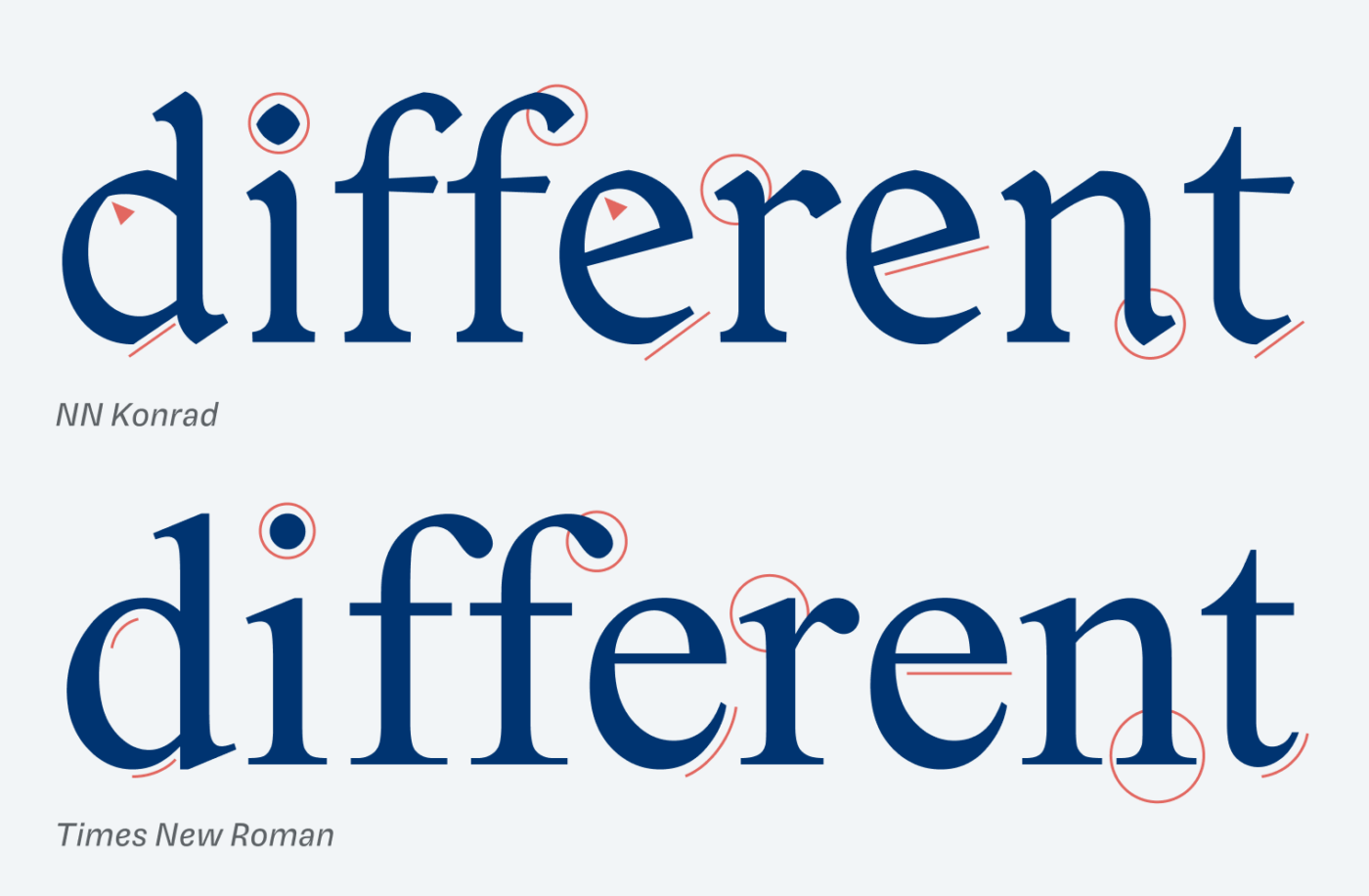
To better illustrate how NN Konrad differs from a roman typeface, let’s compare it with a very roman one … Times New Roman 😜. But what does “roman” mean? Next to blackletter and italics, it is one of the three main categories of historical type and the base for what is most familiar to us now. You will see that NN Konrad is more angled, the entry and exit strokes are quite different, and everything is a bit sturdier.
If you’re interested in all the historic backgrounds and details, I highly recommend visiting NN Konrad’s wonderful mini-site.
Font Pairings for NN Konrad
I’d classify NN Konrad a quite dynamic, constrasting serif typeface. Rational Bricolage Grotesque would make a very interesting and unusual combination for headings, but also narrow Clear Sans for functional text.

- Headings
- Copy


Learn more about pairing typefaces using the Font Matrix.
What do you think? Is NN Konrad something for your next design project with a historic touch? Tell me in the comments!
Wow, what a gem! Love the accompanying microsite. Thanks!
It’s gorgeous, right? I love the concept! Happy you enjoy it as well! ☺️
This is a very charming font! One of my favorites you’ve reviewed thus far. Love the blackletter hints. I’d use it more for headings than body text, but you’re right, it works for both.
A typo: In the font pairings, you have “Bricolage Gortesque” instead of Grotesque.
It will definitely shine more in larger sizes ☺️, even though it works in smaller. Thank a lot for the typo 😉.
Hello Konrad 👋🏻
There is something ownable in you. You’re enough on your own, especially in headings. And I see a brush stroke in those blackletter hints. It is very embedded in my memory and in design applications. Konrad will stand out wherever you use it. Just ensure you don’t pair some other quirky font with it. They will compete and Konrad may end up as a kitch.
“You’re enough on your own”. Wonderful, Jana 🤩!