

My thoughts on Ella
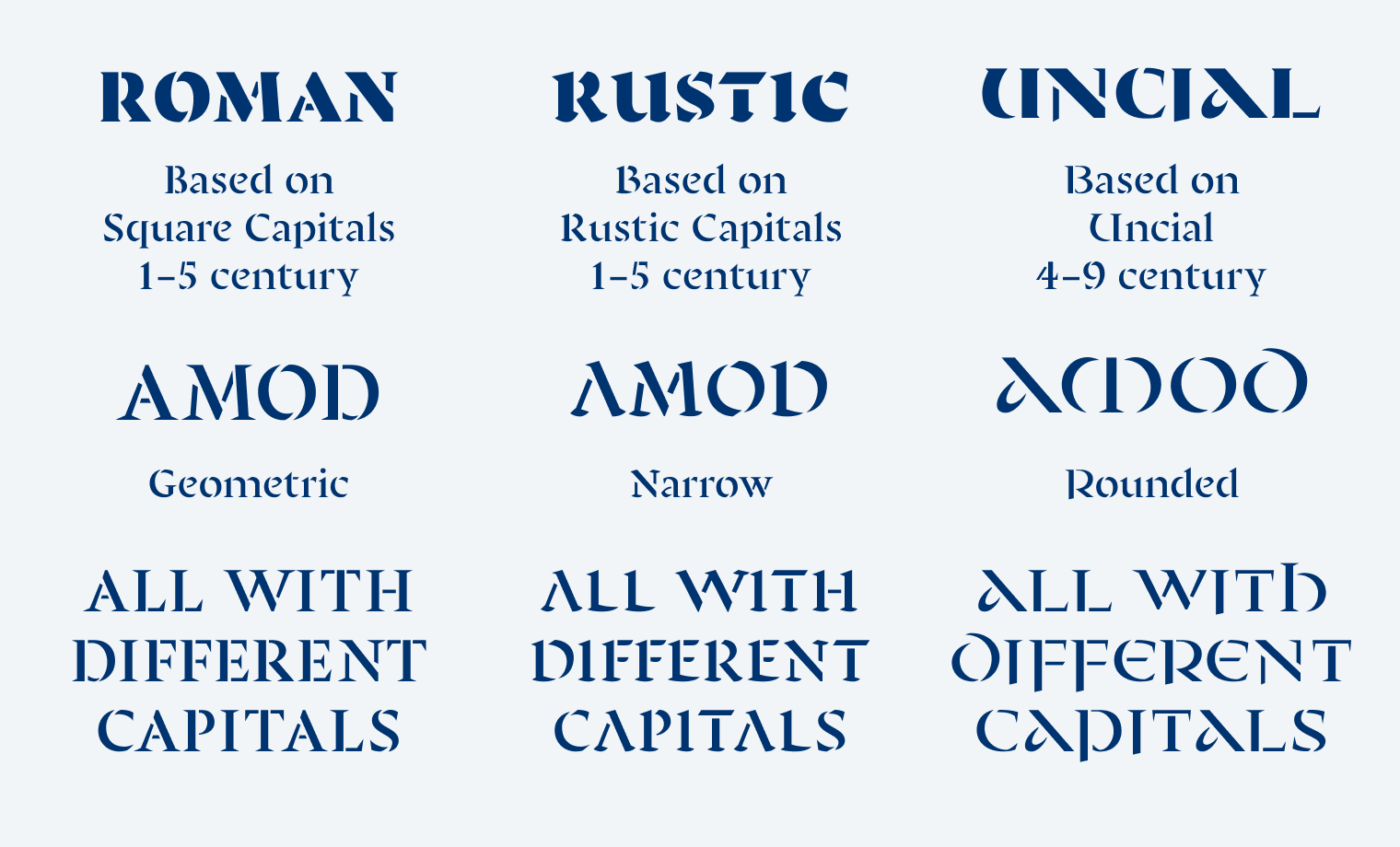
The expressive stencil typeface Ella takes you on an exciting trip to the development of the Roman script. Oh no, history! So booooring! Well, not with this font. Between the first and ninth century, there were three dominant capital alphabets, all with a unique flavor. The one you’re most familiar with is Capitalis Quadrata, which is very geometric and developed into the classic roman type. Capitalis Rustica has narrower, more casual letter shapes, while Uncial is quite rounded, also showing ascenders and descenders.
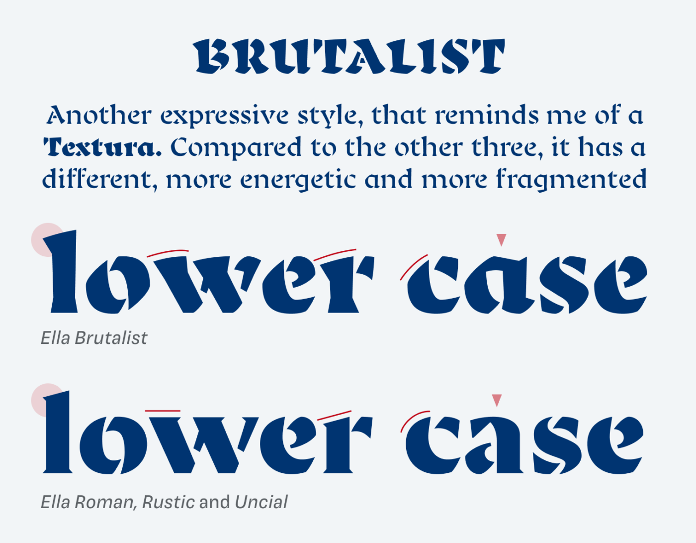
Now while Ella Roman, Rustic and Uncial share the same lower case alphabet, the fourth style, Ella Brutalist takes a different direction. It turns more into a black letter script. Some letter shapes change (a, g), everything is a bit looser, and the strokes become more energetic. It is clearly the most daring style and my favorite among the four.
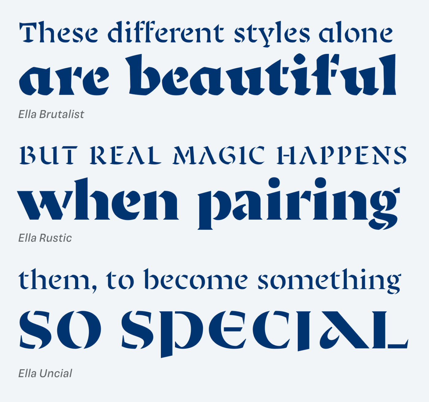
The special thing with Ella is, that all these script styles were put together into a unique and beautiful stencil typeface. This gives it a contemporary touch, highlighting the modularity of calligraphy, and emphasizing the beauty of contrast, especially with the bold weights. It also makes it possible to combine them for appealing posters, cover designs or headlines.
No wonder that Ella got the TDC’s Certificate of Typographic Excellence. If you want to dive more into the development of the history on scripts, I recommend to you this concise summary that gives you a great overview.
Recommended Font Pairing
If you are looking for a similar, dynamic typeface for your body text, choose edgy Piazzolla or a bit softer Rowan.

- Headings


Learn more about pairing typefaces using the Font Matrix.
How do you like Ella? Or do you know another brilliant stencil font I should feature? Share it with me in the comments below!
My thoughts on Ella: https://www.youtube.com/watch?v=Oqd9lzMP1V8
Just kidding, Oliveeerr CONGRATULATIONS on the website revamp 😍🙌🏻 My dream finally came true. Oh, now even laymen to whom I share your blog can easily navigate through it. Perfect. Onto Ella…
Roman it is. Looking from a distance, it’s an art itself, I see it in the headings of some magazine cover. It’d be great for tattoo too.
Brutalist🤔Do you remember The Flintstones? Yep, Brutalist & Flinstones, for your tree girls: https://www.youtube.com/watch?v=UL7beNWNLEQ
Thank you, Jana! These are some very diverse video links 😅. I loved the Flintstones, watching the intro again brought back childhood memories …
Nice find as usual, Oliver. Wish I had something to justify Uncial — ascenders, descenders, and the D is the cherry.
P.S. Is there anything Rowan doesn’t go with? It’s one of those “Free? Pinch me” fonts.
It’s lovely, Jeremy, isn’t it? And agreed, Rowan is very versatile. I’m sure there will be cases where it’s not working, like when you pair it with something that is very similar but different, like Self Modern 😉.