
My thoughts on Massilia
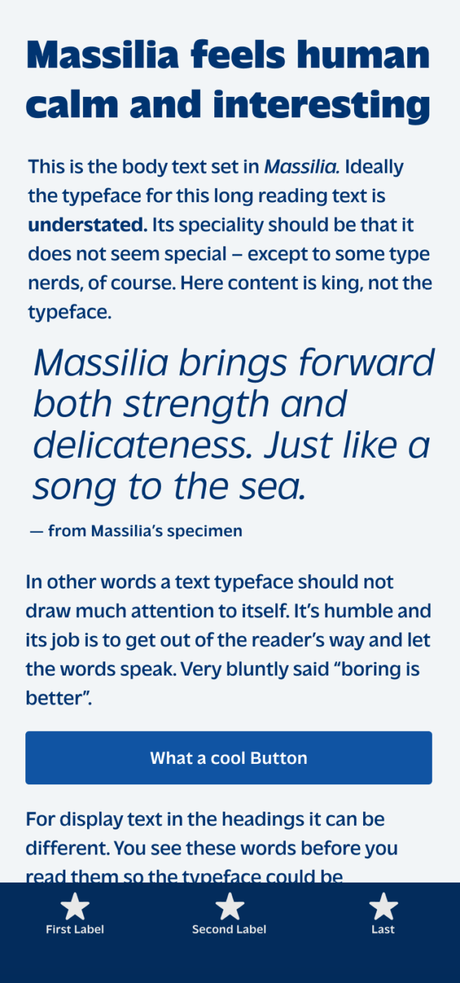
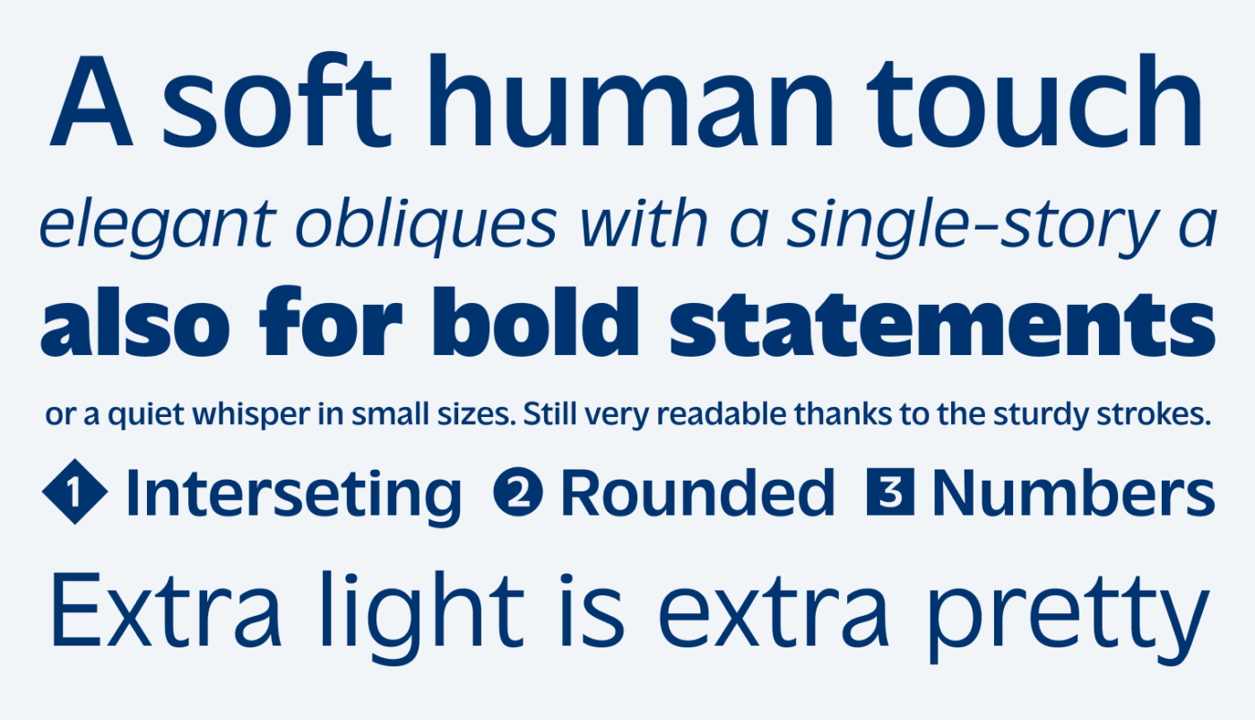
The humanist sans-serif typeface Massilia by the coolest dude, Matthieu from Blaze Type, combines vintage vibes with a modern touch. It is quite sturdy, which makes it surprisingly versatile. The Regular weight is already fairly strong, so I would not use it for super text heavy applications. But because of that, I could imagine this typeface it in a unique UI design, too.
Massilia is an homage to the classic typeface Antique Olive from the 1960ies. Whenever there is an updated version of a typeface, I ask myself why? Looking at the original, you see that it has some flashy features. Like the top-heavy o, the sharp and steep terminals and narrower proportions. This all creates a rather uneasy impression. Compared to that, Massilia looks much smoother, cleaner, also coming with an elegant single story a in the obliques.
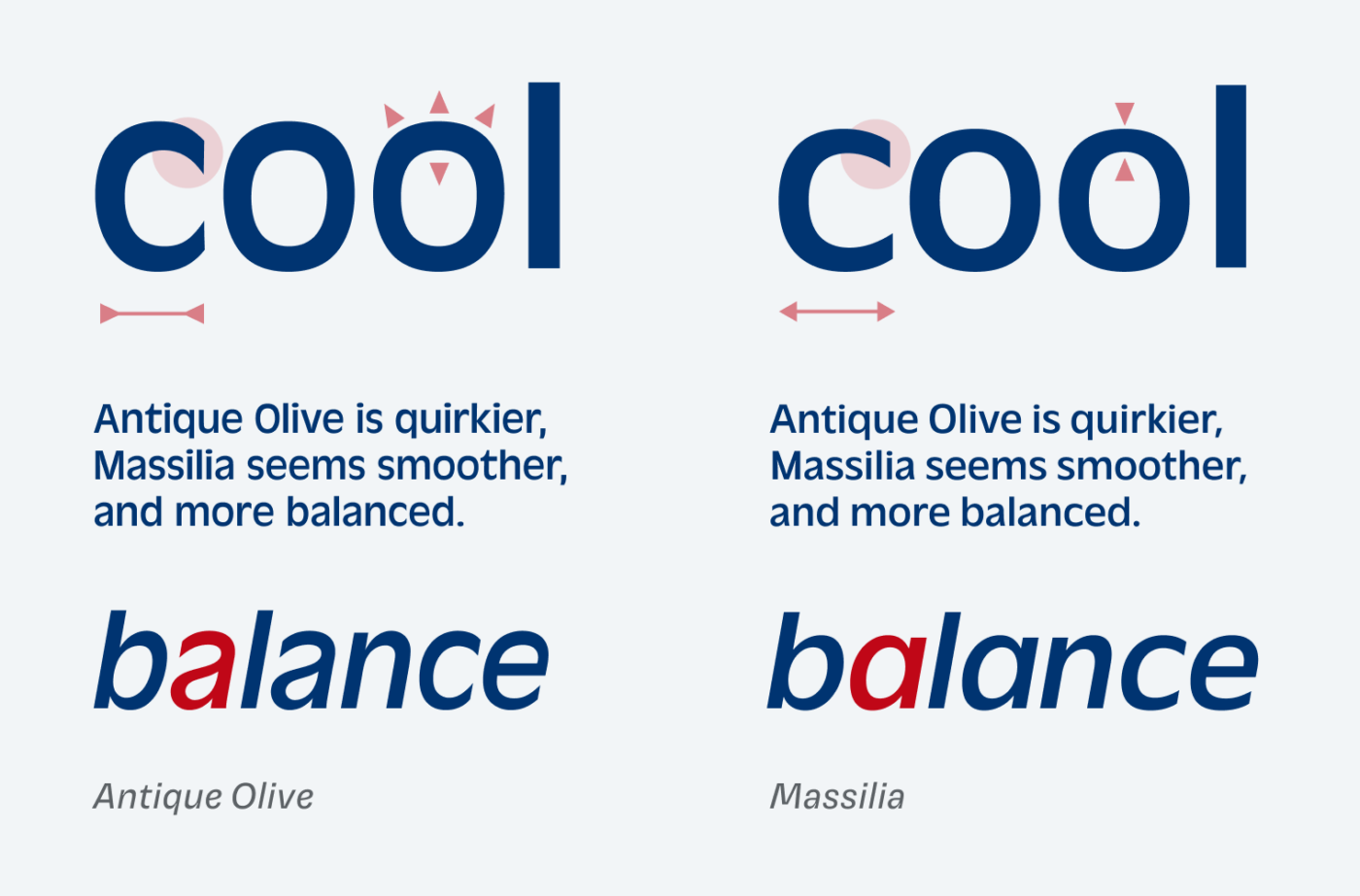
I personally really don’t like Antique Olive – as I described with Paysage – but this interpretation makes me like it. It highlights the cool things, while fixing the overly weird ones. Creating a more even, but never boring impression.
Recommended Font Pairing
An interesting pairing for striking headings could be reverse contrast Antipol or playful Bricolage. If you want to embrace a little messiness, try Avería for captions or an intro text.

- Headings
- Copy
- UI Text


Learn more about pairing typefaces using the Font Matrix.
What do you think of this week’s typeface? Let me know in the comments!
I feel indifferent to Massilia, Oliver😀 But it helps me to appreciate Antique Olive that much more! Massilia is, compared to AO, stable and in harmony with inner demons.
When I saw the Long reading text version, it was like you added a blurred effect. But Massilia is like ocean waves in Italic, which I love!
Neeeeext, please
😉