
My thoughts on Search
The brush script typeface Search by PintassilgoPrints is rather unusual. It’s an uppercase only alphabet, representing something playful, unbound and spontaneous. It clearly excels in headings that should convey a genuine expression of the moment, maybe something rebellious even.
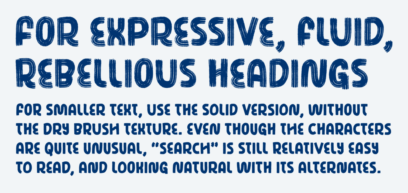
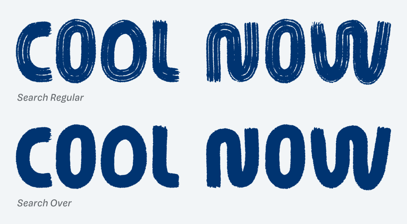
The characters show an organic flow, mostly created by one or two brush strokes. This is very charming and visible in letters like the N, M and W, that are created out of one movement. But also letters like the H, E, F or Y show surprises and a certain playfulness, while the textured, Regular version make them feel more authentic.
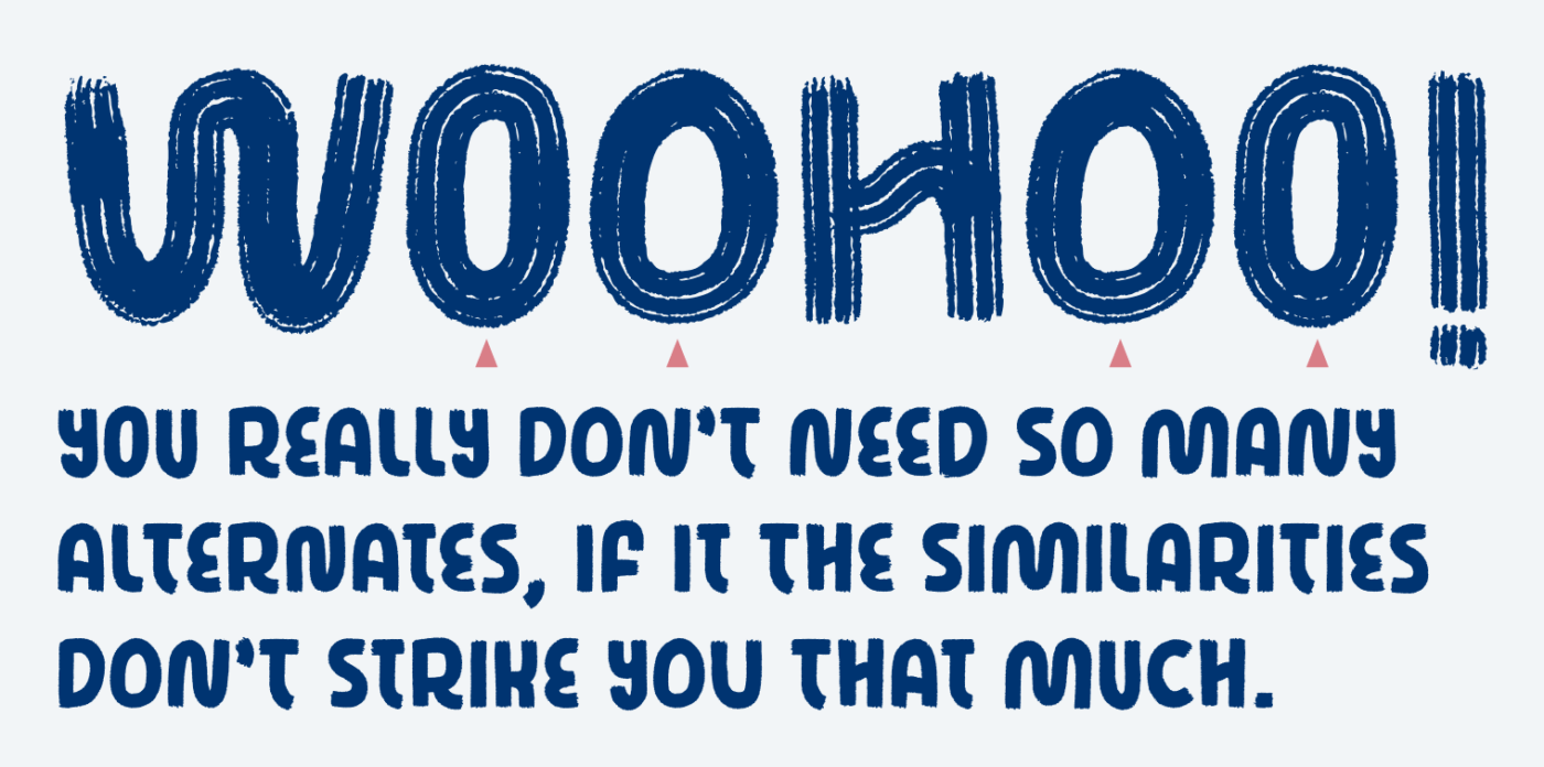
When it comes to handwritten style typefaces, you don’t want to see that letters are obviously repeating. This is why it comes with two alternates for each character, but if you search – pun intended – for repetitions, you will find them. Nevertheless, the design is quite forgiving, and it works in most cases, also because adjacent letters get swapped by default.
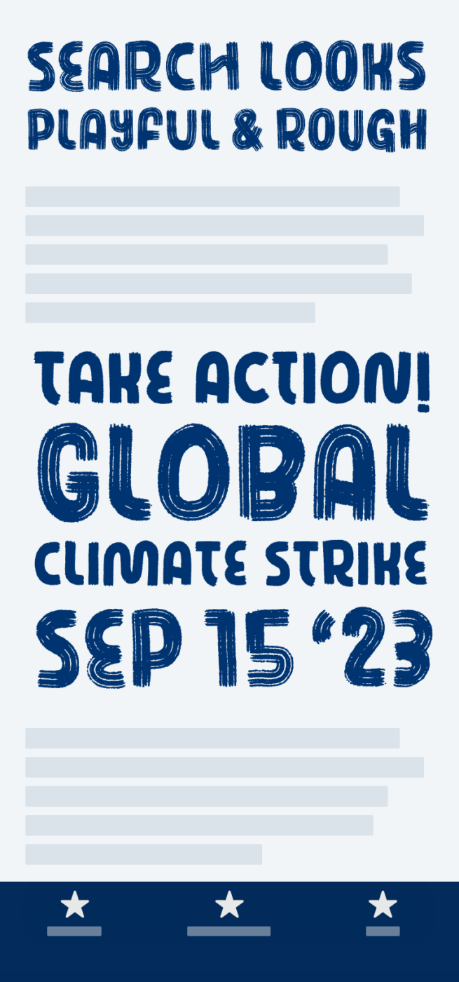
Use Search for expressive headings, that represent something coming from the heart. Also for a little intro text, or pull quotes of a hip, rebellious indie-zine. I used the letters as a template for the handwritten cardboard signs for the global climate strike today.
Recommended Font Pairing
When it comes to pairing it, you can really mix it with almost anything. But I recommend picking a linear sans-serif typeface for body text, that still has something sober but approachable, like Asap, or Paysage, which shows a little more character.


Learn more about pairing typefaces using the Font Matrix.
How do you feel about Search? Does it inspire you for an upcoming project? Tell me in the comments!