Skip to content
Pimp my Type
  • Free Type Check
  • Articles
  • Font Friday
  • Speaking
  • YouTube

License Single style

2

FR Kraken Slab

DisplaySlab SerifFree Font
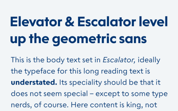
Elevator & Escalator level up the geometric sans
4

Elevator & Escalator

Sans-serif
2

Emeritus

Display
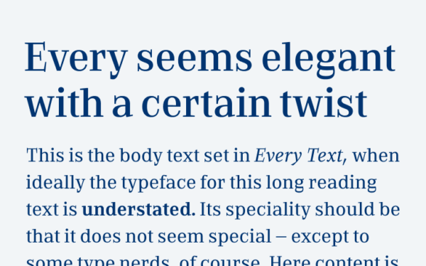
Every seems elegant with a certain twist
2

Every

Serif
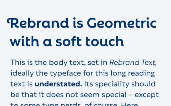
Rebrand is Geometric with a soft touch
2

Rebrand

Sans-serif
Hanje Ultra is loud, tight and goofy

Hanje Ultra

Display
8

Spitzkant

Serif
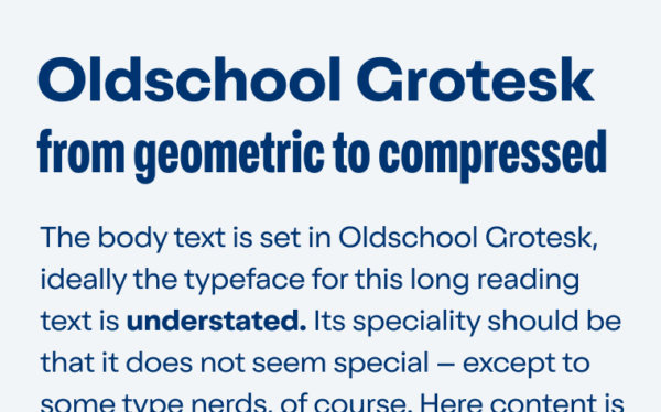
Oldschool Grotesk from geometric to compressed
6

Oldschool Grotesk

Sans-serif
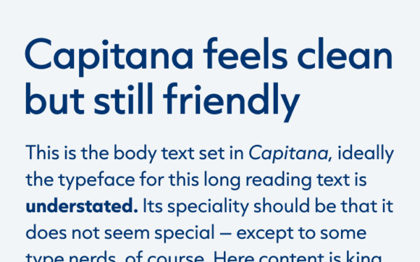
Capitana feels clean but still friendly
4

Capitana

Sans-serif
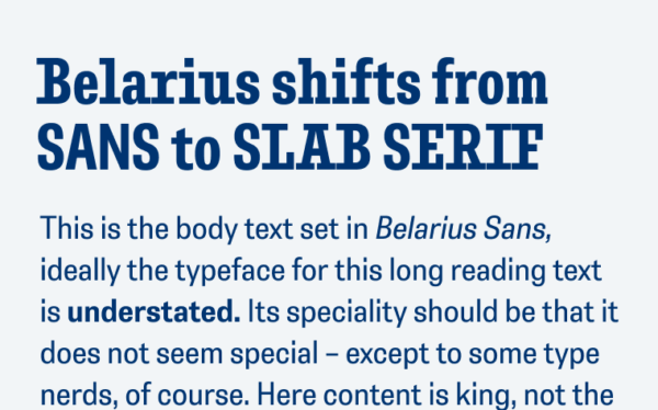
Belarius shifts from sans to slab serif
5

Belarius

Sans-serifSlab SerifFree Font
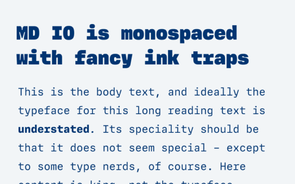
MD IO is monospaced with fancy ink traps
2

MD IO

MonospaceSans-serif
Stadio Now plays with reverse constrast
2

Stadio Now

Display

Posts navigation

Older posts
Newer posts
Oliver Schöndorfer

Smarter Typography, Stronger UX

Hey, I'm Oliver Schöndorfer – typography consultant, speaker, and UI designer from Austria. Let's chat about how to boost your UX with better typography. I love sharing insights in my enthusiastic, entertaining style – whether at a workshop, conference, or on a podcast. Drop me a line!

  • E-mail
  • YouTube
  • LinkedIn
  • Instagram
Oliver Schöndorfer, © 2018–2026 | Imprint | Privacy

¶ I love type, but typos seem to love me! If you find one, send it over so I can fix it. The typefaces Piazzolla and Magnet that are used on this site were neither stretched, faux-bolded nor harmed in any other way. Please be good to type.