
My thoughts on Rebrand
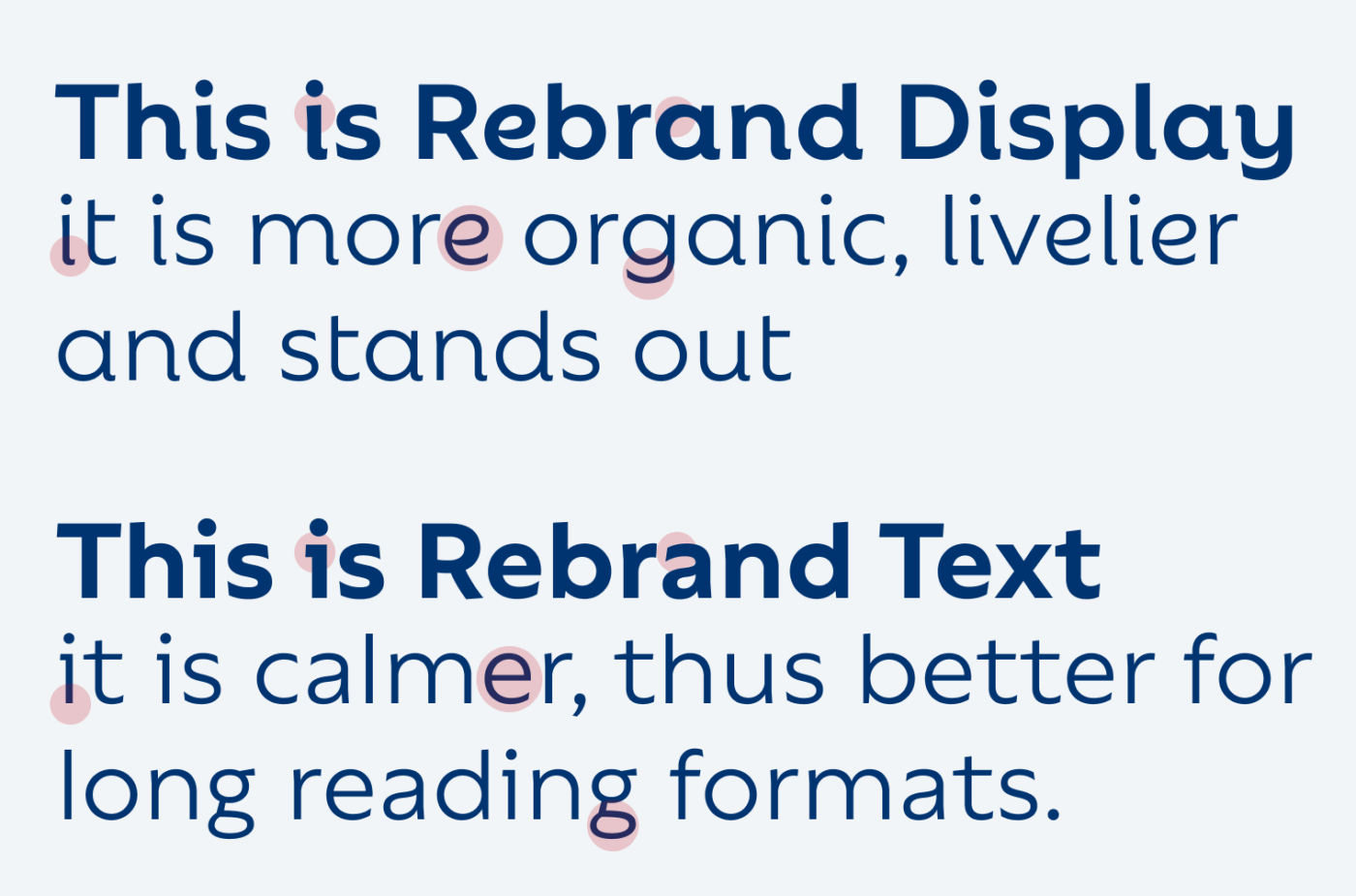
Geometric sans-serif typefaces often can seem dry and mechanical, which can make them replaceable. Rebrand by Latinotype is different and immediately shows a lot of character. It consists of two main styles, Display and Text. The display style is something like an upright italic, reminding me of popular Bree. It is playful, organic, even a bit calligraphic with the curved terminals (see the a, i or d). This makes it very approachable and friendly. On the other hand, Rebrand Text is more static and calmer, without sacrificing the overall spirit.
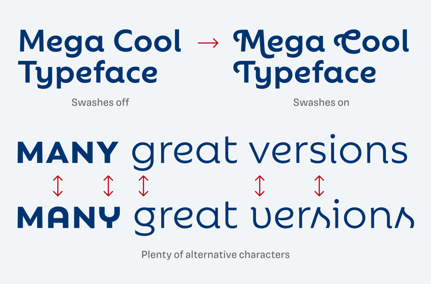
Another cool feature are the many alternate characters and optional swashes that come with Rebrand Display. They can make this already striking typeface even more interesting. I really dig the soft, organic vibe Rebrand creates. I can imagine how it would work beautifully on a text heavy website, or for some attention grabbing titles. For heavy use as functional text in an app design, it is a little too wide and space consuming.
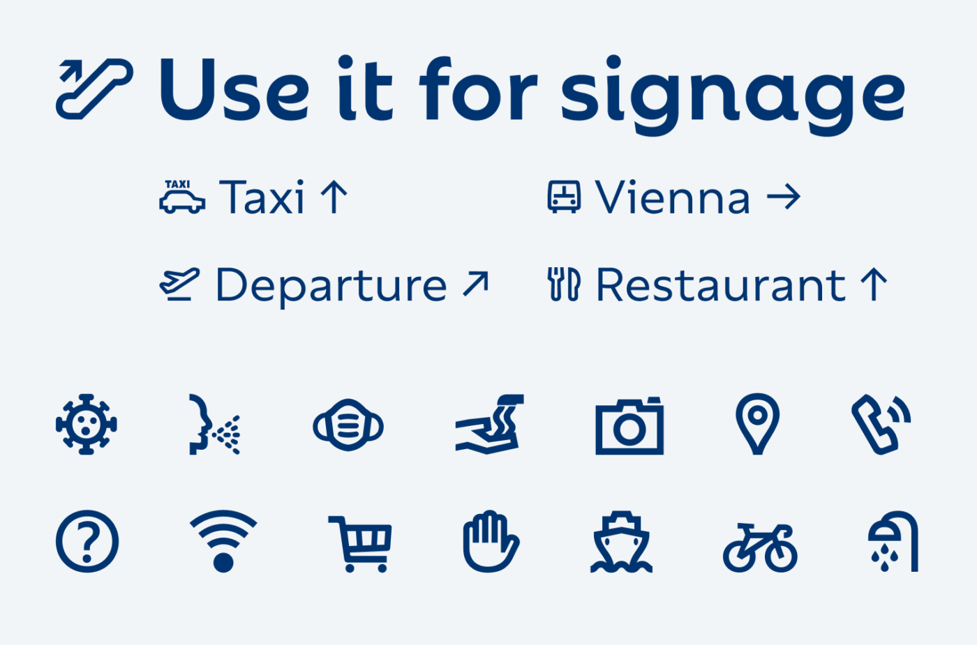
Besides these two main styles, Rebrand also comes with a Dingbats Font containing several arrows and symbols, even some COVID specific ones. This makes it a good choice for signage, and maybe for UI design. But for a really serious application, the 105 contained symbols are too little.
Recommended Font Pairing
Looking for a playful and even more expressive companion for headings? Choose upright italic Sansita.

- Headings
- Copy
- UI Text


Learn more about pairing typefaces using the Font Matrix.
What do you think? Is Rebrand something for an upcoming project, or do you have a font recommendation? Tell me in the comments below!
At the first sight, I didn’t associate Rebrand with being a sans-serif. I immediately thought How amiable, and sociable this font is! e and g are almost smiling.
Especially Display, it looks so effortless… but Oliver, I bet you it was a tough job to come to that. Look at the word “More”, m is giving a hand to o, while r and e are singing. These are some easy-going letters, spirited.
My vote goes to Display, superb for headlines.
Oh Jana, your character descriptions always have so much character 😍. Thanks for that!