
My thoughts on Capitana
Capitana is the newest typeface by Felix Braden. At first sight, it might remind you of the mother of all geometric sans-serifs, Futura. But taking a closer look reveals that Capitana is different. One challenge with almost 100-years-old Futura, are the inconsistencies you would not expect in a modern typeface. Like the different terminals at the G, C and S (see below). Also, its narrow proportions and rather closed shapes make it little suited for long format reading or small sizes.
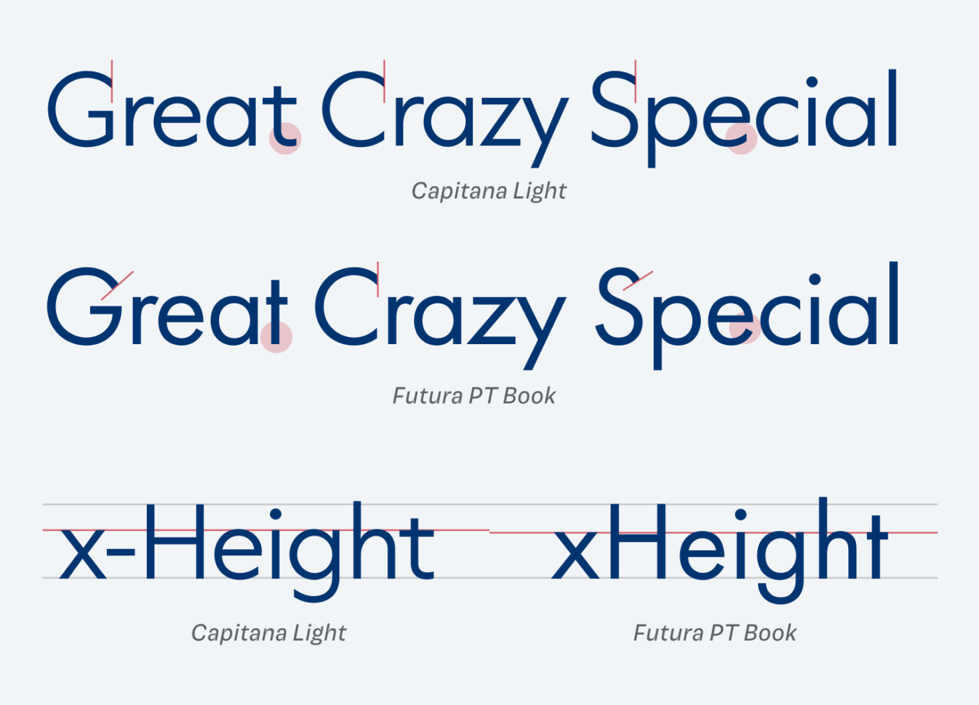
Capitana to the rescue! Felix describes his typeface as being the bridge between constructed geometric shapes and friendly, open humanistic shapes. And I can clearly see that in this typeface (learn more about different form models of typefaces in my recent article about the Font Matrix). This gives you a great advantage as well, since you can combine it perfectly with classic serif typefaces (antiquas). Thanks to its wider proportions and open shapes, it also works in smaller sizes for functional text and in UIs.
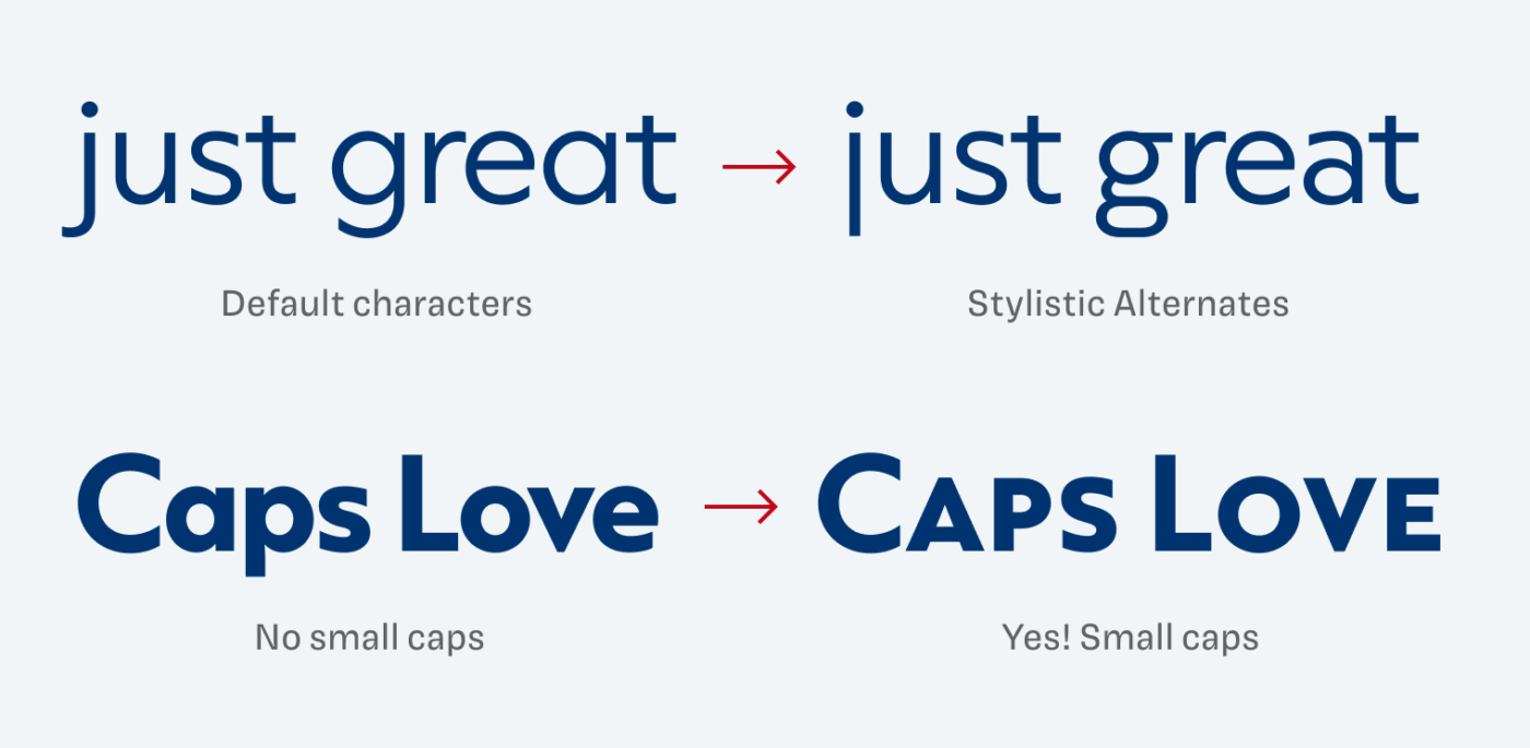
Felix also complements the typeface with some interesting stylistic alternates that could work well in striking headings. I also appreciate the small caps provided, since they come handy when you have a lot of abbreviations, and you don’t want them to stand out that much. Overall, a contemporary and versatile update for the genre of geometric sans-serifs, feeling clean but not sterile, stylish and still friendly.
Font Pairings for Capitana
To make the overall impression of geometric Capitana a bit less cool, pair it with one of these suggestions.


Learn more about pairing typefaces using the Font Matrix.
What do you think? Is Capitana something for an upcoming project? Tell me in the comments below!
That is very nice indeed and I don’t recall seeing Capitana before. Another modern geometric font with a friendly feel I like is Captura Now.
Recently I used Jost* in a web project as an updated alternative to Futura. Another one I recently experimented with URW Geometric.
Cool, Ashley! I like Jost a lot as well. And thanks for pointing me towards URW Geometric! Did not know that one. Like how squarish it becomes in the narrow and wide widths.
It’s so good to receive your Newsletter. I do the visual reading but for a holistic brand picture. When it comes to micro-managing the typography analysis, you’re Master Oliver! 🧐
Jost is my choice for almost 4 years now but Futura is my 1st Love. Capitana has a sonorous name, good branding!
What I love seeing in Capitana are geometric shapes (c, e) but fav letters here are r and y. Their endings are open while other circle-like shapes are closing. And that’s the game! I’m seeing a great potential in Capitana, something I did with my own font Anika, a decade ago. Use letters to create patterns for fashion and interior design. I’d love to try it with this font!
How cool is that idea, Jana! I’d love to see a pattern in these letter shapes!