
My thoughts on Stadio Now
Stadio Now is a typeface published by the lovely Italian foundry Zeta Fonts. It is a revival of Stadio from 1974 by the highly important type designer Aldo Novarese (which you know from Eurostile). The original design, that only consisted of one style, was digitalized, extended, complemented, and is now available as a variable font. There as so many things I love about Stadio Now. First, it looks very striking, and unusual, casual, or even goofy due to the reverse contrast (more about that concept in my Antipol review). But the mood strongly depends on the specific weight and style you choose.
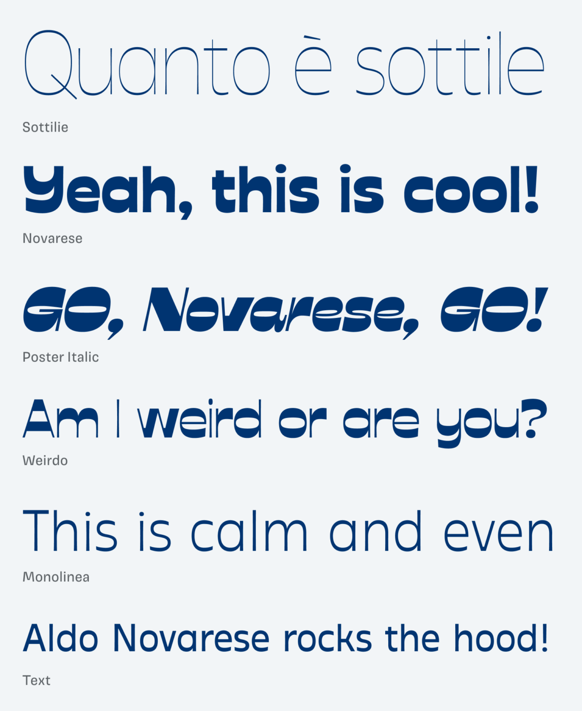
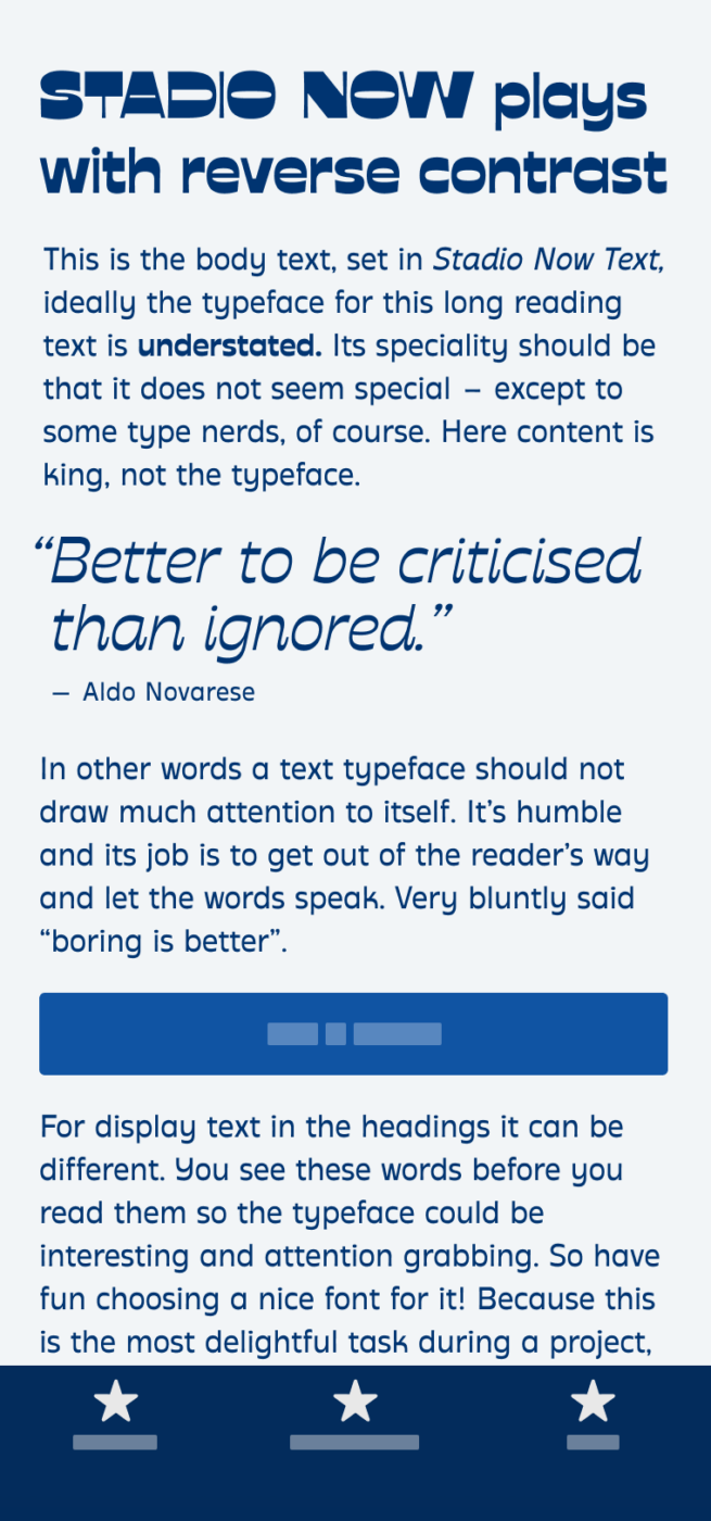
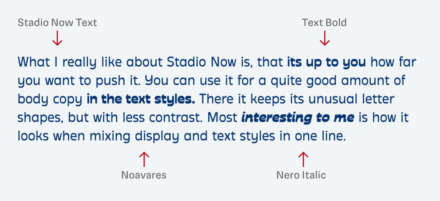
Zeta Fonts created a contrasting and diverse design space for Stadio Now, going from even, to contrasting, to confident, to weird. On the other hand, Stadio Now Text and Monolinea are almost calm, which makes this type family also suited for some running text. And even then it keeps the unusual letter shapes and vibe.
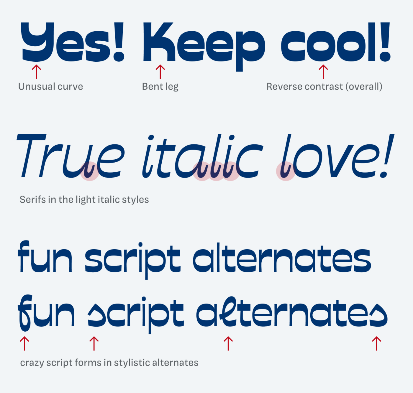
There are so many little gems and hidden features, that it really pays off to discover them. Besides the unusual letter shapes of the upper case Y and K, the lighter styles come with adorable serifs in the italics, which add extra charm and quirkiness. My favorite Easter egg are the script forms provided as stylistic alternates, that make the unusual even more unusual, just crazy!
I could vividly imagine Stadio Now on a retro revival packaging, bold campaign, or an intriguing web design with plenty of display text. I also recommend reading the backstory of the design process in Zeta Font’s blog, which is also set in Stadio Now (where you can also see that it does not really work set in Display Italic for the captions).
What do you think? Is Stadio Now something for an upcoming project? Tell me in the comments below!
If it’s not my ‘cup of tea’ it doesn’t mean I can’t applaud for variables and stylistic expressions!👏🏻But I can’t associate different styles with each other and ever think it’s the same typeface.
‘Weirdo’ reminds me of Garfield’s eyelids, anyone?🙄
Crazy script forms in style alternates remind me of Arabic letters.
A huge discount for your readers, bravo!! One has to earn that appreciation, Pimp my Type is a brand to follow💙
I like that you can appreciate it for being there, even if you don’t prefer it, Jana 💙. Arabic letter – great link! You’re totally right!