
My thoughts on Every
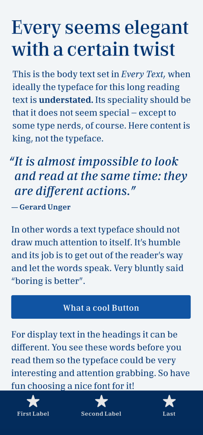
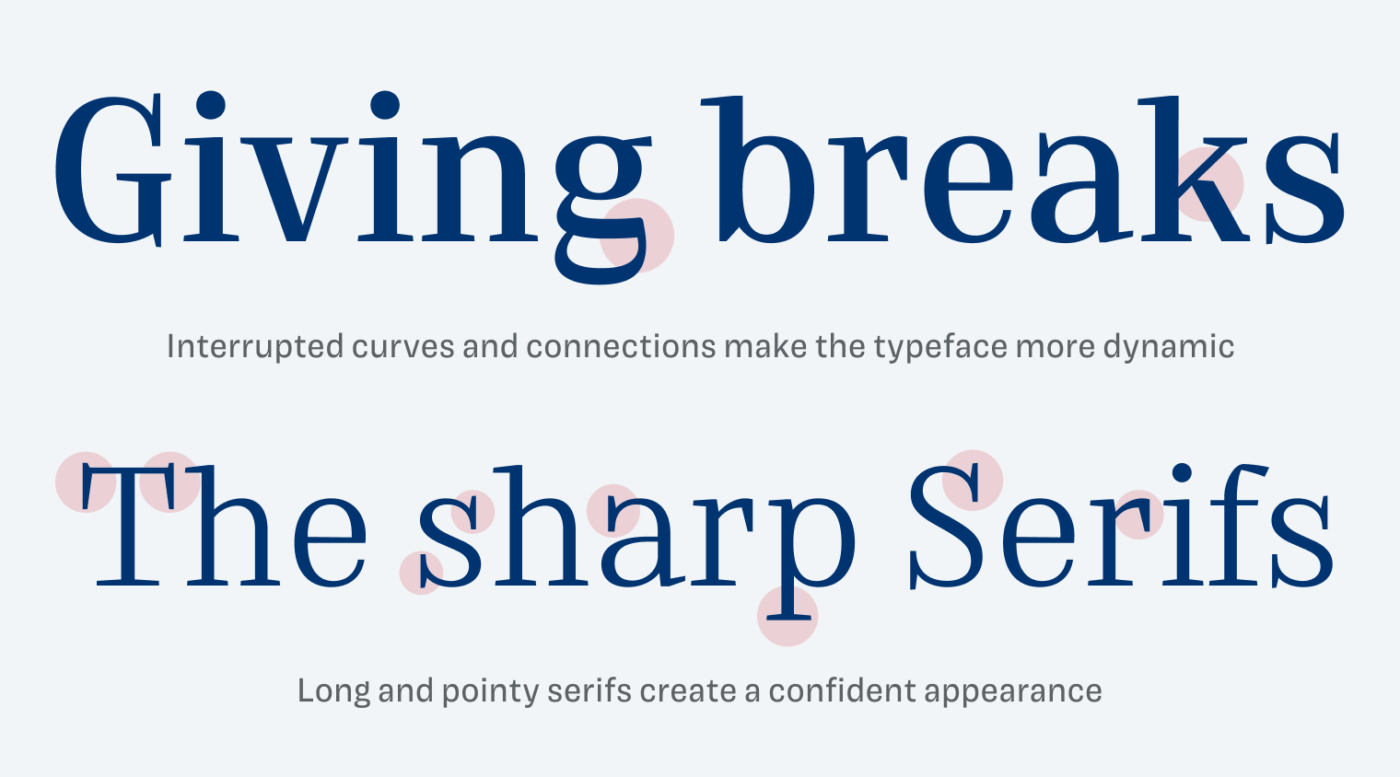
The typeface Every by Anita Jürgeleit caught my attention because of its determined, restrained and yet a bit unconventional design. It definitely has a more classy, elegant, or traditional feeling to it. It is rather narrow and contrasting, but what spices Every up are the deliberate interruptions it shows.
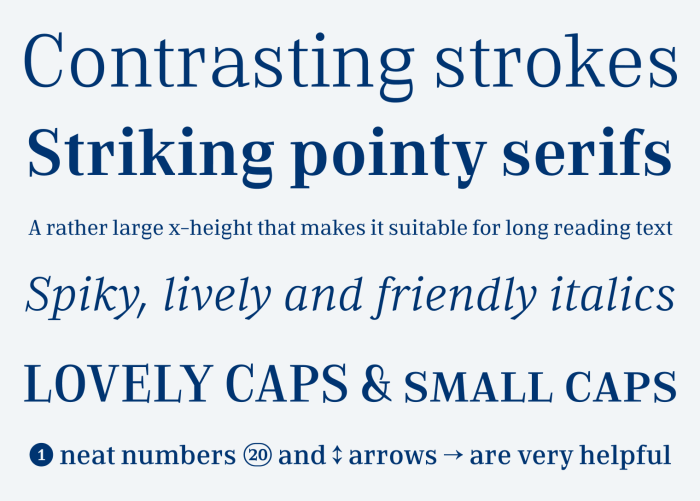
The two most important peculiarities are the pointy long serifs and the intentional breaks. The vertical serifs seem most striking (see the T or the lower case a or r). All these features are noticeable, but not over the top, at least for not super text heavy applications, like a book or magazine.
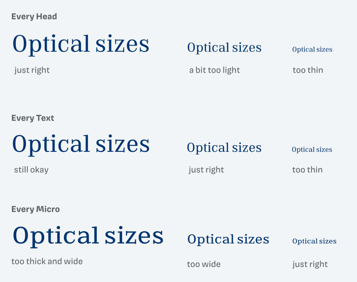
To ensure, that Every performs best in a particular size, you can choose between the three optical sizes:
- Every Head is more delicate and will look best set in sizes larger than 24 to 28 px. Used for smaller sizes, it becomes too thin.
- Every Text looks best between 14 to 24 px. The strokes are a bit sturdier, it does not look dramatically bad in larger sizes, but Head is still way a-head (no shortage of puns today 😅).
- Every Micro should only be used below 14 px, which is tiny. The proportions and spacing is wider to ensure legibility. In larger sizes it simply looks too thick, wide and leaves you with a dull impression.
To me, these optical sizes make Every a true workhorse typeface for various applications, even app design. For the future, it would be great to have Every as a variable font, where optical sizing could work automatically. But for now I’m okay with picking it manually.
Font Pairings for Every
Every is a rational, contrasting serif typeface. If you want something unusual and very different for headings, choose all caps Optician Sans or wild, condensed Humane.

- Headings
- Copy
- UI Text


Learn more about pairing typefaces using the Font Matrix.
What do you think? Is Every something for an upcoming project, or do you have a font recommendation? Tell me in the comments below!
Absolutely beautiful interrupted curves and and cursive style!! 🙌
¡Absolutamente! Glad you like it, Caco! 😉