

My thoughts on Oldschool Grotesk
Oldschool Grotesk was designed by William Montrose, the co-founder of the German foundry Kilotype. This typeface I immediately fell in love with. Why? Because when I think of grotesque typefaces, one thing come to my mind: strict. But Oldschool Grotesk feels different, at least in the regular width. It is quite space consuming, even geometric. Nothing like Akzidenz Grotesk, for example. You can see this at the o or e. But the narrower it gets, the stricter, more reserved or rational it becomes.
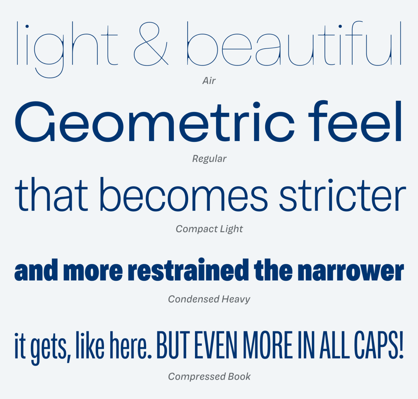
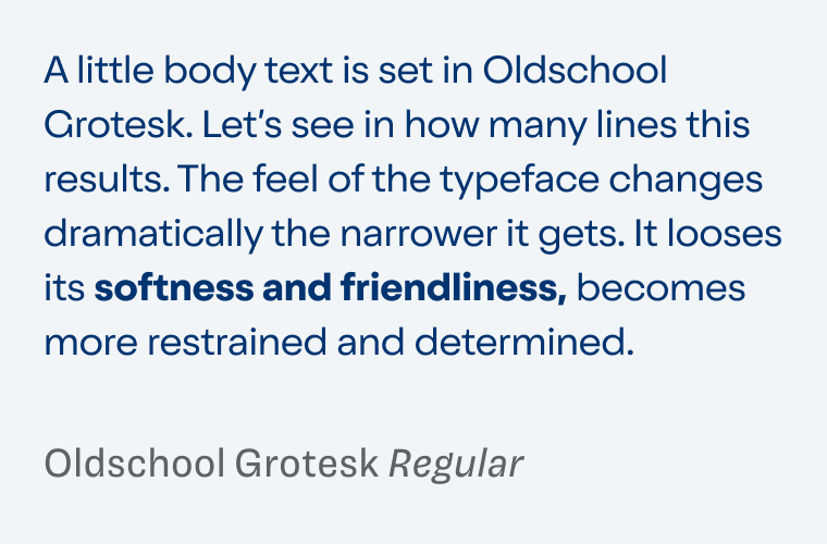
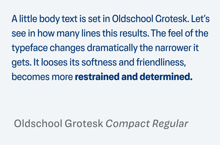
You can observe this shift of moods in the example blow as well. The default width, and Oldschool Grotesk Compact work well for body text, and functional text in interesting UIs. Condensed and Compressed should only be used for large display text, though.
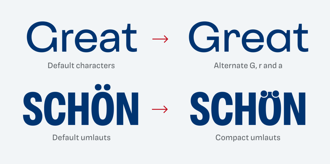
This vast design space is the super strength of Oldschool Grotesk. It makes the typeface very versatile, working on posters and in app designs. The only thing that might be missing are italics. But I could live with that for most projects. Make sure to check out the beautiful Oldschool Grotesk Microsite to see the typeface with all its variable superpowers in action.
Font Pairings for Oldschool Grotesk
Oldschool Grotesk lies between geometric and rational. If you want to pair it with something very different and chic, use script style Avril for headings.

- Headings
- Copy
- UI Text

Learn more about pairing typefaces using the Font Matrix.
What do you think? Is Oldschool Grotesk something for an upcoming project? Tell me in the comments below!
OldSchool Grotesk is in your veins, young modern man! OSG, besides lacking Italics, owns many usable faces to employ in commercial projects. It promises to have a Roboto or even Times New Roman reputation but in its own – grotesque league.
Condensed Heavy – for Disney cartoons, Regular Compact is a rather clinique, for the health and/or pharmacy industry, Compact Air/Thin is loveable feminine, while Compressed is excellent for poster design games… Width variables are plentiful options for one whole brand identity too. Favorite character? G!
I don’t love grotesques but this one is very useful!
Yay! Happy to read a new comment from you, Jana! Gee, love the G as well. And Air 🤩.
Nice one! The Condensed reminds me a lot to Futura schmalfett with a touch of Helvetica Condensed.
Absolutely, Markus!
The Air version is definitely something to love <3
I'd use it on a project for sure. Great thoughts here, Oliver.
Awesome, Henrique! Share it with me, when you do!