
My thoughts on Emeritus
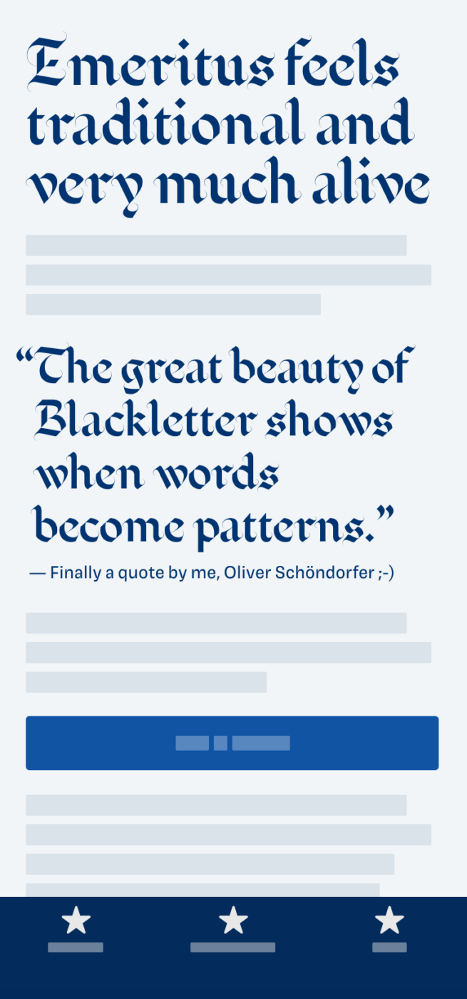
My heart just starts jumping when looking a these beautiful, rhythmical patterns blackletter typefaces can create! It is so much visual joy! Sometimes super hard to read, and horrible for long reading text, since we are not used to that. Emeritus by Blaze Type feels traditional, but not strict or dusty.
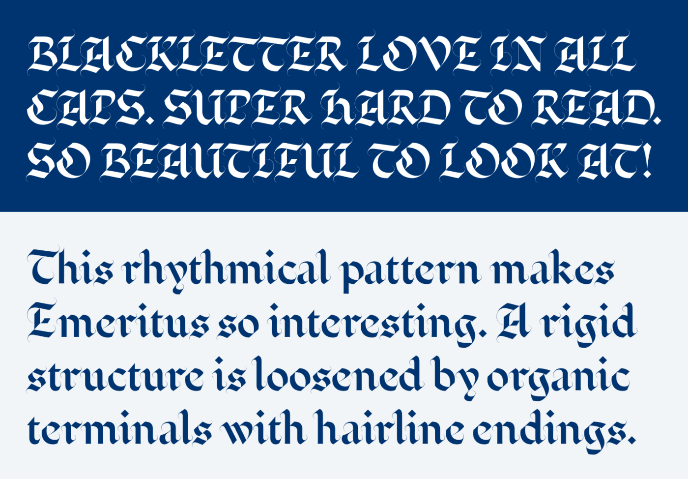
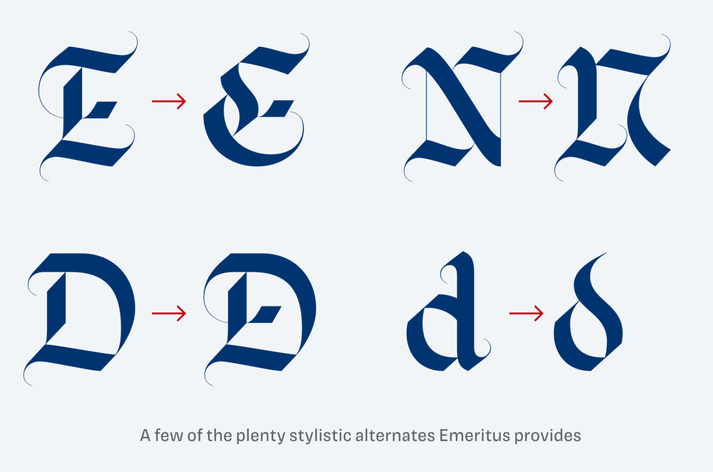
I think what Emeritus does really well is how it mixes a rigid structure of very contrasting lines with a lot of liveliness and playfulness. Try to set Emeritus as large as possible, so you can see the organic terminals and the curved hairline endings. Gorgeous! And make use of its plenty alternate characters.
Of course, you’ll have to have a project that works for it. And for screen display it most likely will be too delicate or hard to read. Nevertheless, maybe it will do for one word, or a gigantic drop cap? I think I should design a fairy tail app only to do that … If you dig this style, but Emeritus is a bit too much, check out Avona or the free font Grenze I reviewed.
What do you think? Is Emeritus something for an upcoming project, or do you have a font recommendation? Tell me in the comments below!
My 1st thought was “This is a masterpiece”, an ancient one👌🏻
I don’t even consider its readiness, all I think is it’s a design piece, and don’t care about that headline!
You’re not alone. Whenever I land on some website to read an article, my eyes are sensitive to all things letters. If the typography is off, that will impact the experience, despite the value of the content. But I’m far from being a proficient nerd like You. This week’s font is a nice surprise, going to archive for some Christmas design!
Oh! Great idea, Jana – it definitely fits a Christmas theme 🎄! And so happy to have you in the Club of Type Sensitive People. Life is good and hard here 😅.