
My Rasa Font Review
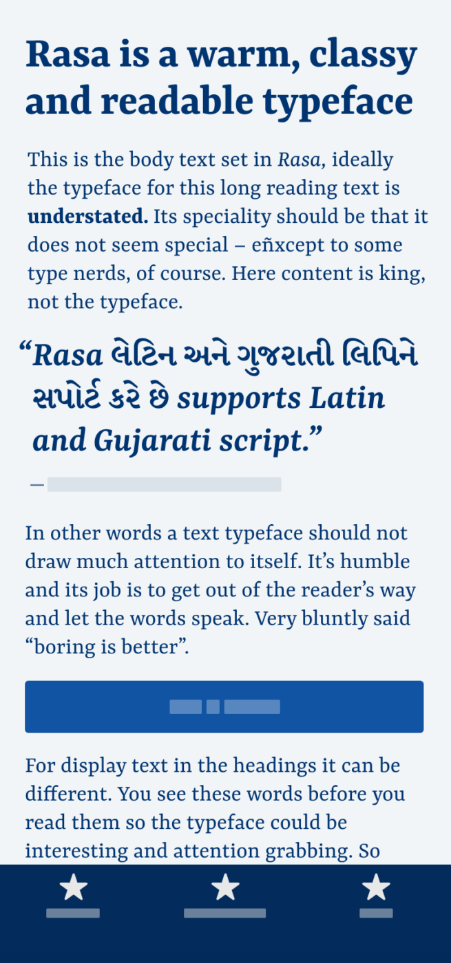
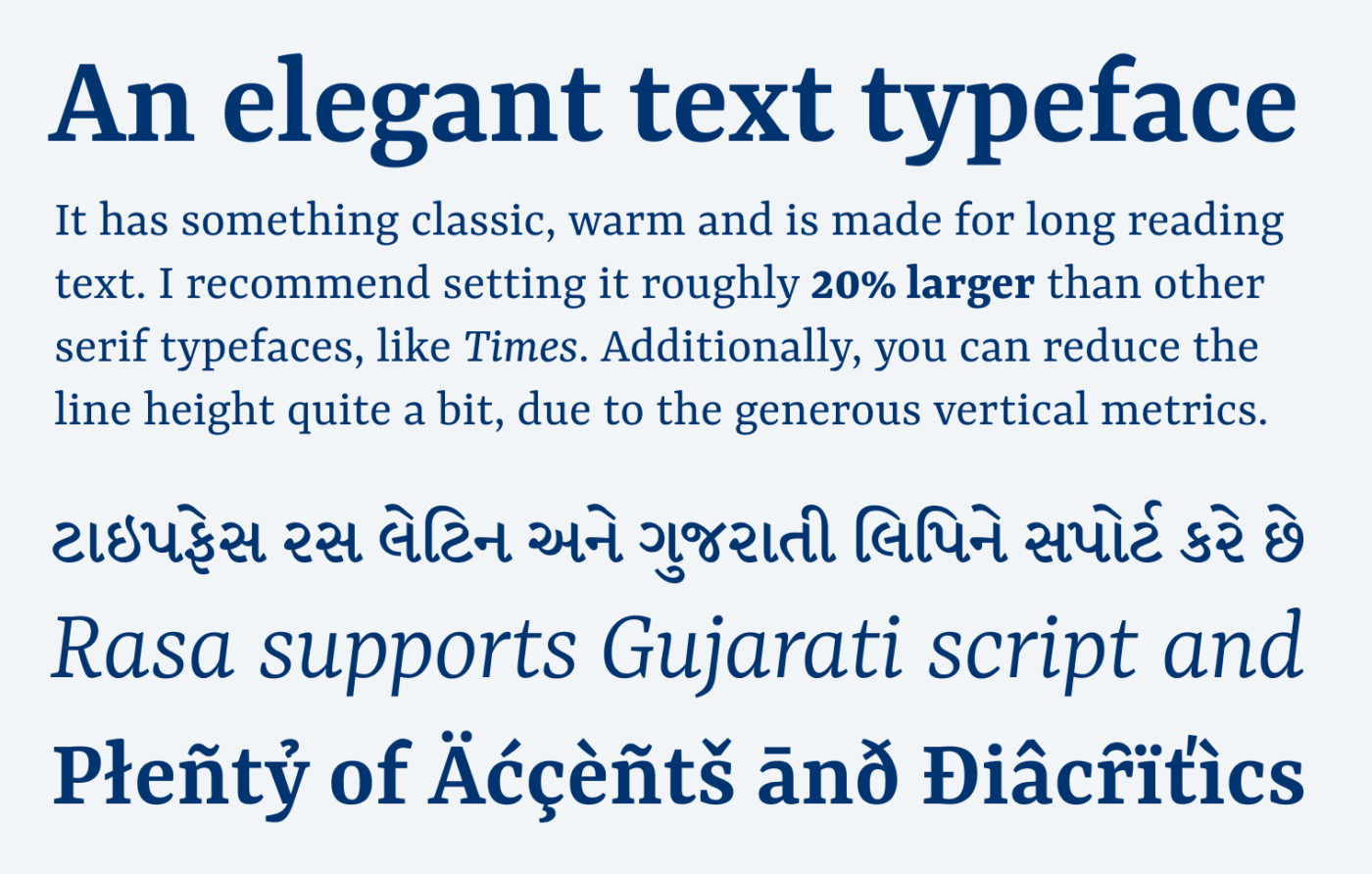
You are looking for a smooth, elegant, and free variable font for body text? The serif type family Rasa from Rosetta is made for continuous reading, while supporting over 92 languages in Latin and two in Gujarati script. But wait, isn’t this just a clone 😳 of the popular Google Font Merriweather? Let’s take a closer look.
The Latin-only version of Rasa – available as Yrsa – is based on Merriweather. This is neither bad nor forbidden. It’s reinterpreting the popular typeface, adding another script (Gujarati) and removing Cyrillic. When it comes to the impression the typefaces make, Merriweather comes across as quite sober, with a utilitarian drive. Rasa is not so far away from it, but it still feels warmer, friendlier and more contrasting, especially when comparing at the headings below.
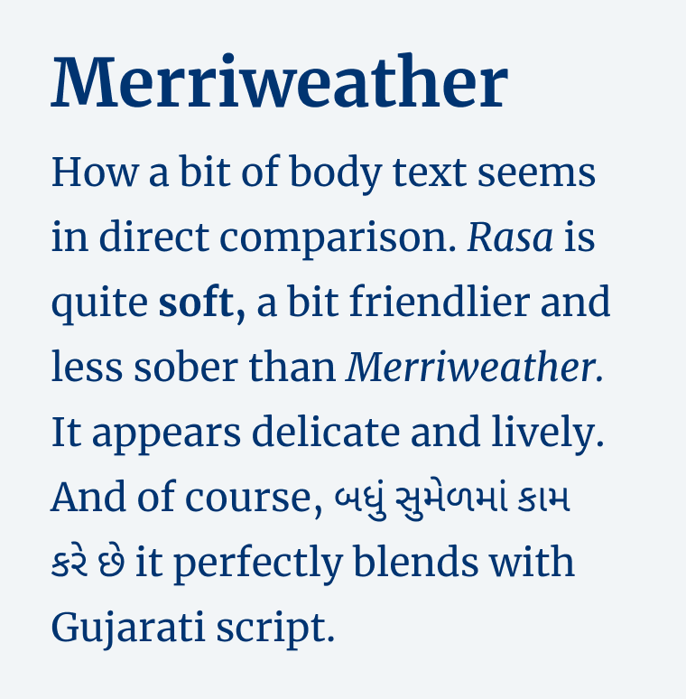

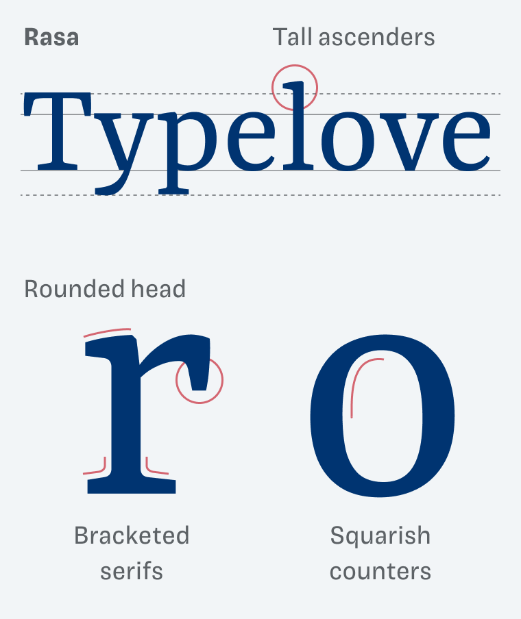
When looking at the details, the differences become more evident. Merriweather has short ascenders, little contrast and straight serifs. It also is tighter spaced. Rasa with its taller ascenders, bracketed serifs, and rounded heads has a warmer tone of voice.

But the biggest differences are the metrics. Rasa is more loosely spaced, and compared to most other fonts, you should set it quite large. There are also some additional things you should pay attention to, which I point out here for supporters on Patreon.

If you want to learn more about the making of Yrsa and Rasa, and explore some other differences, check out this blog post by Rosetta.
Font Pairings for Rasa
Rasa lives between dynamic and rational form models. I’d call it a quite dynamic, linear serif typeface. So it pairs well with Garino or other rational typefaces for headings, but also with these suggestions:

- Headings
- Copy


Learn more about pairing typefaces using the Font Matrix.
What do you think about Rasa? Or do you like Merriweather better? Tell me in the comments!
While Rasa is very nicely done, nothing beats the stringent Merri-the-weather-lady 😉
Have you had Akkurat on your show Oliver? Pardon, blog? 😀
P.S. For travel with kids… Hm, hm, hmm… It should be something either very nature or Disneylandy. I believe that Ljubljana if it’s not too “boring” for you, and it’s close, is good for the start of a family journey!
But, if you go fancy and attractive, than Spain. Anything will do there with plenty of 🌞
I have not featured Akkurat … yet. Almost a classic by now. And it covers plenty of scripts!
These are some good traveling tips with kids. And you nailed it. Either nature or entertainment. A city trip = trip to HELL 😂. Spain is a good idea! We are also considering that right now.