
My Signika Font Review
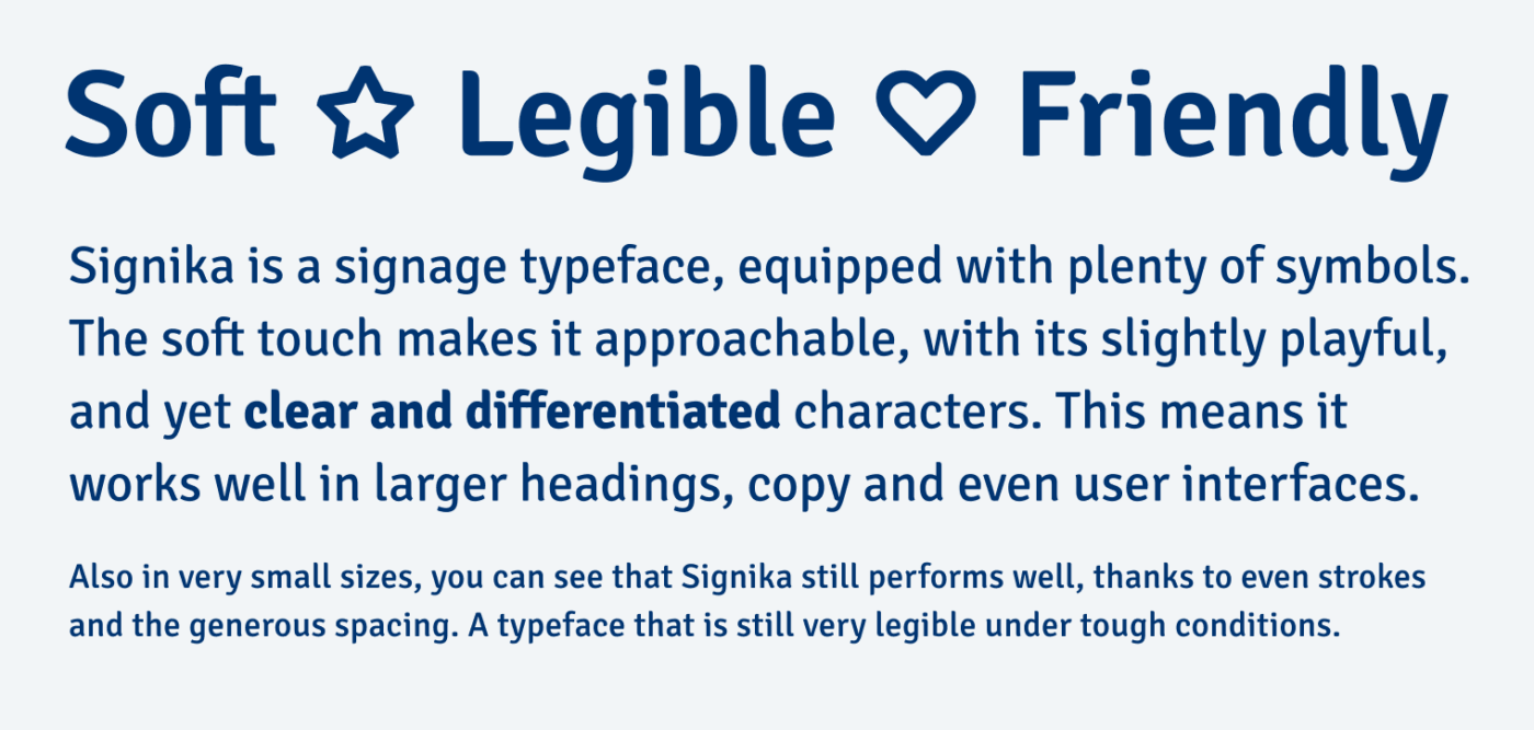
The free sans-serif typeface Signika is a hidden gem on Google Fonts. Originally designed by Anna Giedryś, it is made for signage. The typeface has very clean, legible and unique characters. However, this does not mean that it has less personality. The rounded terminals and playfully added serifs – like at the “i”, “g”, or “r” – give it a friendly touch.
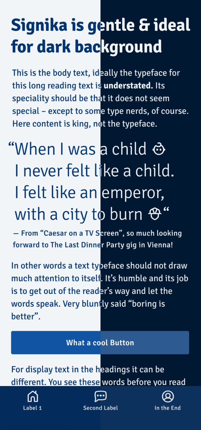
Because light text on dark background optically appears heavier, Signika is equipped with a dedicated style to compensate for that: Signika Negative. This negative style is slightly thinner. See the difference below. If you don’t want to use it as a separate type family, you can adjust the Grade axis GRAD in the variable font.
When switching to Signika Negative, I observed that the spacing also slightly changes. Compared to other fonts that are optimized for light text on dark backgrounds, like Darkmode or Action Text, this can create minor shifts in your text flow. You can also see in the slider above, but in most cases it will not be relevant.
And as a typeface made for way finding, it is equipped with more than 250 icons and arrows. How you can access them in a very clever way, I show supporters on Patreon in this quick video tutorial.
Even though Signika works well in all sorts of text, if you want to use it for serious long reading text, you might miss italics. In this case, you could use it for headings and small print, and combine it with one of my suggestions for copy.
Font Pairings for Signika
Signika is a dynamic linear sans-serif typeface. A great serif companions could be dynamic Pausa.Also rational, but playful Caladea would be a great match with its quite similar soft stem terminals.


Learn more about pairing typefaces using the Font Matrix.
What do you think? Is it really worth using a typeface optimized for light text on dark background, or is the positive style good enough? Tell me in the comments!
The negative version is an great idea! My opinion about the font itself is that it seems like a not very original copy of Spiekermanns Officina, just a bit rounded.
Agreed, Markus, you can definitely find similarities to Officina. However, overall it feels much softer because of these adjustments.
More useful than negative would have been italic. Nice open counters. Not too wide. 1 i l I nicely differentiated. Negative not at Google fonts?
The typeface only for negative is available on Google Fonts, find it here under Signika Negative.
Signika is too friendly, for my taste. And don’t trust font that doesn’t have Italics 😄
But… Signica’s significance is that her letters dance in coherence, especially i next to n, k, and a.
Little g? Nah. Yes to Signica Negative, I can take it more seriously.
Oliver, have you written about the humanist, realist, rational, decorative, grotesque, geometric, etc. in general as a topic, the classification? I bet that Google SERP would love that!
Writing about it is a great SEO idea, Jana! I should absolutely do it!
Signika Negative + Aesthet for headings is a legible, fresh combo.
You mean Aesthet Nova from Inhouse Type Foundry? Could be a nice combo, both have soft touches.