
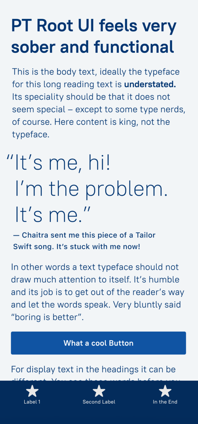
My PT Root UI Font Review
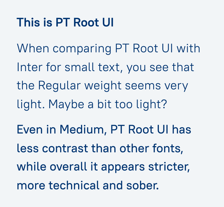
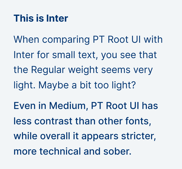
The free sans-serif typeface PT Root UI is – as the name suggests – made for user interface design. It has very even strokes, is compact and comes a cross as quite mechanical, clean almost sober. PT Root UI reminds me of DIN 1451, but it’s softer and without the quirks. And the typeface is very light, in my opinion, when compared to other fonts like Inter here.
A nice feature of PT Root UI is that it’s a uniwidth design. This means each character, regardless of the weight, takes up the same amount of horizontal space. So when you make something bold, it will not create any reflow in your web design or UI.
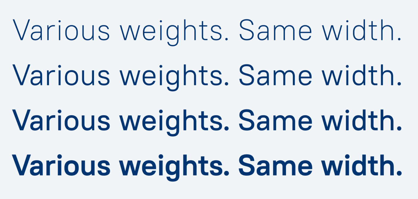
This gives you additional possibilities. You could change the weight in hover or focus states without jumping text or misalignment. How much better this looks in comparison with Inter, you can see here on Patreon.

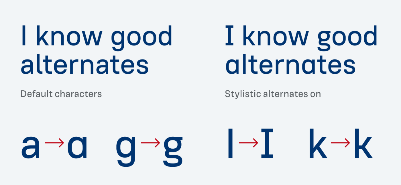
What I also appreciate about PT Root UI is that it has quite some interesting stylistic alternates, that can shift the mood of the typeface into something totally different.
Since this typeface is made for small text, also in regards of the loose spacing, i would not use it for a lot of body text and either pick PT Root as a companion or one of my recommendations.
Font Pairings for PT Root UI
PT Root UI is a rational, linear sans-serif typeface. It pairs well with something contrasting like serif typeface Rasa, but also quite similar Mona Sans would work fine.

- Copy
- UI Text


Learn more about pairing typefaces using the Font Matrix.
Many thanks to Quirico for bringing this typeface to my attention. If you spot a font that I should review, tell me in the comments!
Signifier? https://klim.co.nz/blog/signifier-design-information/ I’d like your take on this masterpiece, if you feel inspired Oliver.
PT Root UI is known to me, and I’m afraid of such light fonts for readability purposes.
🙌🏻for three lovely girls skiing, bravo!!! See you in Mediterranean in summer ☀️
Used by no less than Erik Spiekermann on his own website. https://www.spiekileaks.com/8-the-spiekileaks-typeface
Of course, has become quite visible as it is the serif in use on the OpenAI site, alongside Söhne from Klim also.