

My Lucette Font Review
This is something rare and unusual. The sans-serif typeface Lucette by Alice Savoie takes up the idea of a so-called “top-heavy” design. This means that the upper parts of letters show more contrast. It is also the reason why Lucette makes a quite unique impression, coming across as unusual, quirky, playful, even a little goofy.

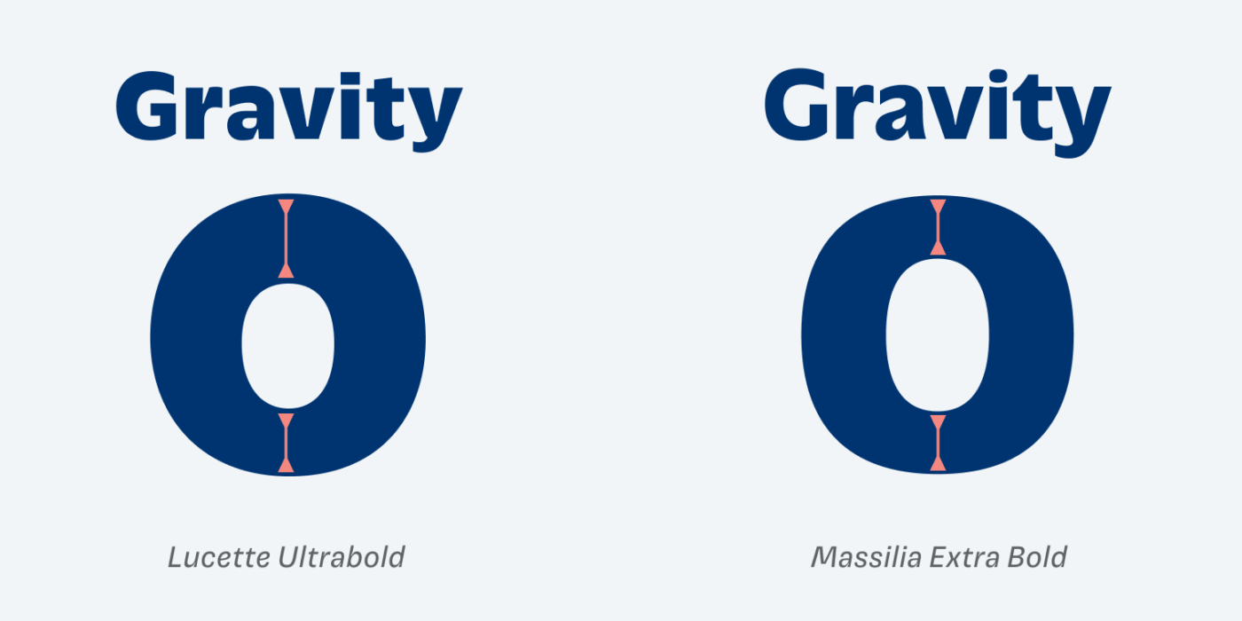
Conventionally, stroke contrast is distributed evenly across horizontal lines, but Lucette emphasizes the upper parts. This is still present in the lighter weights. When comparing it with Massilia, which like Lucette took inspiration from classic Antique Olive, you see what I mean. Gravity suddenly feels differently.
What strikes me is that Lucette has both very organic and very technical aspects to it. Looking at the “s”, the top-heavy contrast feels bobby and soft, while the articulated wedge-shaped cut-outs, or the horizontal crossbar at the “k” feel more constructed. It creates an interplay I really find interesting.

The typeface also comes with a Black Display style, that is taking contrast, playfulness and its wild shapes to the limits. See my comparison here on Patreon.

I would not recommend Lucette for long format reading, since the unusual contrast might be distracting in a lot of copy. But it works surprisingly well in smaller size, given the generous x-height, loose spacing and distinct characters. So maybe it is something for a brave app or web design?
Font Pairings for Lucette
Lucette is a quite dynamic, contrasting sans-serif typeface. If you look for something similar but less fancy for copy, pair it with clean Muller Next, or one of the other suggestions.

- Headings
- Copy
- UI Text


Learn more about pairing typefaces using the Font Matrix.
What do you think about it this unusual design? Is it heavy on your heart or lifting your soul? Tell me in the comments!
I licensed Lucette from FutureFonts a good while ago (and may have mentioned it to you). I agree that it looks great .. which is what prompted me to get it 🙂
In practice, in a text/blogging application might not have been its best milieu. From one pov, it could look a little comical (sponge bobby, one of my children said) in headings. In smaller sizes the descender on the ‘g’ disappeared a little, and the bottom in general could look a little light.
I loved the name.
“Sponge bobby” is the best adjective ever! 😍 I love that!