

My thoughts on Grantig
The bold slab serif display typeface Grantig is inspired by the opening titles of Western movies. But it’s not stuck in the past, it has something very daring and contemporary about it with its strong and sometimes almost goofy attitude. It comes in one weight but three different styles: Regular, Slant and Backslant, of which the latter one is most crazy and wild.
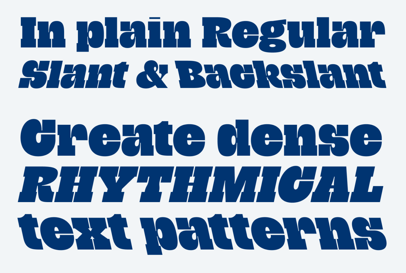
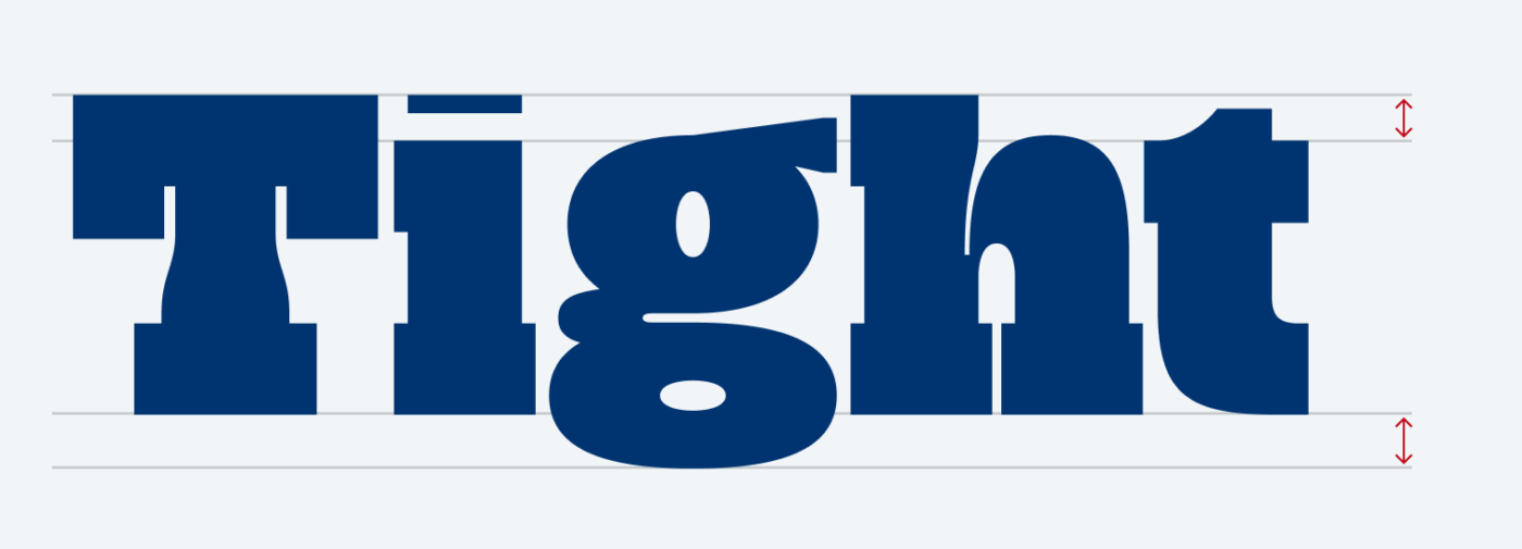
Grantig is great for large, dramatic titles and headings. You can also set rhythmical patterns of text, embracing the extreme contrast. The tall x-height and at the same time ridiculously short ascenders and descenders let you reduce the line height even below 100%.
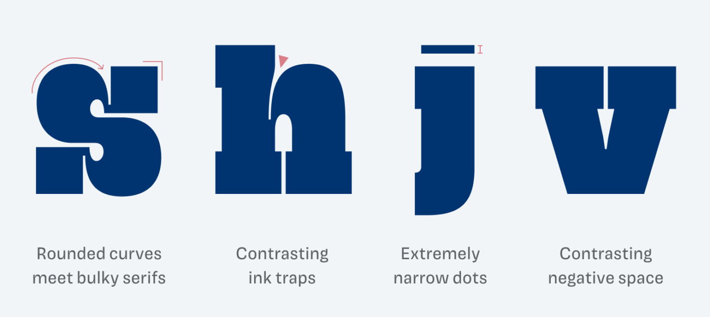
The heavy strokes and delicate counters play with contrast as well. But also when it comes to movement where dynamic curves meet fat serifs (look at the “s”). Compared to that, the serifs of the vertical strokes, like at the “h” are almost subtle, like the narrow dots of the lower case “i” or “j”.
Grantig is a typeface made for strong appearances in editorial design, posters, titles and headings. It is a great font to play around with in these use cases. For everything else, I recommend pairing it with one of my suggestions below.
Font Pairings for Grantig
This contrasting rational serif typeface pairs well with other rational typefaces, like Helvetica or Magnet. But since it’s so special, you could almost try any sort of combination.


Learn more about pairing typefaces using the Font Matrix.
What do you think about Grantig? Are you eager to use it in your next design? Tell me in the comments!
“where dynamic curves meet fat serifs” by far, the most crazy font here, in Pimp My Type lab! 🤣 I’d use Grantig for UI functional text.
Joke aside.
When I look at a song quote, it’s as if you put it in 3x smaller shoes. Crumped.
Grantig is best for cartoons, TV, winter boots brands, snow gear, kids’ books… and, all kinds of unexpected stuff🙄
Do you have some font for luxury and premium, ecommerce? I’m all about that these days.
“Most crazy font here” 😂 good observation, Jana! Well, maybe one of the Festive Fonts fits for luxury and premium? Nyght Serif, Isenheim or Erotique for example?
You’re a treasure house of fonts. I realized that “luxury” means to everyone differently. For some, the Apple website is luxury with all the minimalism, and for some, it’s a lushness at Versace House.
Thank you, Oliver, a precision craftsman 🙌🏻🫶🏻