
My thoughts on Radio Canada
When Jeremy asked me about my opinion about the free sans-serif typeface Radio Canada, it was not familiar to me. So I took a close look and found it to be surprisingly underused. It’s a clean, legible variable font, obviously made with accessibility and inclusivity in mind. Besides Latin script, it also contains syllabics, so that many indigenous languages spoken in Canada are supported. See syllabics in action on the website of the Government of Nunavut, using Ubuntu.
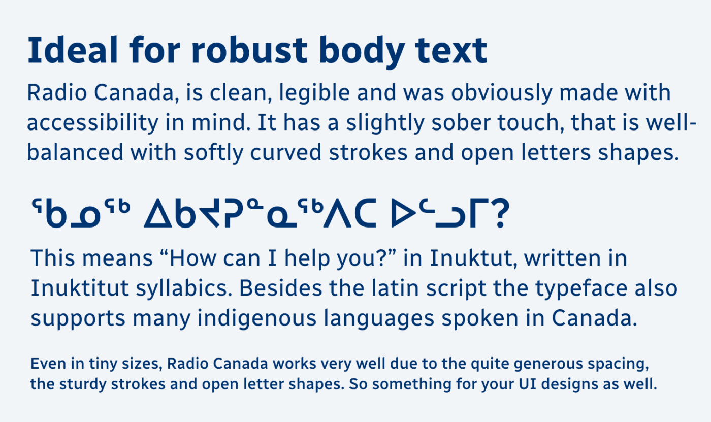
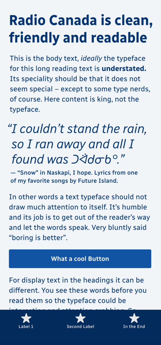
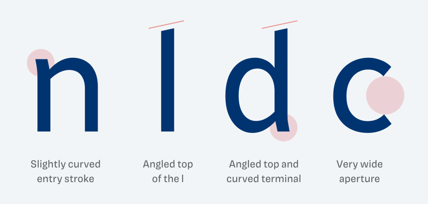
The typeface mixes a sober, and clean impression with charming details, like the slightly curved terminals or beveled ascenders. This way it keeps the balance. It has very even strokes and narrow proportions, while the spacing is quite generous. This makes Radio Canada ideal for long reading text and UI design.
But this big advantage can also backfire when using Radio Canada in larger sizes. It can seem a bit clunky and tends to fall apart. Adjusting the spacing and weight is necessary to make it work. The variable font offers plenty of options here, also by adapting the width axis if you want to save on space.
To me, Radio Canada is a typeface we could see more often, especially in UI design and body text. But for larger heading or titles, I recommend combining it with something more interesting.
Font Pairings for Radio Canada
This linear sans-serif typeface lies between dynamic and rational form models. An interesting combination for headings would be Neue Freigeist or another rational display typeface, but also dynamic Larken.

- Headings
- Copy
- UI Text


Learn more about pairing typefaces using the Font Matrix.
What do you think about Radio Canada? Do you also want to see it more often? Tell me in the comments!
Impersonal, not my cup of tea, Oliver 🤔
But this post led me to your previous posts about magnificent Larken 😍 and Font Pairing.
Once more, happy new chapter to all Pimp My Type audience 🌞
Sometimes you need it to be more “neutral” and get the personality through the combination. But I can understand you point of view 😉.
That’s a smart point! I was myopic in making my comment because, for me, typography is the star of the show. 😅I enjoy using it as a main differentiating agent.
But in places where illustration is a more prominent agent, for overall visual language, it’s better to bring in someone like 📻 Canada.
Thanks for the detailed review, Oliver. Of course we know my opinion of it is positive!
I see it a a relative of FF Meta, but certainly more restrained. Meta was used for headings in an old government style manual, combined with Goudy Old Style for the body text. How do you think Radio Canada would go if used (condensed) like that?
(Radio Canada news seems to have a house style of a space between quote marks and the quoted text. Interesting but not sure it will catch on.)
I agree, Jeremy, it is somehow related to FF Meta, as both are dynamic linear sans-serif typefaces. And Radio Canada would work in combination with Goudy Old Style as well!
A space between the quotation mark and the text … that’s strange. But not sure if it’s common in Canada?
Yeah, I also checked this font out because of your “Larken” post. I pair Larken with Brandon Grotesque. Radio Canada leaves me untouched somehow.
That’s also a good combination, Alex!