
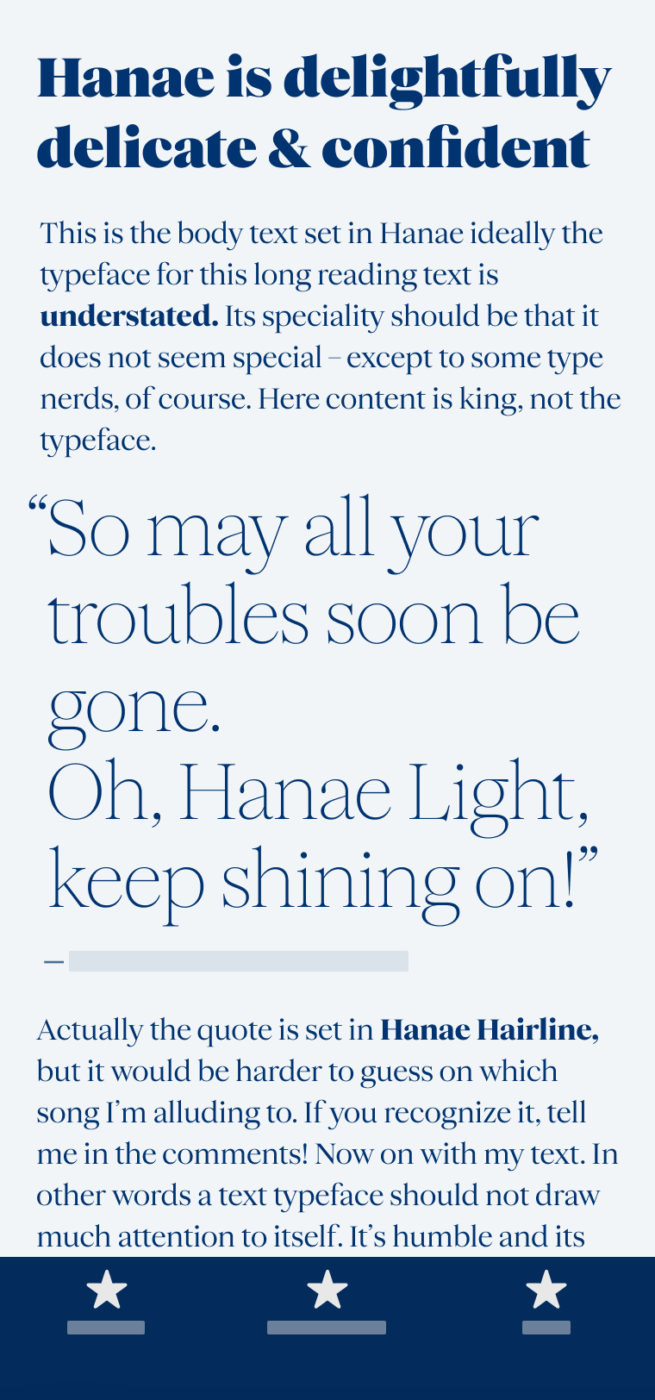
My thoughts on Hanae
Hanae is one of the most elegant and at the same time modest typefaces I spotted this year. Made for fashion and editorial, it gives your headlines, posters or any other display text a certain finesse while not going over the top. What I like most about it are the extremes! Hanae Hairline manages to still be contrasting, while Hanae Super still keeps its tender elegance.
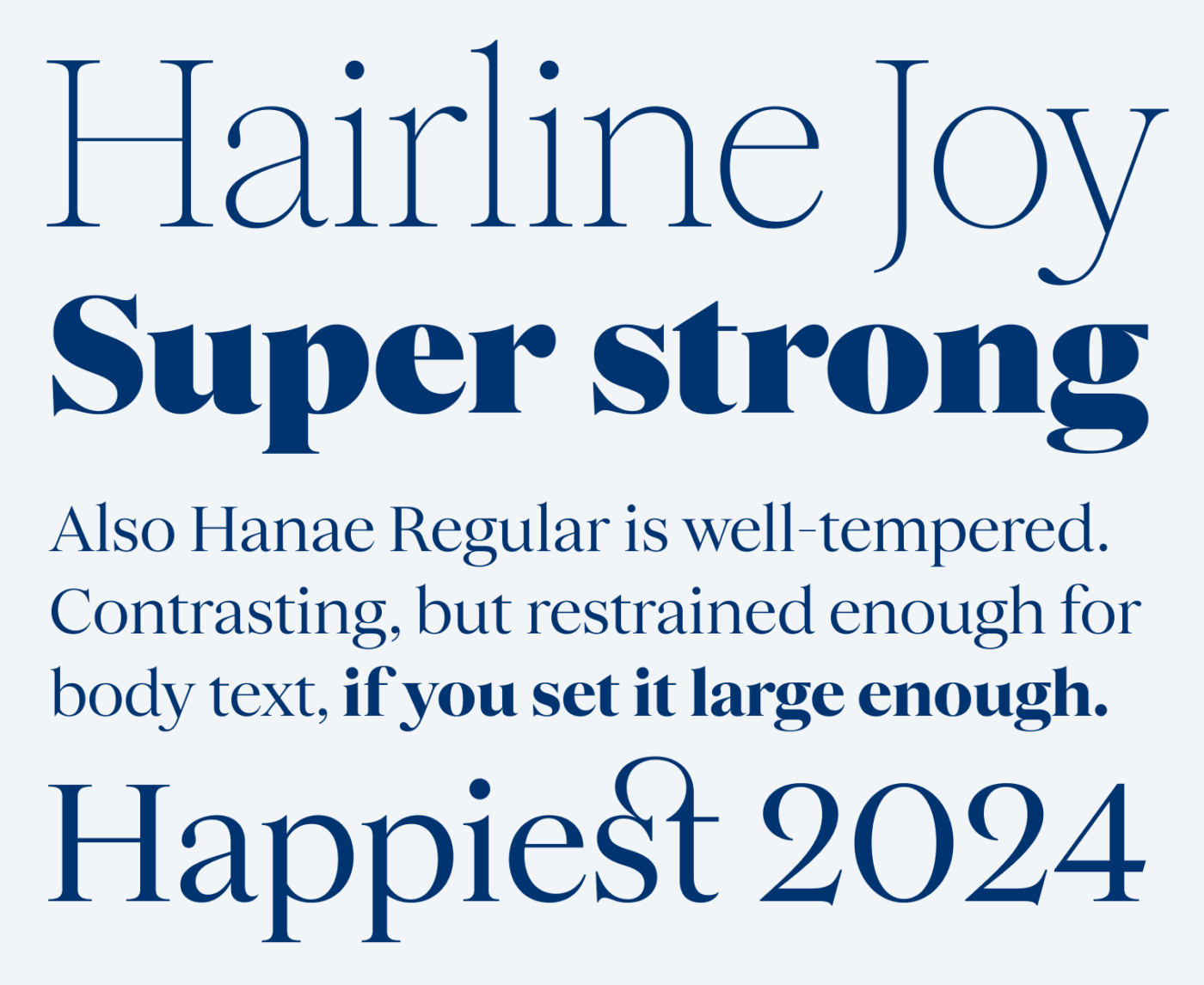
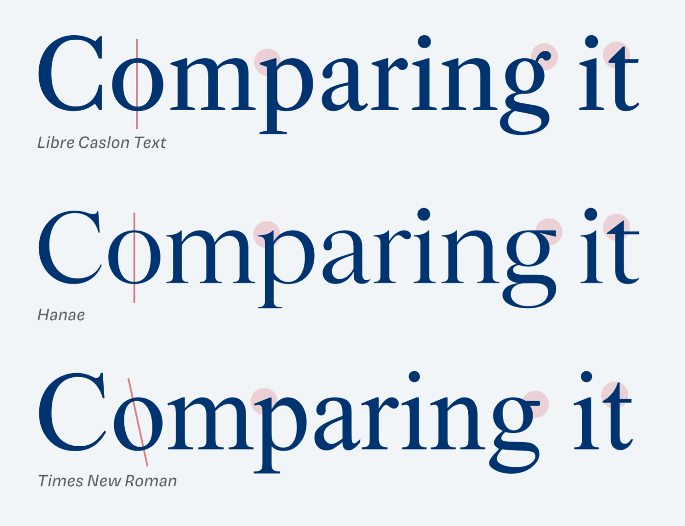
For body text, it is still quite contrasting, but works if you set it large enough. I suggest a minimum size of 18 to 24 px (14 to 18 pt), so that it can truly shine. You can feel that Hanae is inspired by classics like Caslon, Baskerville, or Times New Roman. But compared to them, it comes with a different flavor. The sharp serifs, vertical axis and stronger contrast make it more refined, while the wider proportions and tall x-height let Hanae keep its utilitarian functionality.
Even styles of Hanae are already out to shape your content right, but the typeface is still in the making. Get a peek of the wonderful italics and learn more about the backstory in this interview with Ayaka Ito. There I also read about possible Cyrillic and Japanese Kana, so I’m definitely looking forward to seeing where Hanae will develop!
Font Pairings for Hanae
Hanae is a quite rational, contrasting serif typeface. So it pairs well with Neue Freigeist, Mona Sans or other rational sans-serif choices.

- Headings
- Copy


Learn more about pairing typefaces using the Font Matrix.
What do you think of Hanae? Is it something for your next design project? Tell me in the comments!
Hanae is finally on Font Fridays! I don’t know if you remember, Oliver, but I shared a link to Hanae several months ago with you. And here we go, I was looking forward to hearing/seeing from your sharp eyes 🤓
Without going into the weed because you do that much better, Hanae feels adorable wholistically. It’s a very feminine, rich typeface. Super Hanae keeps her sophistication even this thick. I’m planning to take Regular Hanae for my brand sometime in the 1st quarter of 2024. I thought it was a finished version when I messaged Ayaka about it🤔
I wish you a blessed time with loving and trustworthy people 🤗
May you happily sing from the smiling soul, deep within. Let your heart dance in synchrony with other good hearts around the globe. Long Live the PimpMyType community 🙌🏻
I took some time to feature, but I finally made it. There are just too many good fonts out there 😂. Thanks for brining my attention to it, Jana!