
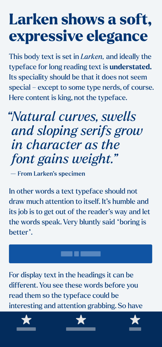
My thoughts on Larken
When I discovered Larken, I felt strongly drawn towards it, while I could not clearly articulate why. I had to take a closer look what it is, that makes this serif typeface by Ellen Luff so special. Larken coveys a certain elegance, which is rooted in its construction, based on traditional dynamic letter shapes. Reminding me of engravings, especially in the lighter weights.
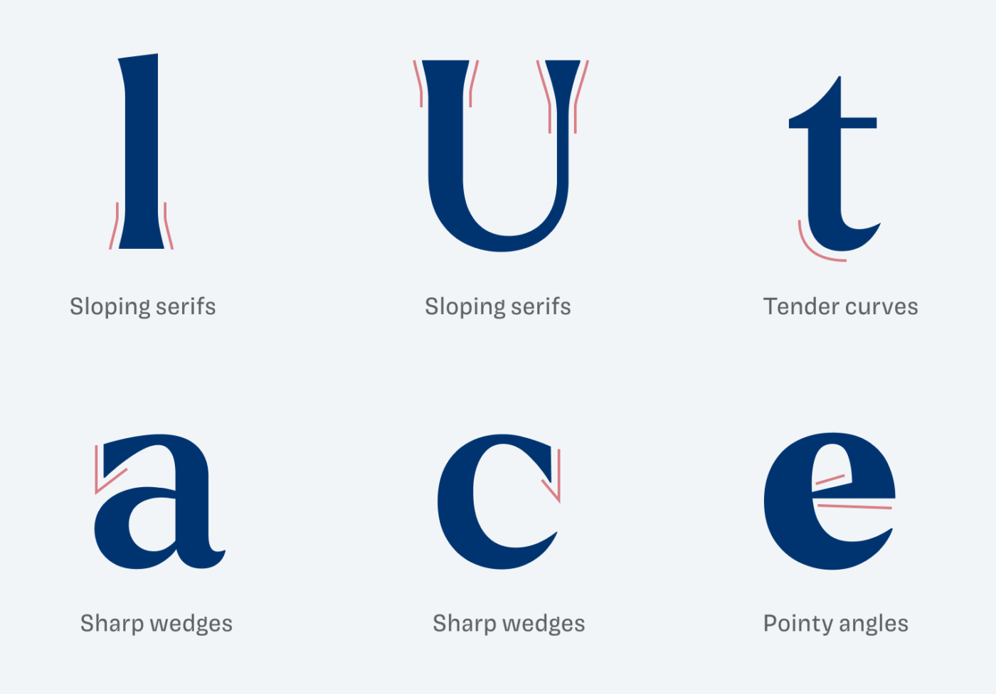
This classic construction is counterbalanced with a certain simplicity. The subtle, sloping serifs make it stable and noble, while the tender curves make Larken seem organic. This is mixed with sharp wedges and pointy angles that show decisiveness. Features that get highlighted even more in the stronger weights.
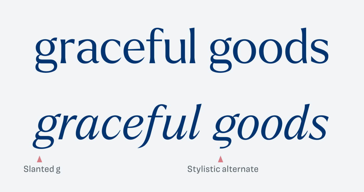
The italics show an interesting design decision as well. Compared to the upright style, all expected letter changes in the italics can be seen – like the single-stroy a, the f with the descender, or the curved bottom serifs – except for one. The g does not change shape, it is slanted. This is surprising and certainly gives it a contemporary twist, which can be a bit softened by using the stylistic alternate.
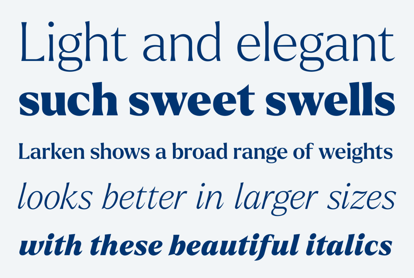
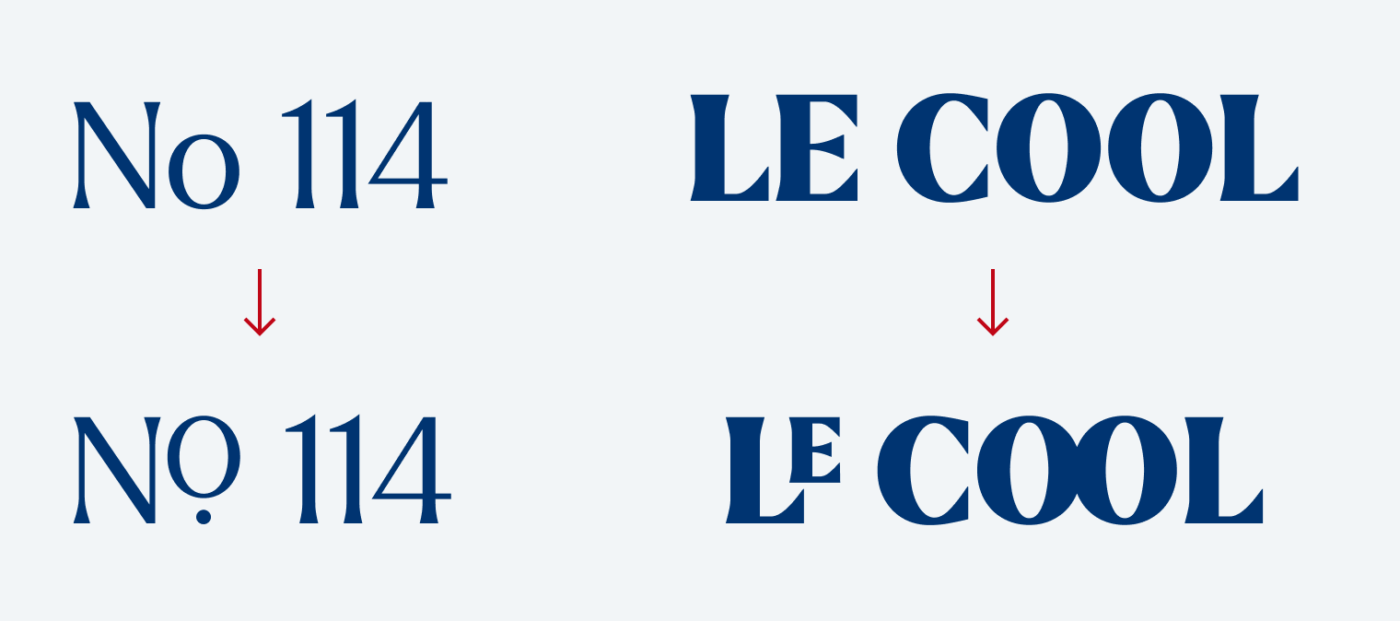
Larken might be okay for a few paragraphs of running text, if you can set it larger than 20 px, but due to the tighter spacing and the stronger contrast it works best in display sizes. You see this also when using the nice rare ligatures, that giving you the ability to spice up certain your headlines or logotypes.
Overall Larken conveys noble simplicity with a sharp, contemporary twist, the bolder it gets. Ideal for expressive statements, that are rooted in confidence and stability, it will deliver on packaging, in logo types and display text.
Font Pairings for Larken
Larken is a quite dynamic, contrasting serif typeface. For body text, you could pair it with clean, quite rational Radio Canada.

- Headings
- Copy


Learn more about pairing typefaces using the Font Matrix.
Thanks to Matt, who recommended this beautiful typeface to me. If you have a suggestion for an upcoming Font Friday, tell me in the comments!
Larken joins my list of fav this year from Font Fri’yay and beyond.
You said it all, elegant, noble…taking our attention without even trying. I call it EFFORTLESS! There is something ancient in the Larken, that owns that dignity and charm.
Too good to sit in the paragraphs. A true art of 6 virtue traits in letterforms. Pointy angles and tender curves – give it a feminine charm. Larken might be good for the publishing industry and for brand products such as fragrances.
Effortless is beautifully put, Jana! Thanks for the addition.
I fell in love with Larken a few years ago. I use it in my own brand design. Once in a while, I fel drawn to a more soft / feminine serif but then again look at Larken and feel: Yeah, it can add such a wonderful strong stance feel in a softer design compared to having a feminine serif in a soft design. I like the contrast it adds without feeling rigid. It feels elegant, flexible yet has a certain strong attitude without being overpowering.
And it also looks good well on your site, I like how you applied the gradients there!
And it also looks good well on your site, I like how you applied the gradients there!