My thoughts on Neue Freigeist
When the first sans-serif typefaces came up in the 1850s, people called them Grotesque. Because back then when everyone was used to seeing serifs, they simply looked bizarre. And these typefaces were not that polished and clean like Helvetica or Futura. The were wild, quirky and quite unusual. Neue Freigeist by René Bieder is picking up exactly that spirit and transforming it in a contemporary, and versatile typeface.

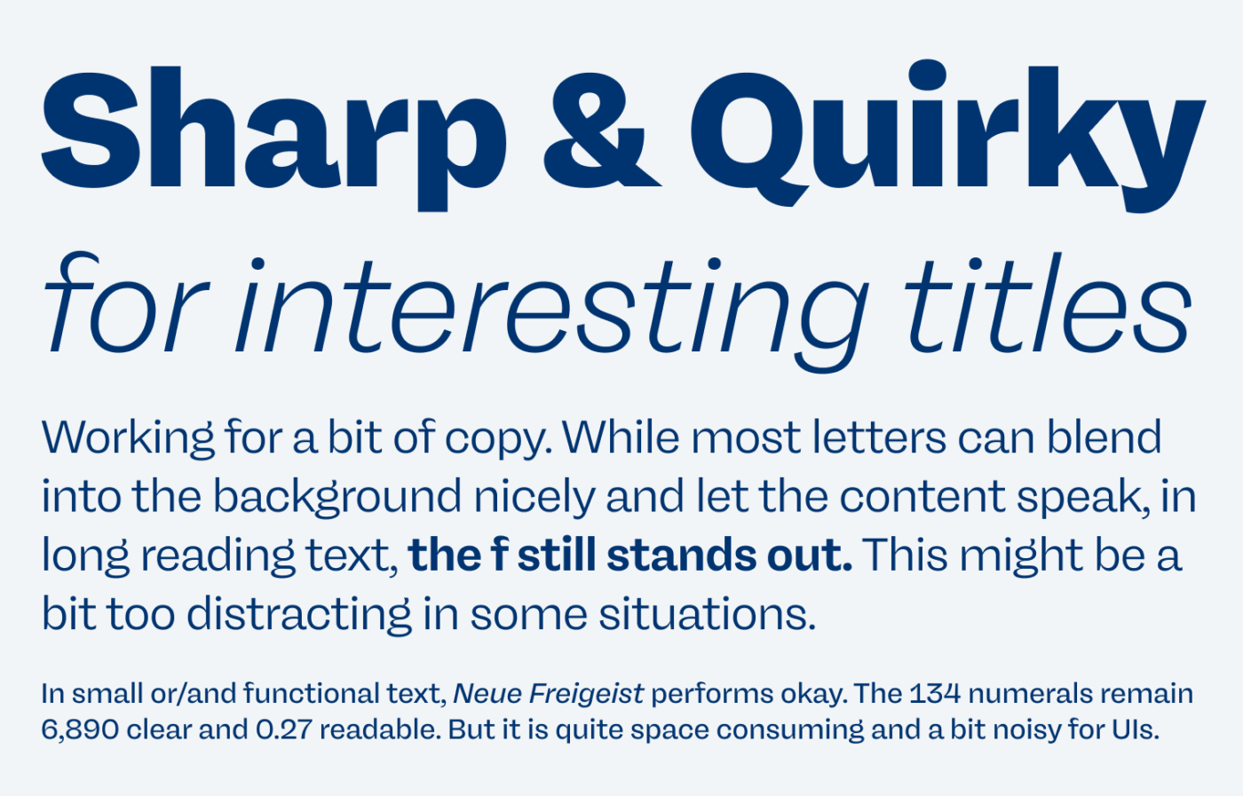
Neue Freigeist simply looks gorgeous in stronger weights and headings. Very determined, clear, and sharp. For body text, it works fine, however, the lower case f stands out a bit too for my taste, which might be too distracting in really text heavy applications. Unfortunately, there is no alternative character provided. But you have to make a decision as a designer, if you want certain features to stand out or to blend it.

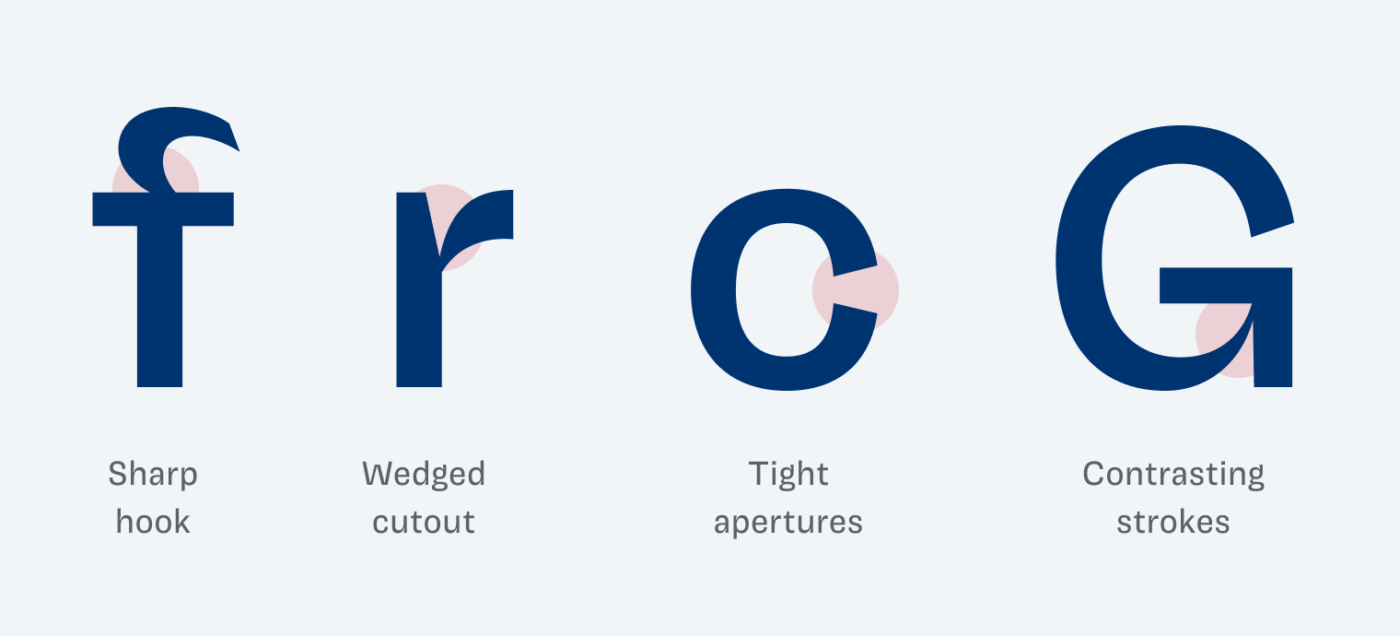
Besides the sharp hook at the lower case f, other features that make Neue Freigeist so special are the wedged cutouts you can see at the r, u, m, n. Also, the very tight, sharp apertures at the c and s, the contrasting strokes at the G and a. They all add this special flavor of subtle weirdness to it.

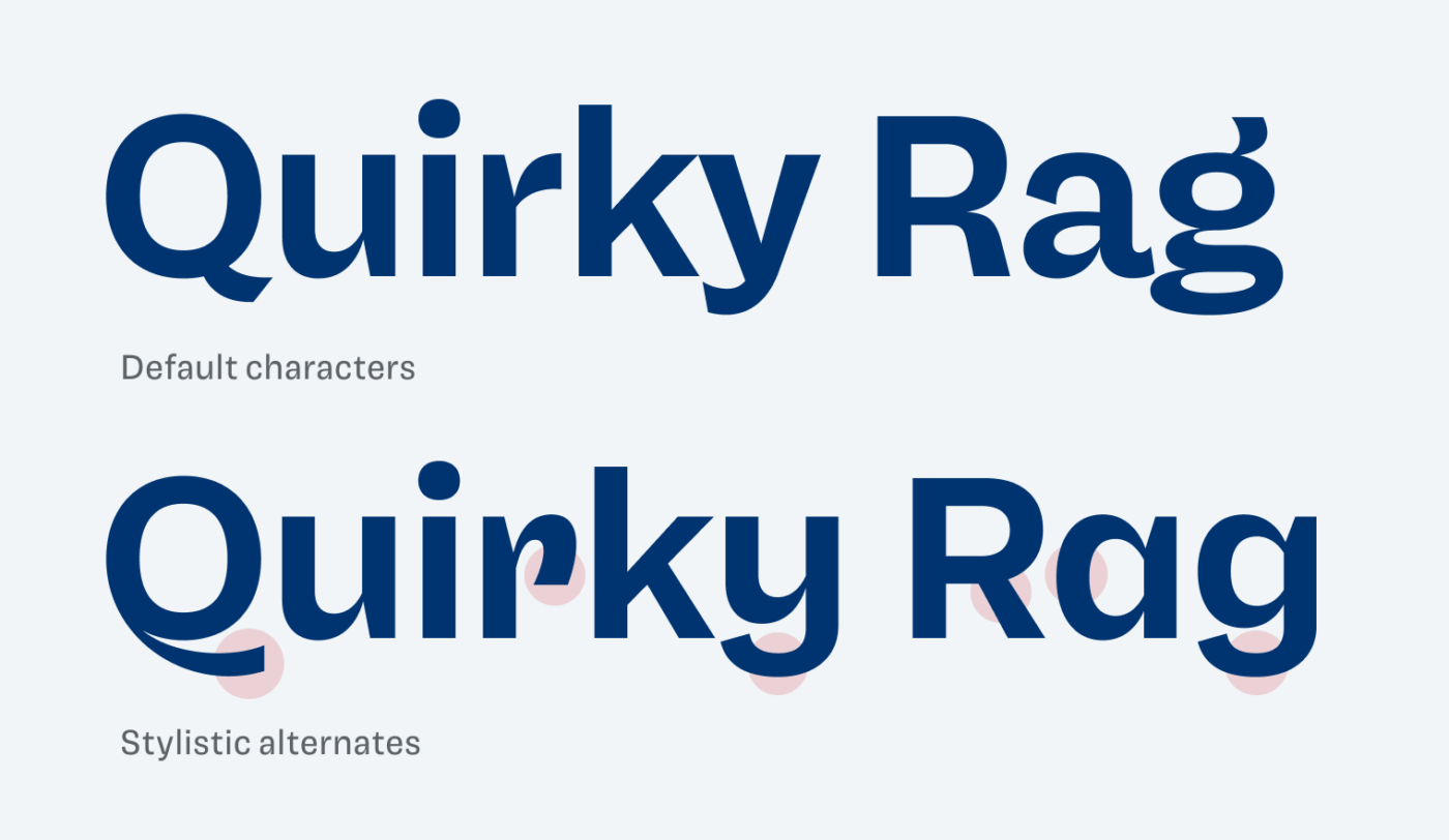
When it comes to stylistic alternates, there are plenty. Some that make the typeface a bit simpler, like the single story a and g, or the diagonal leg of the R. Others that make it more playful, like the tail of the Q, the curved y or the aggressive hook at the r. Play around with these in your headings or titles and discover what works best for the mood of your project.

Recommended Font Pairing
For even more striking headings, pair this font with quite rational contrasting sans-serif Mayenne Sans.
- Headings
- Copy
- UI Text
Learn more about pairing typefaces using the Font Matrix.
Tell me your thoughts in the comments, also if you have an idea for an upcoming Font Friday 😉.


This is my first read of your newsletter. I absolutely love it! It’s supernerdy and insightful 🙂
Yay, Lise! Happy you enjoyed it so far! Always curious about your feedback, so don’t hold back in future editions 😉.