My thoughts on Playpen Sans
This release by TypeTogether makes me so happy, perfectly fitting to its appearance. Playpen Sans is a free font that is believably imitating casual handwriting. It has a warm, friendly vibe to it, brining personality and authenticity to your screen.
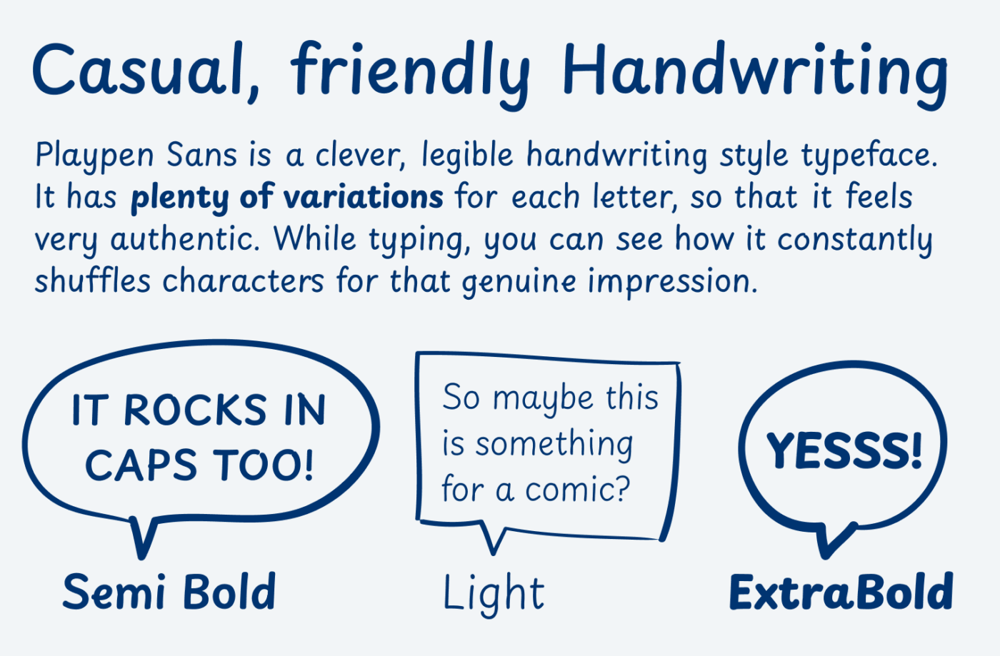
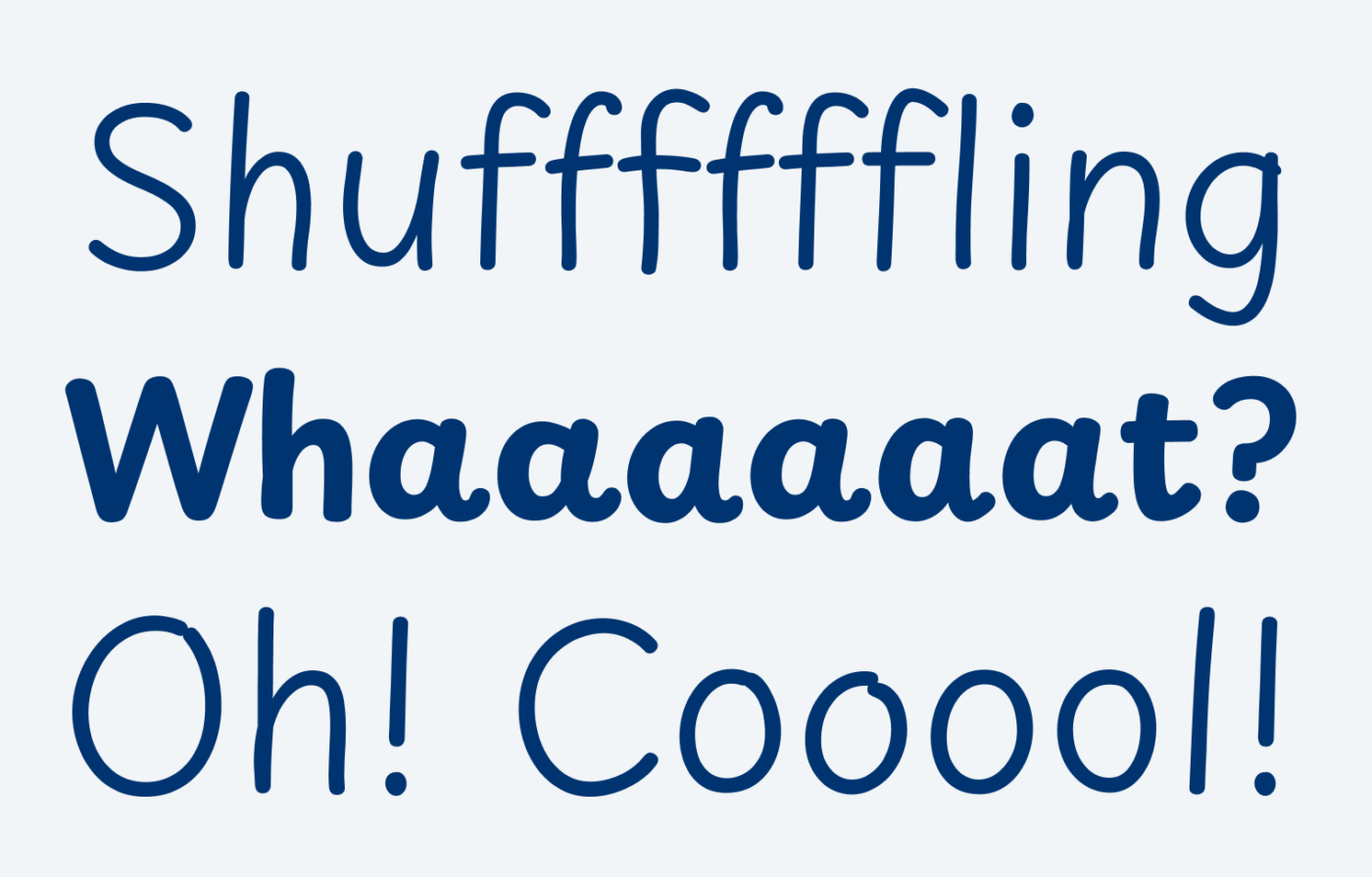
Playpen Sans works so well, because there is a lot going on under the hood. Each character has seven versions with subtle changes. A built-in shuffler ensures that enough variety is created. It all supported by the overall simple design of the typeface, with little striking characters.
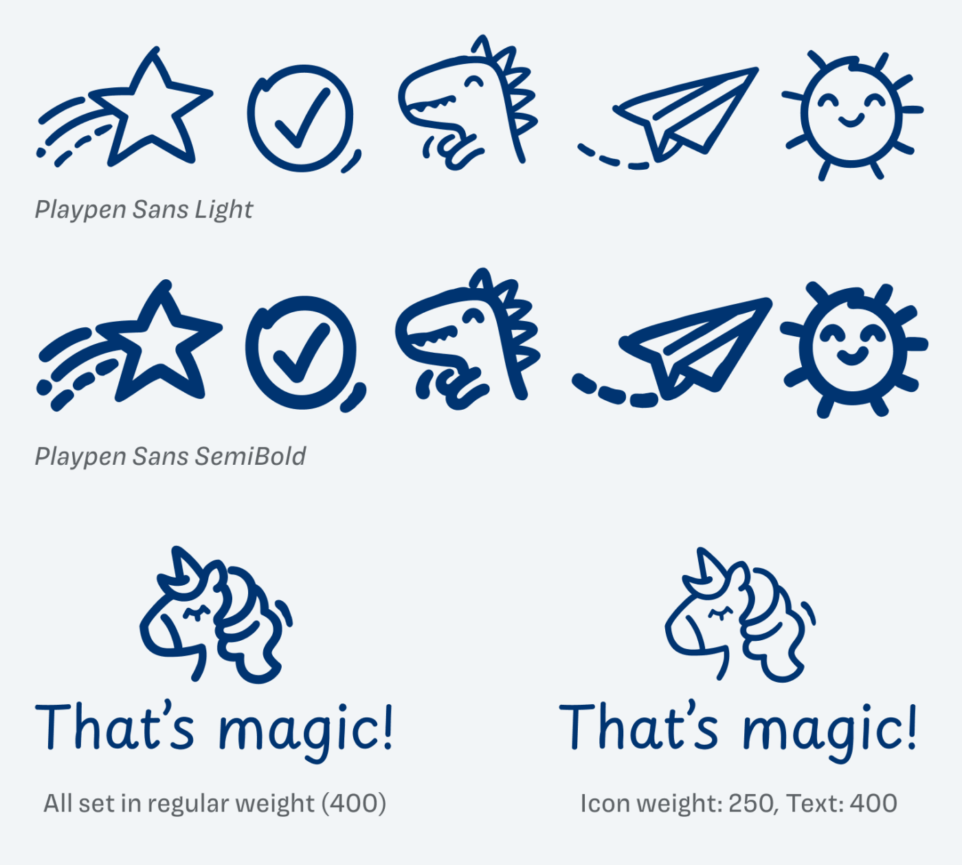
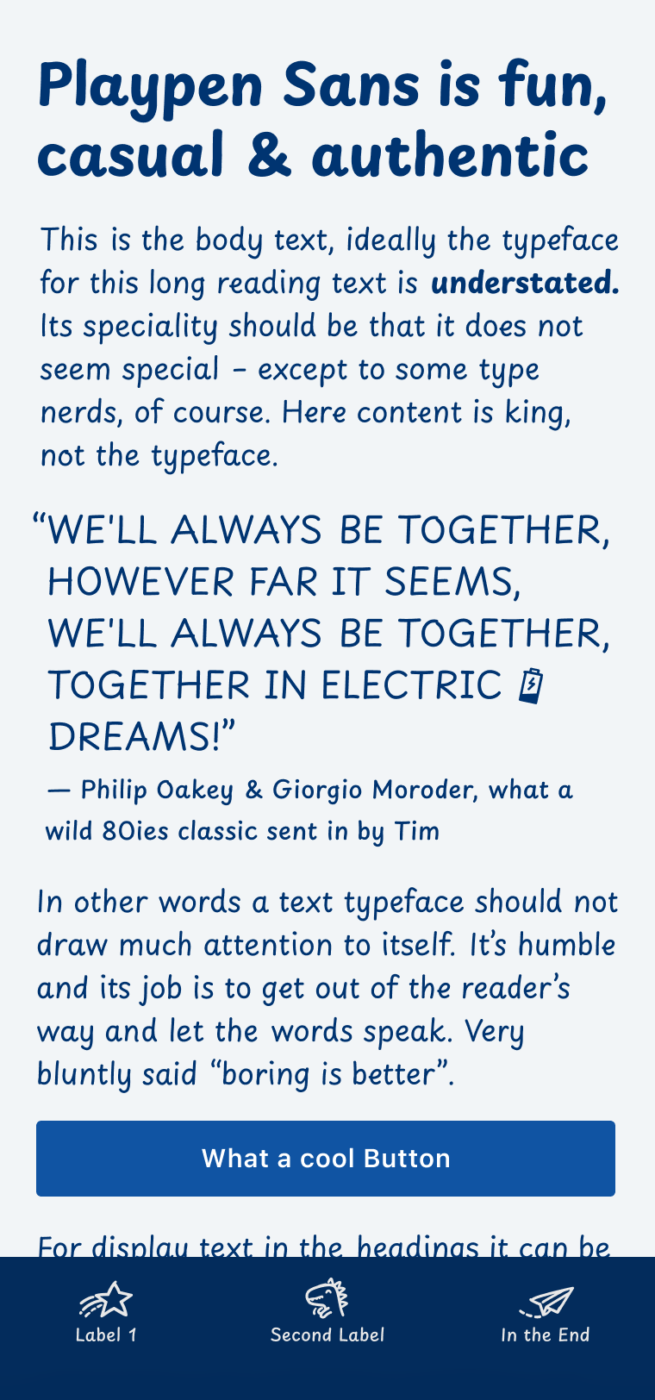
Simply adorable is the small set of icons that is included with Playpen Sans. Since the icons follow the same stroke weight as the text, you can integrate them seamlessly. If you blow them up, make them lighter by manipulating the weight axis. This way it appears as if they were drawn with the same pen, only bigger, like I show below.
The typeface is already quite legible, but you can even enhance it by activating additional settings, which I show to Patrons in the Font Friday Video Digest.
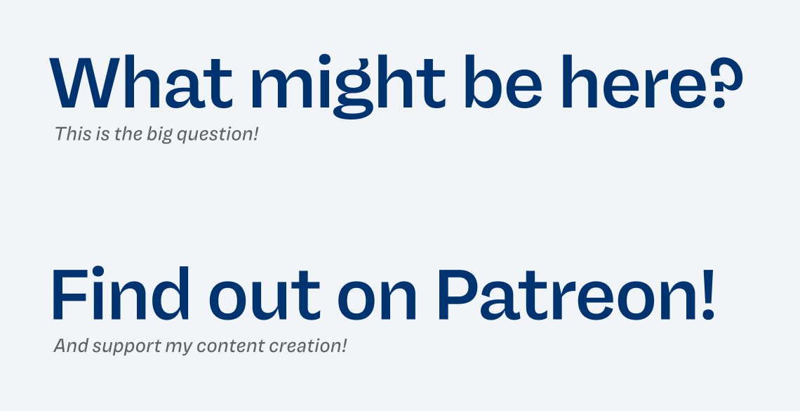
Playpen Sans is ideal for easy going headings, little notes or captions, maybe some UI components even? Also as a more sophisticated and likable alternative to Comic Sans.
Font Pairings for Playpen Sans
For a little text, Playpen Sans works well. But when it comes to longer copy or UI text, you could pair it with something like soft New Zen, clean and round Fixel, or one of the other suggestions.
- Headings
- Copy
- UI Text
Learn more about pairing typefaces using the Font Matrix.
Do you have some ideas where to use Playpen Sans best? Then tell me in the comments below!

Great find, thanks! As with any font in the script/handwriting category, there can’t be enough alternates. I really appreciate that they made so many in this case! At first glance, though, the differences between the alternates seem a little too subtle when the font is set at small sizes. Anyway, I’m looking forward to trying this one out!
That’s a good point, Alex! You’re absolutely right that the variations might be a bit too subtle to be visible in some cases.
Vielleicht möchten Sie mal die folgende Schrift vorstellen
https://dotcolon.net/font/aileron/
Did not know that one! At first glance it looks very nice, but there are some kinks in the bows, looking at the r, n, d, p, q … especially in the light versions they are a bit too irritating. But thanks for the recommendation, Christian!
Comic books, kid’s clothing brands, all kiddy birthday greetings, maybe some ‘healthy’ modern foodstuff – plant milks and similar.
This one is a surprise, Oliver, especially since it’s free🙌🏻
Sun icon – hilarious, the name ROCKs PlayPen ⭐
Yes, yes and yes, Jana! The icons are so cool ☀️😎!
As always great finding. Loved the legibility with playful vibe. BTW did you checked Fredeko?
Thank you, Mubin! And no, I did not check out Fedeko! Nice one, not super sure about some things, I’ll add it to the queue for fall and will find out what details bother me here 😉.
New Arabic, Devanagari, Hebrew, and Thai versions just dropped! Have you checked them out on Google Fonts?
Thanks for the info! Just updated it 😊.