
My thoughts on Aldgate
This is such a vast and versatile superfamily, that I have problems wrapping my head around it. It covers an enormous range of weights, widths, in upright and italic, represented in Aldgate Sans and Aldgate Serif, manifested in four variable font or 252 static font files 🤯.

Aldgate Sans originates from these very distinct British humanist sans-serif typeface, like famous Gill Sans. Similarly, it comes with a friendly and warm spirit, but compared to the sans-serifs from the early 1900s, Aldgate is more refined and made for modern use-cases. The typeface is interesting enough for headings, especially in the wider styles, but calm enough to carry on … with body text or even UIs.
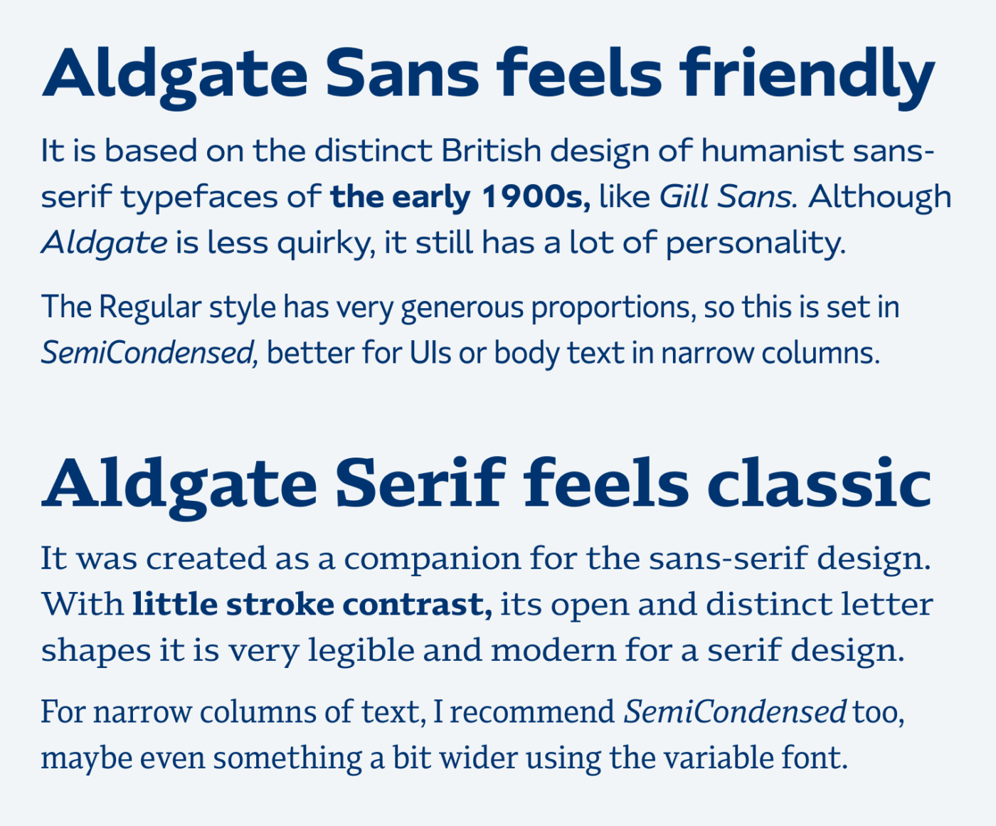
Aldgate Serif was made as a companion for the sans-serif design. Due to the serifs, it immediately feels more classic. But it has a very contemporary touch to it, given the slight contrast and open letter shapes. To me, the normal width feels a bit too wide for body text, but then again SemiCondensed (width: 85) seems quite narrow. Use the variable font to adjust the width to something like 90 or 95, or use it in wider columns.
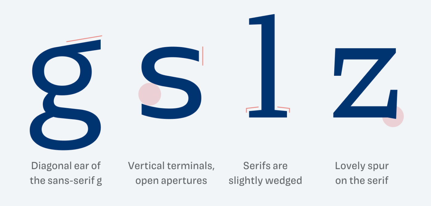
My favorite character of Aldgate Sans is the lower case g with that diagonal ear that wonderfully blends into the bowl. Some delightful details of Aldgate Serif are the slightly wedged serifs or these lovely, tiny spurs you can find at characters like the upper case S and lower case z. So overall these very distinct characters, the interesting construction, vast design space in the variable font make Aldgate a great choice for plenty of use-cases.
Font Pairings for Aldgate
Firstly pair Aldgate Sans with … Aldgate Serif! But you would have come up with that yourself, right? So if you want something more contrasting and eccentric for headings, try something very different, like June Expt Curious or PF SignSkript.

- Headings
- Copy
- UI Text


Learn more about pairing typefaces using the Font Matrix.
What do you think of Aldgate? Is your head spinning from so many styles? Tell me in the comments below!
What’s not to love about lowercase g? This is a rare font that I can finally say yes to distinctive S!
When I see ‘generous proportions’ I immediately think of Montserrat which makes me cringe 😬
So, Semicondensed everything, here at Aldgate! It feels so confident and compact in that style, Oliver. These practical options are welcome 🙌🏻
P.S. Thanks for reminding us about good old Gill Sans.
SemiCondensed everything 😂. Yes, to me it is also a bit too wide.