
My thoughts on Fixel
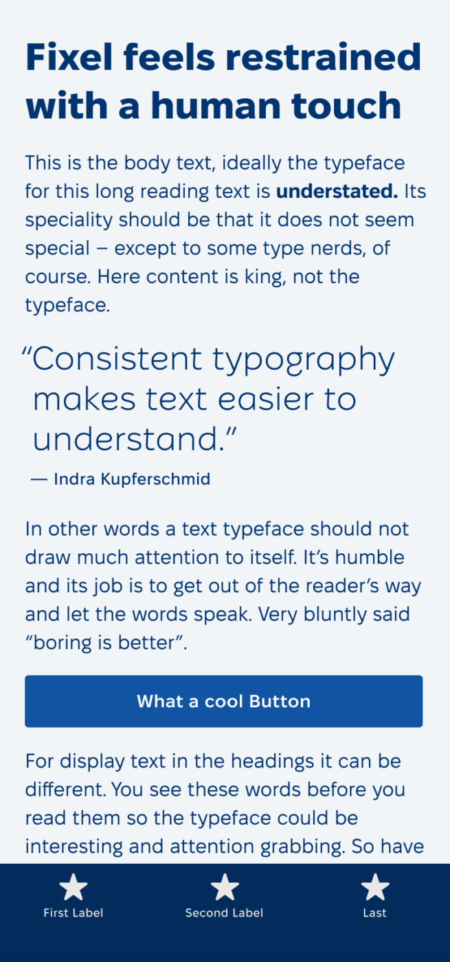
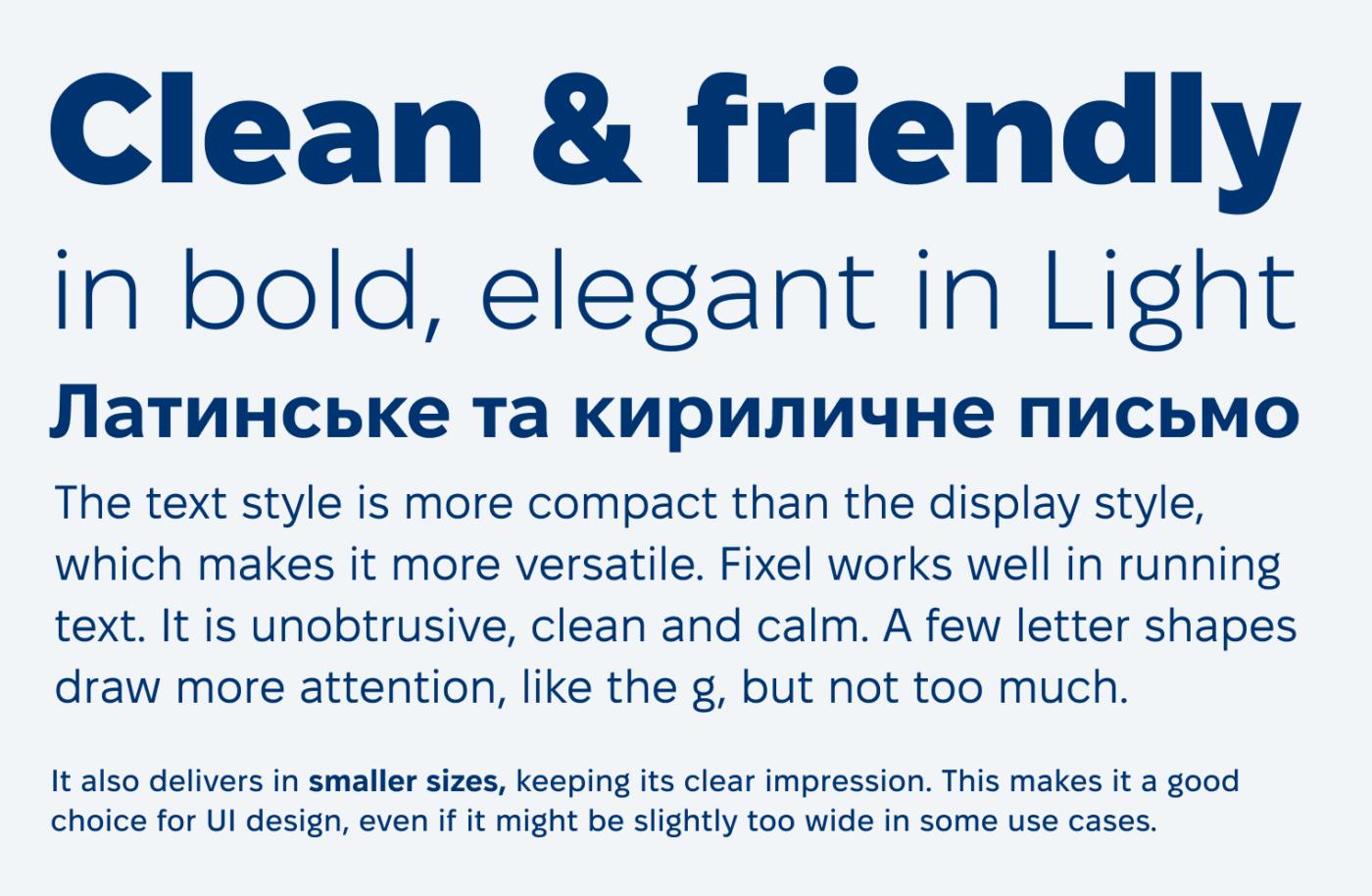
The free sans-serif typeface Fixel lives between styles and is quite adaptable. It has very even strokes, is clean and unobtrusive, in a sense neutral but never boring or cold.
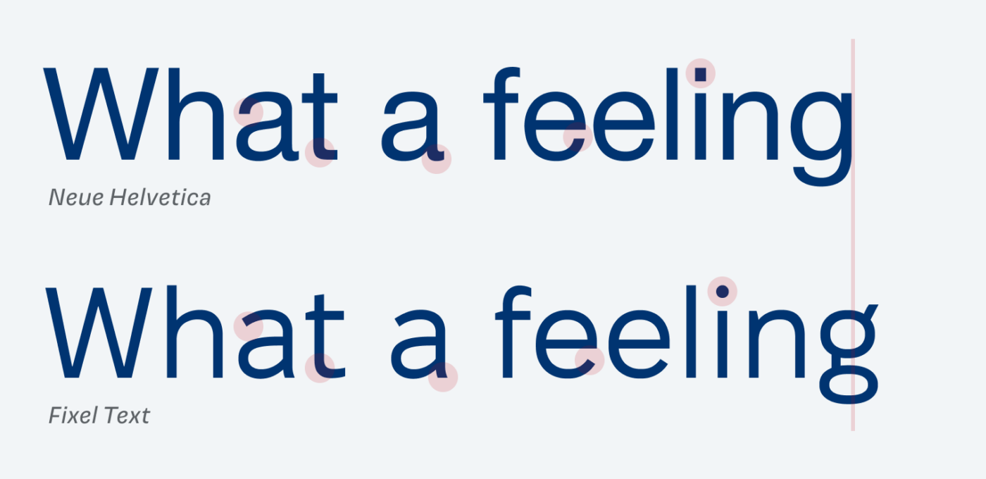
It claims to be a “grotesque with a human touch”, but what does this actually mean? When comparing it to popular grotesque typefaces like Helvetica, you can see that letters are more open. Everything is a bit more rounded, the curves are softer. The spacing and proportions are a bit wider too, giving Fixel even a slight geometric touch, confirmed by the almost circular o and e.
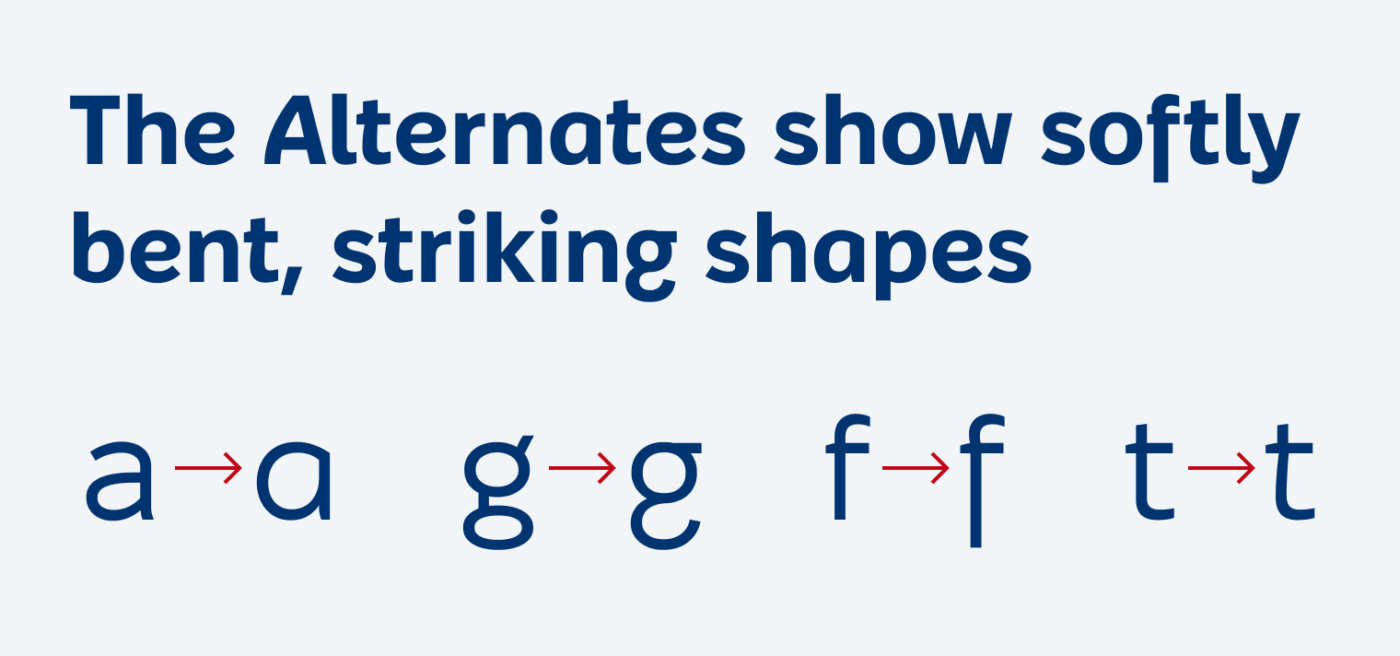
One highlight of this typeface are the stylistic alternates, which move Fixel into a totally different direction. With the single-story a, the f with a descender, and the playfully bent stem of the t, it almost looks like an upright italic. Does this remind you of a strict version of Bree, too? This makes the alternates a welcomed addition for attention grabbing display text.
Overall, Fixel is a smart choice for copy, UI design, and bold headlines as well. It is available in Latin and Cyrillic script and was made for the software company MacPaw, which also created the beautiful microsite showing all of Fixel’s features.
Thanks to Ashley for recommending Fixel, I also spotted it on the brilliant tools.design newsletter. If you have a suggestion for an upcoming Font Friday 😉.
I must thank you for this font! For a very long time, I’ve been looking for a clever mix of modernity of geometric fonts and the readability of grotesques—and I think Fixel nails this!
It’s playful enough to serve as a great headings font with the boring but legible Roboto Serif for body font, yet not overly quirky so I can use it for functional text. I always set the width axis to 70, though, because it’s too wide otherwise.
Happy you like it, Matic! And it’s a wise decision to make your headings a bit narrower, especially for mobile ☺️.