My thoughts on New Zen
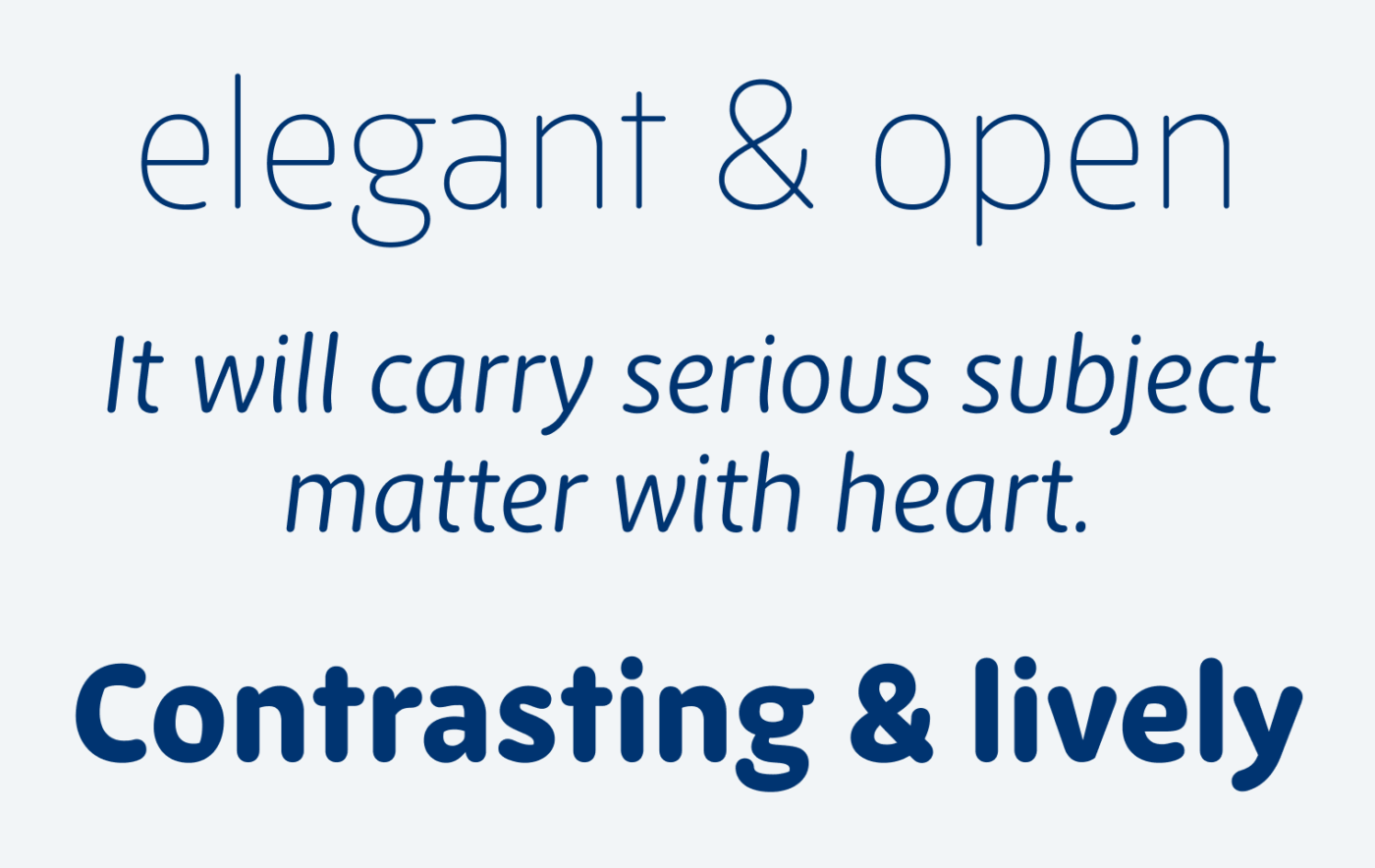
I became aware of the foundry Newly, when Miles Newlyn commented on one of my FontFriday recommendations. That’s when I discovered their beautiful catalogue that’s covering several typographic styles, executed with precision and heart. New Zen stood out to me for its approachability, friendliness and warmth. This sans-serif has a rounded terminal, elegant proportions, and open shapes. In the light and regular weights, the stroke seems even. The bolder it gets, the more contrast is introduced. It becomes livelier, showing some tradition calligraphic stress while remaining its friendly blobbiness.

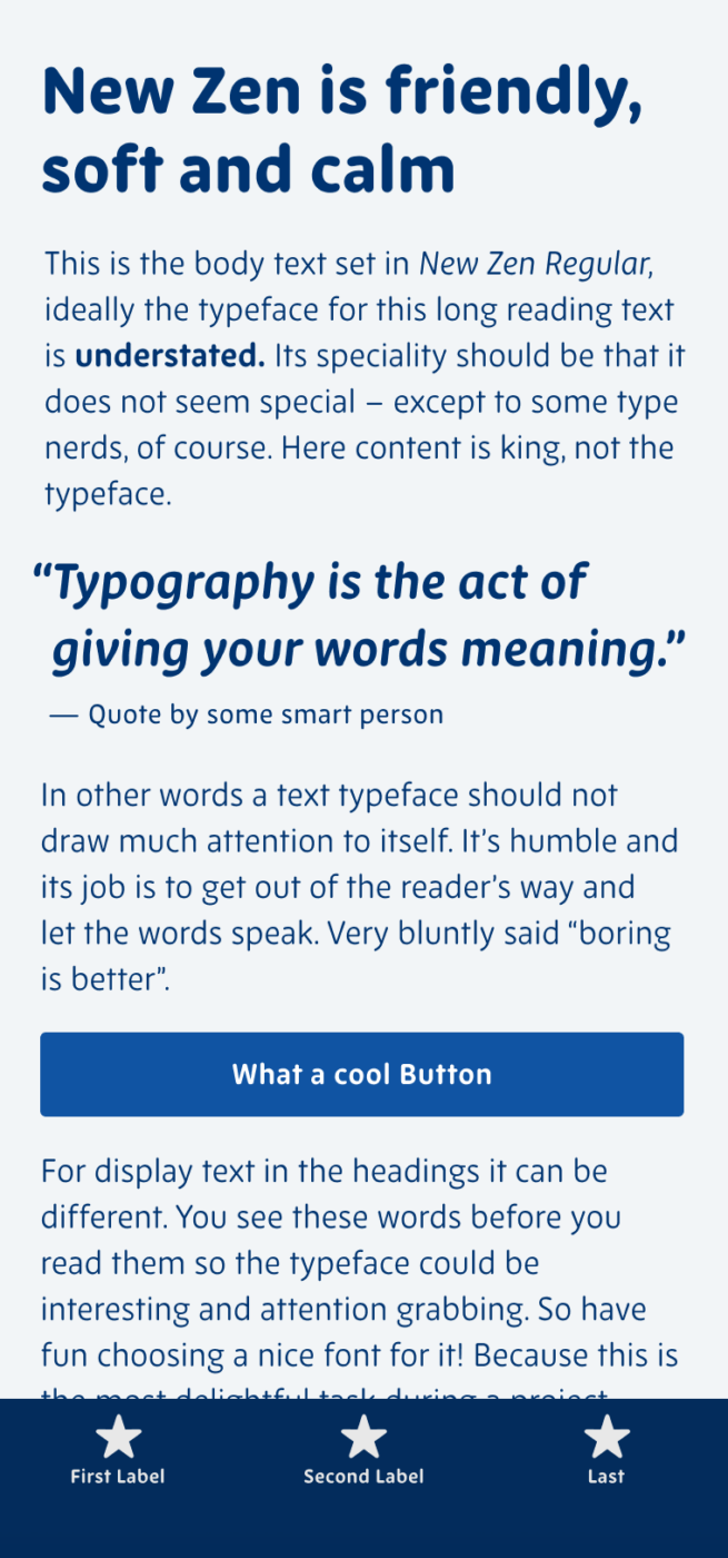
This all makes New Zen ideal for headings, body text, but functional text as well. I can definitely imagine it giving a user interface or app that certain touch of humanness and comfort. You can activate it via Adobe Fonts for free, licensing is rather affordable, but requires annual payment for web and app usage.
Recommended Font Pairing
Looking for a playful, sensual companion for New Zen? Choose upright italic Sansita. Or the charming script typeface Courgette.
- Headings
- Copy
- UI Text
Learn more about pairing typefaces using the Font Matrix.
What do you think? Is New Zen something for an upcoming project? Tell me in the comments below!


Regular version: Look at that smilin’ hEart, E. It’s effortless, it feels trustworthy. Dancing I, legs are in the waltz flow.
Light version: we have an emotional couple G and A, perfect chemistry! Even it’s light, it feels more grown-up and I love when T is straight, without curves.
But I’m more prone to a regular version. It’s versatile and applicable. It feels reliant buddy. Friendly. The only thing which doesn’t go is naming. Pardon my professional distortion.🤔 I’m all about identity naming, taglines, creative wording. This one is not total zen. Yes, it owns tranquility, but not so calmness.
I wish if people who create typefaces consult other professionals from a creative field to sense their work of art. They’re not subjective, will provide a user’s perception, and come up with a creative+strategic naming.
But New Zen is Bookmarked in Jana’s house😊
Thank you, Oliver, for always interesting Newsletter delivery!! ✨
“Look at that smilin’ hEart, E. It’s effortless, it feels trustworthy. Dancing I, legs are in the waltz flow.” Brilliant, Jana! Yeah, the name is ab bit misguiding, since I would not associate with Zen or what I think Zen is, either.