Sans-serif typeface

from TypeMates
designed by Daniel Utz

Variable Font

2 axes: Weight, Slant

15 Styles

5 weights: from Thin to Black
Icons in all weights
with matching italics

Best for

  • Headings (display text)
  • Long reading text (body text)
  • User Interfaces (functional text)

License starting

below $50 (one style)
below $200 (bundle)

Specialty

A simplistic, geometric sans-serif typeface bringing joy to web, UI and app design thanks to a well-equipped icon set.

My thoughts on Netto

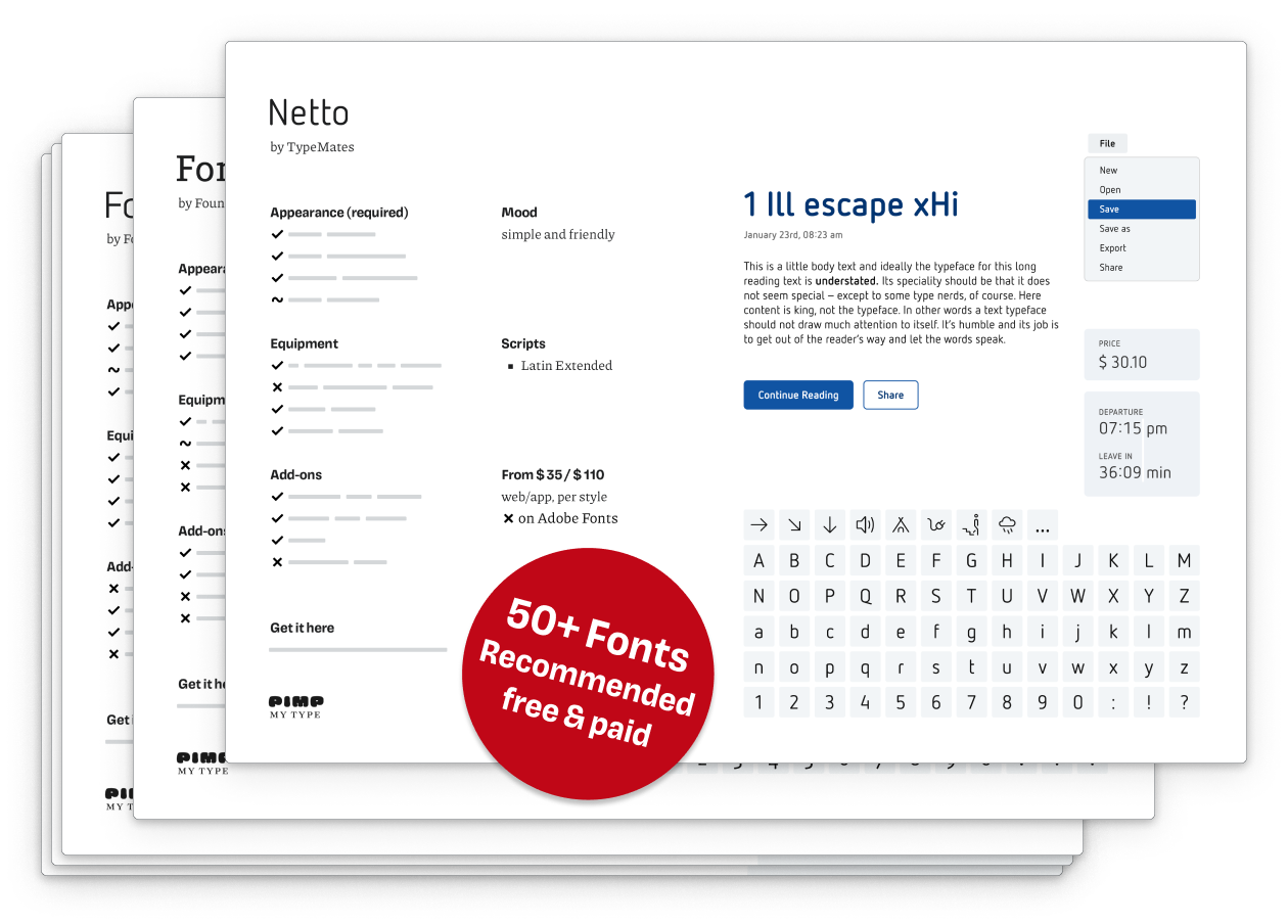
Celebrating the launch of the UI Fonts Checklist, I wanted to feature this quite unique typeface made for user interface and app design. Netto is a narrow, simplistic sans-serif, that makes an impression as if it was drawn by a robot. A friendly, playful, TypeMates-robot 😉. I love the minimalistic and yet warm style, looking at the icons, especially this adorable elephant. Besides common symbols for interfaces, more than 400 icons cover topics like nature, food and way finding.

A few of Netto’s icons in Thin, Light, Regular, Bold, Black weight
Very cool – Netto’s icons come in varying weights so they always match the text.

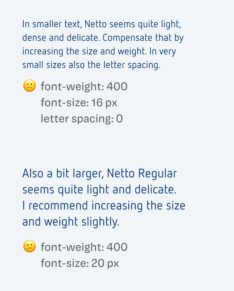
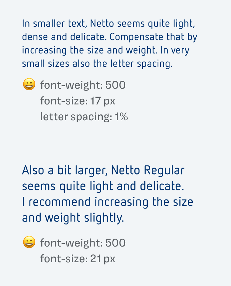
For very text heavy applications, Netto is not ideal, because of the narrow proportions and quite light strokes. This also could be problematic in smaller text. But since typography is about what you make of a typeface, you should compensate for that. I recommend setting it a slightly larger, and making it stronger. Unfortunately there are no separate Medium or Semi Bold weights available. So you will have to get the variable font and adjust the weight axis.

font-weight: 400
font-size: 16 px
letter spacing: 0
In smaller text, Netto seems quite light, dense and delicate. Compensate that by increasing the size and weight. In very small sizes also the letter spacing.

font-weight: 400
font-size: 20 px
Also a bit larger, Netto Regular seems quite light and delicate.
I recommend increasing the size and weight slightly.
Netto Regular seems a bit too fine …
font-weight: 500
font-size: 17 px
letter spacing: 1%
In smaller text, Netto seems quite light, dense and delicate. Compensate that by increasing the size and weight. In very small sizes also the letter spacing.

font-weight: 500
font-size: 21 px
Also a bit larger, Netto Regular seems quite light and delicate.
I recommend increasing the size and weight slightly.
… so set it slightly larger and stronger.

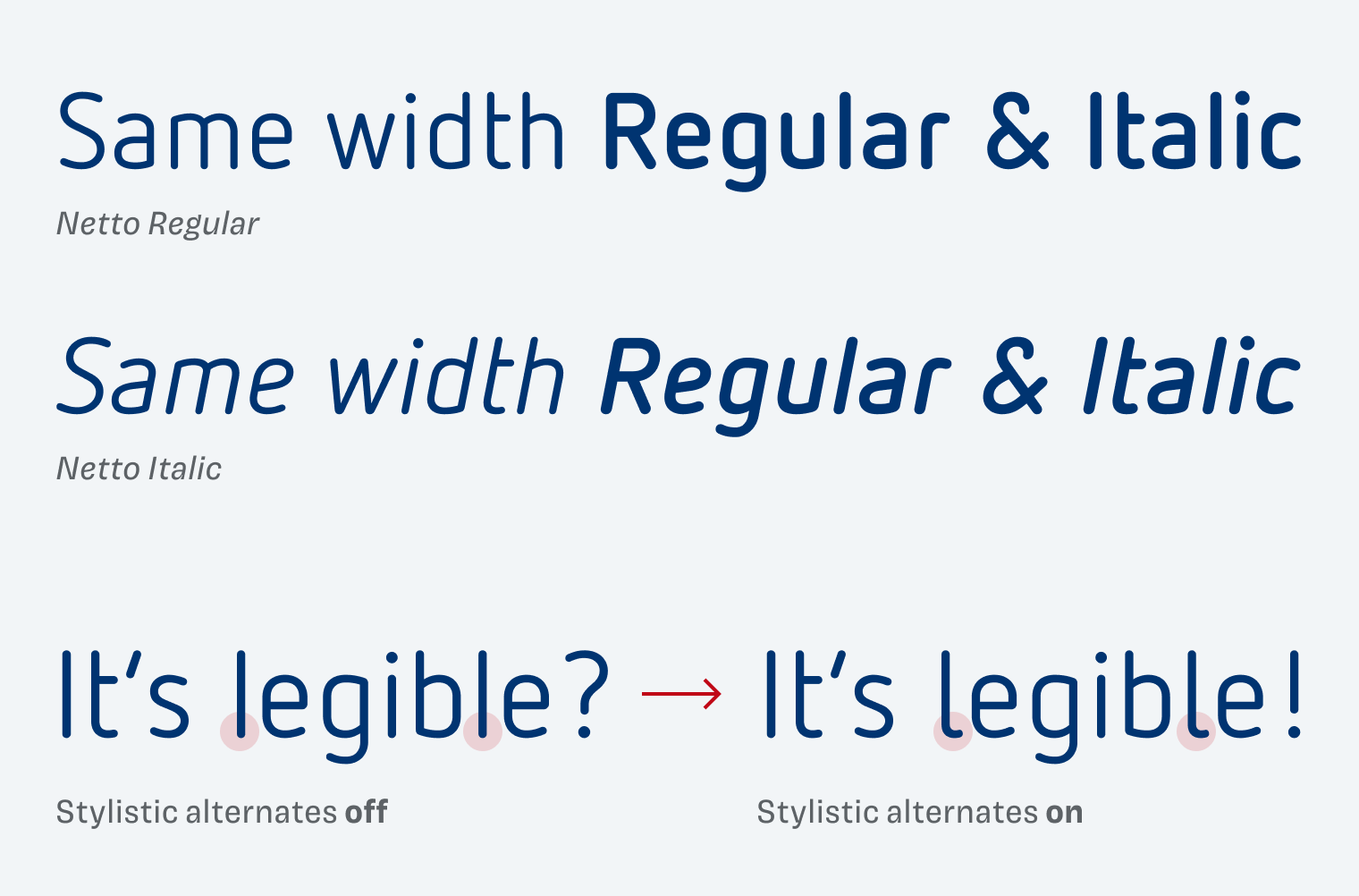
Two more things show how Netto is tailored towards UIs. First, the italics have the same with as the upright styles. This means you could use italics as hover style without unpleasant text reflow. Second, you can use an alternate l to enhance legibility.

Netto Regular and Italic have the same width 
It's legible? - It's legible!
Stylistic alternates make add a curve to the small l to make it more legible.
Regular and Italic have the same with, enhance legibility by activating stylistic alternates.

Netto is also part of the UI Font Recommendations that come with the UI Fonts Checklist. Easily compare it with more than 50 fonts to and find the ideal font for your next project.


What do you think of this week’s typeface? Write it in the comments! Also, if you have a suggestion for an upcoming Font Friday 😉.

Typographic power to your inbox

  • Font Friday: I recommend one typeface per week, free fonts included.
  • Type Tuesdays: articles & videos that up your design game.
  • Join 2500+ typography enthusiasts, unsubscribe anytime.

Edition #119, published

Leave a Reply

Your email address will not be published. Required fields are marked *