My thoughts on Newsreader
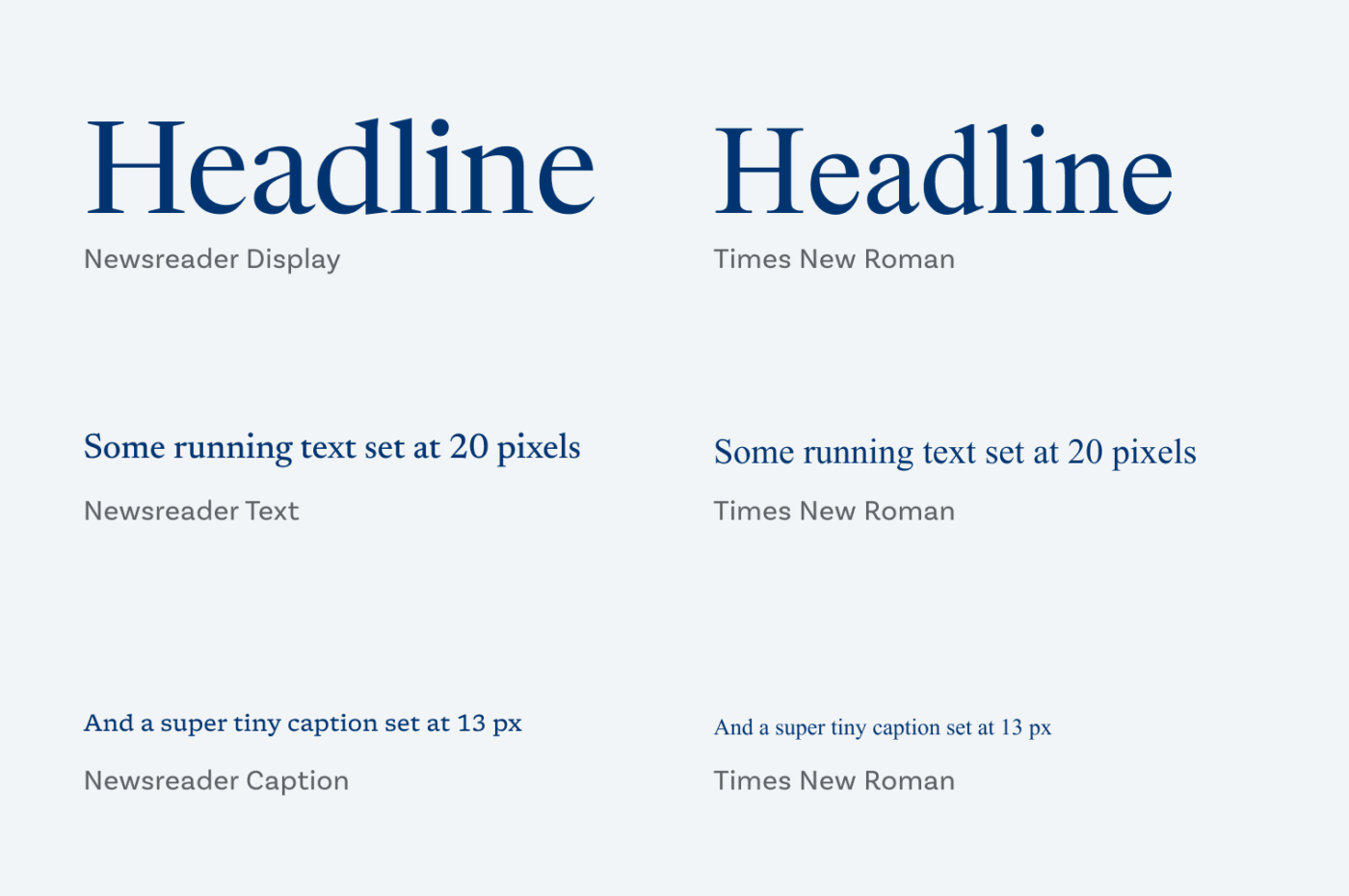
Times New Roman is so boring, being one of the most widespread typefaces. But besides that, it was made for the age of print back in 1931, commissioned for the British newspaper – surprise, surprise – The Times. For today’s reality where we consume content digitally in varying type sizes, Times New Roman is too delicate and this is where Newsreader comes into play.

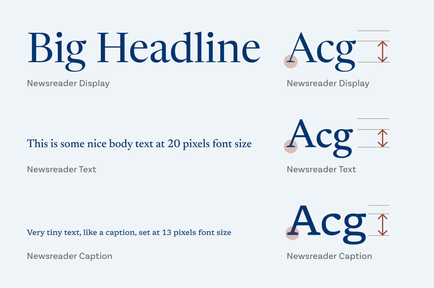
Newsreader is a free open-source serif typeface commissioned by Google Fonts, and designed for on-screen, longer-form reading. Like Times New Roman it belongs to the category of transitional old-style serifs (if you really wanna know), but with sturdier strokes, more open shapes, and equipped with the superpower optical sizes! The static fonts come in certain styles for display sizes (24 px and above), text sizes (between 16 and 24 px), and captions (everything below). Why is that cool? Take a look a Times New Roman above. It looks quite okay set in a large headline. But when used for running text on a screen, it gets fuzzy, not speaking of tiny functional text where it almost disappears.

I already touched on the topic of optical sizing with Piazzolla, but here it’s much more obvious. In display sizes, Newsreader is more elegant with delicate and contrasting strokes, and a larger x-height. In the text sizes the x-height gets lower, and the strokes have less contrast. In the smallest sizes, the letters get wider, even the spacing becomes looser. This guarantees, that Newsreader remains readable in tiny functional text (but since we are not used to seeing serifs there, I would not full-heartedly recommend it). So next time you want to pick Times New Roman, don’t. Choose Newsreader instead. It is made for the digital age, and it also has an insanely beautiful italics.
Recommended Font Pairing
If you want a more modern first impression, pair Newsreader with Muller Next for headings. For user interfaces, Pangea, or the free font Palanquin could a great option.
- Headings
- Copy
- UI Text
Learn more about pairing typefaces using the Font Matrix.
What do you think? Is Newsreader something for an upcoming project? Tell me in the comments below!


Really beautiful font! It seems more contemporary and gentle. Sometimes I feel that Times New Roman is too sharp and harsh depending on the content.
Exactly, Caco! You put it beautifully into words!
I teach typography on screen and this is a great example of a typeface made for readability on the web. I am curious though: does the x-height get smaller for text sizes so that the up and downs are more pronounced, this making it easier to scan?
Thanks for this great example!
Great question, Anselm! I have the feeling, that in the text size the x-height and the letter shapes scale down. It might be to save on space for long reading text to make it more compact. But I’m curious how Hugues Gentile, the designer, thinks about that. I’ll ping him on Twitter!
It’s exactly that, a more balanced ratio between x-height and ascenders/descenders is said to help readability for text sizes.
I am not sure if it has more to do with what we are used to or if there is scientific background to it but in case of Newsreader, vertical proportions were carefully tailored for the intended sizes.
Finally a well-designed, proper swap for an honored Times. It’s lyrical, a good classic we need in this sameness world of the sans. I know many copywriters who would love it and I’ll be definitely using it for my clients.
Between the three, display, text, and caption, I choose text. The display feels blocky, too much white space in n, d and look at that e, poor little head 🤔 Doesn’t look intelligent. You all already commented on the x-height. I see it as a white space 😆But Display Italic is prestigious! While Caption has the most character.
Yes, the display italics truly are prestigious 😍! Wonderfully put!
Thanks I’m really glad I found this font! Actually, I got here from your tutorial on how you helped Facilitator School, to ApfelGrotezk (also a great font), to Newsreader.
Question: would you say that Figtree is a viable less quirky alternative? I want to use Newsreader for blog copy, and Figtree for headings. But I also need one for menus, tools, and such, and I don’t really like ApfelGrotezk for that.
Happy you like it and thanks for your question, Matic!
What you suggest makes perfect sense! Figtree for headings and UI text, Newsreader for body text. Both are very different typeface, so it would be a contrasting combination. Go for it!