My thoughts on Campuni
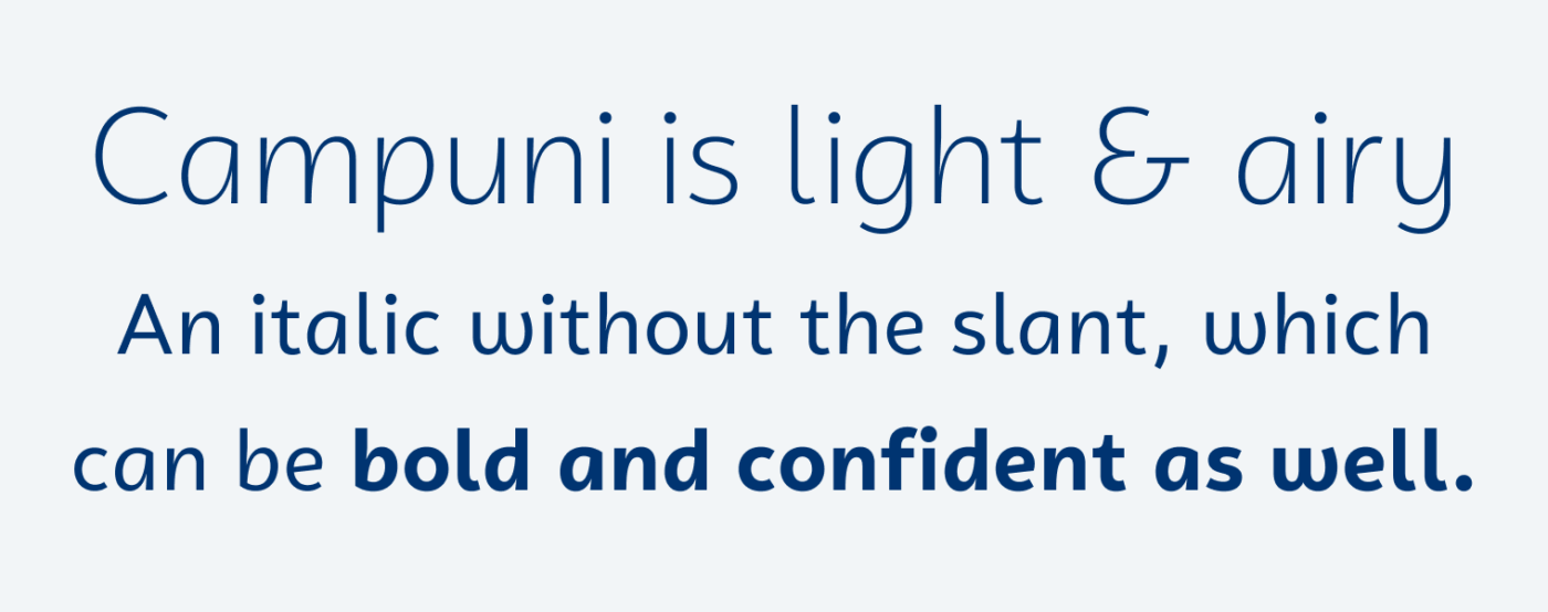
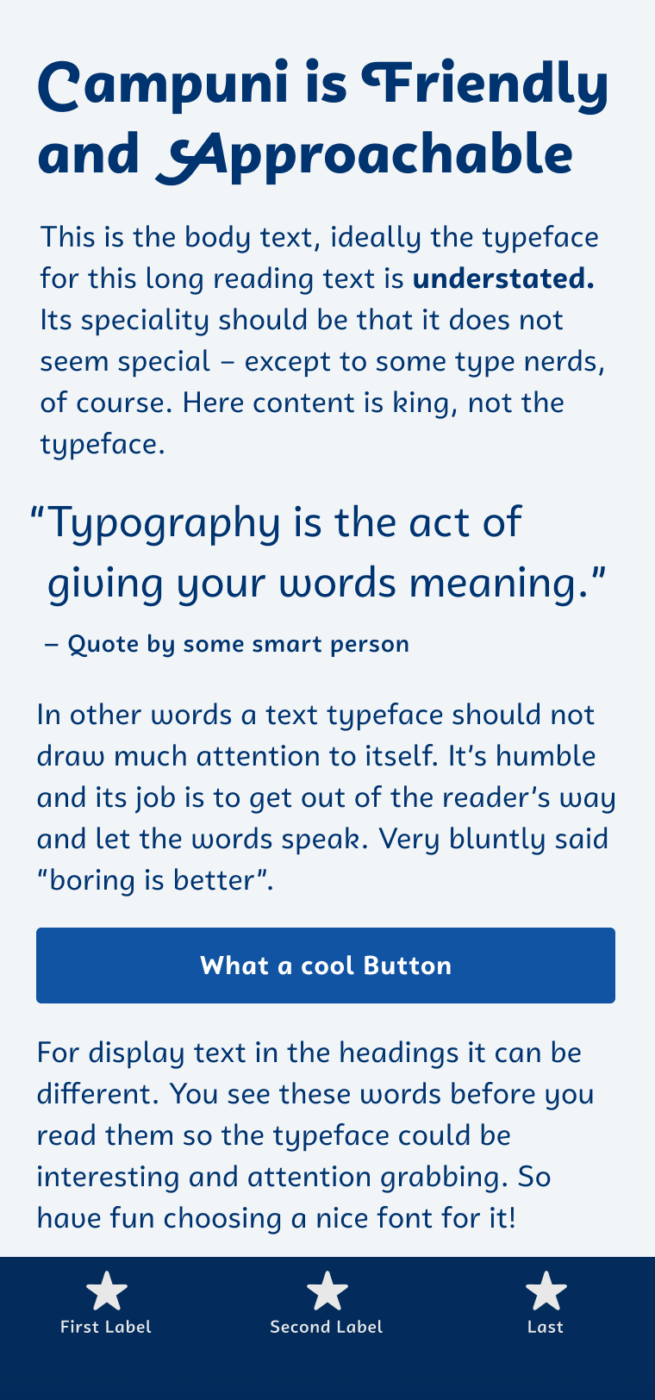
I treasure a sans-serif that is low contrast and simple, but at the same time approachable and friendly. Campuni by the German foundry Identity Letters is exactly that. It is a so-called “upright italic”, which means the letter shapes origin from handwriting, but they are not slanted. This is what lets Campuni seem so warm and friendly and makes it a great choice for an appealing UI or app design that’s in need of a human touch. Display text and even some amount of reading text will work with this gem as well. For longer reading text though, Campuni it’s too eye-catching, so I would pick an alternative for that.

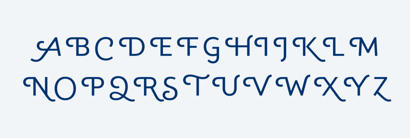
There are two things I want to highlight. Firstly, Campuni comes with very cool swashed characters you can activate via OpenType features. This gives you the opportunity to spice up your headings, like I did. Secondly, I appreciate the affordable and easy to understand licensing options, starting with the “Studio License” that already contains desktop and web fonts. I really like how Identity Letters sees their fonts across platforms by default.

Recommended Font Pairing
Looking for an interesting match for playful headings? Pick striking Larrikin.
- Headings
- Copy
- UI Text
Learn more about pairing typefaces using the Font Matrix.
What do you think? Is Campuni something for an upcoming project? Tell me in the comments below!


This font indeed has a personality… I like the mix of old versus modern styles. Great!
Like you say, it’s very easy on the eye but keeps a slightly classic edge. It’s very unassuming which is definitely part of its charm. Thank you for introducing us!
Sure thing, Sarah! Glad you enjoy it! 😉