My thoughts on Whirly Birdie
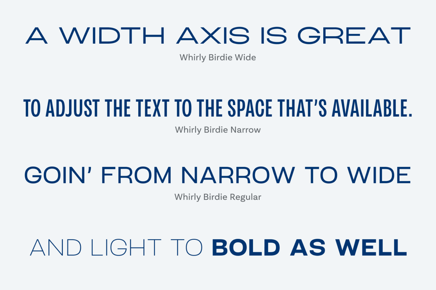
Whirly Birdie by Alex Tomlinson is an all caps display typeface inspired by American advertising of the 50s, and presented on a gorgeous minisite. The letter shapes come across a bit clunky, even goofy, but they have character. The curves are easy, far from polished, and there lies Whilry Birdie’s charm. As a display typeface it’s mostly suited for short large text. So don’t bother adjusting the spacing, go with the flow and have some fun. It’s not there to be taken too seriously.

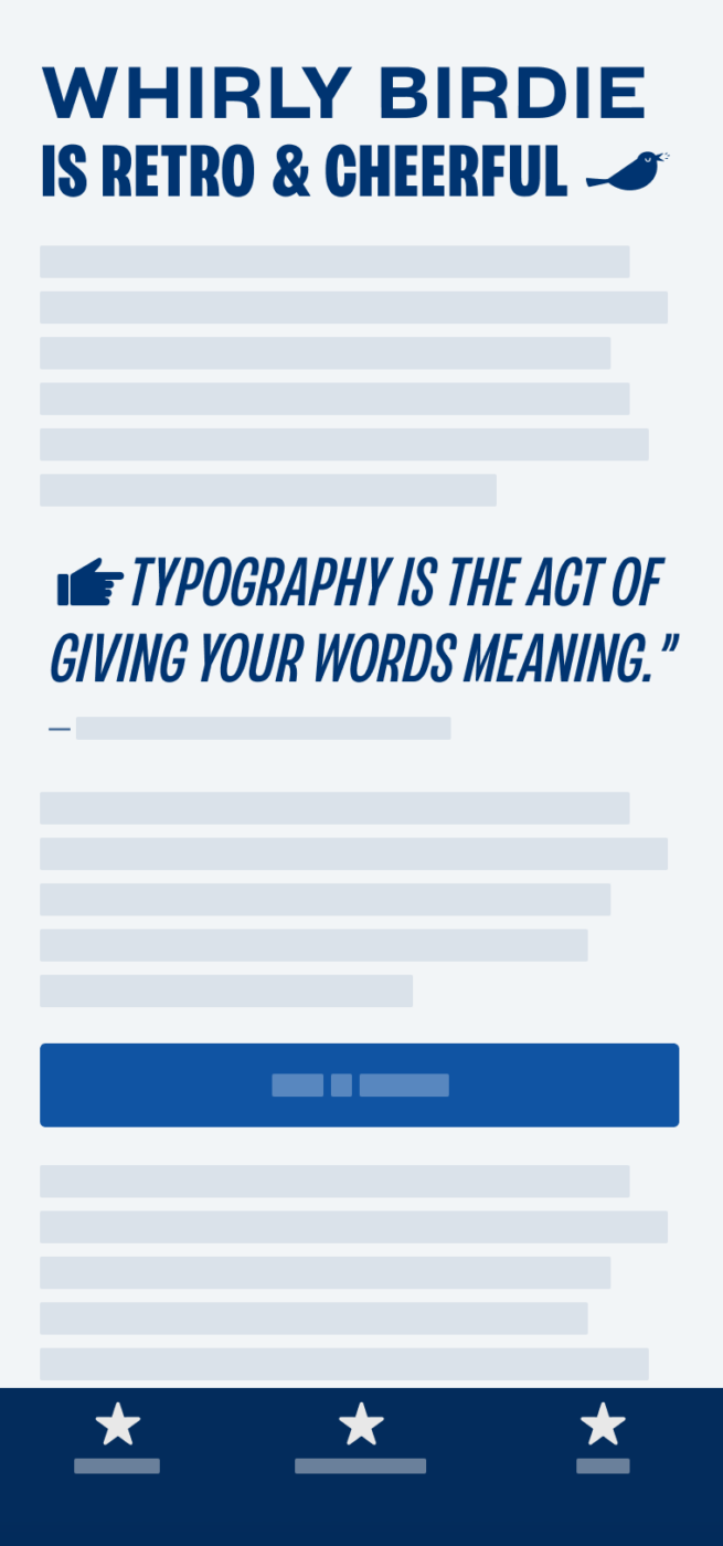
As a variable font, the typeface is equipped with a weight, an italic, and a width axis. I like the possibilities that come with the width axis the most! For mobile design, it enables me to make the headings narrower and save space, while on a desktop a screen, I can make them wider.

I want to highlight the accompanying dingbat font Whirlybats that comes with over 200+ symbols. The twist is, that it uses the variable font axis to animate the different icons. This is so clever, charming, simply brilliant! This makes Whirly Birdie and Whirlybats could be a great eye-catcher for a hip app, or website, making our all too clean and cold digital environments warmer and cheerful.

What do you think? Is Whirly Birdie or Whirlybats something for an upcoming project? Tell me in the comments below!


If we vote at the end of the year for a stellar font from Font Friday, Whirly Birdie is a serious player! Symbols and wide-narrow effect, I mean… surprising and brave in, as you said, sterile digital world. We need more Birdies!
I usually don’t like blocky, goofy, wide fonts but she is disarming. She is that lady with curves, a Betty Boop💃🏻 Very good applicant for lifestyle brands, interior design, etc.
What a great idea, Jana! The top fonts of this year’s Font Friday … as the end of the year is coming closer, and I need some more content, this intrigues me 🤔 😄
I’m 100% with you, Jana! I’m considering using the icons for my brand, which fits exactly into the categories you mentioned. 🙂 By the way, Oliver, excellent choice!
I’m in for a preparation party! 🔠