
My thoughts on Piazzolla
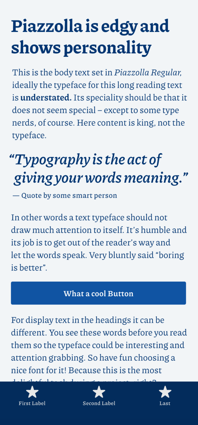
I immediately fell in love with Piazzolla when I saw it. It’s a lively, edgy serif serif typeface that conveys a personal style. But most of all, it’s a type system that makes use of one of the greatest things variable fonts made possible in a seamless way – optical sizing. This means it improves the text legibility at small sizes. Best of all is, that it works automatically in all modern browsers. It might be a super tiny detail, but take the time to compare the different states, taken from Piazzolla’s mini site:
Piazzolla certainly is not for everybody, the larger and contrasting it gets, the more personality it shows. But it also is very calm and quiet at reading sizes. There, its tight leading brings you solid lines and robust paragraphs. This is one of those typefaces where I can’t believe that it’s available for free. All the better, because this will spread good typography more easily.
Recommended Font Pairing
Piazzolla is a dynamic, contrasting, serif typeface. It would make a harmonious pair with a similar form model, like the dynamic linear sans-serif Gratimo Classic. But a rational linear sans-serif like Magnet, or Familjen Grotesk make a contrasting match.

- Headings
- Copy
- UI Text


Learn more about pairing typefaces using the Font Matrix.
Update: Piazzolla is also the typeface you see in the body text of this very page. Learn more about my process of selecting it in this article.
What do you think? Is Piazzolla something for an upcoming project? Tell me in the comments below!
Solid, even stubborn, may I say an old-fashioned, Latino-Americano spirit. It owns a strong, peculiar character. It differs from my gentle, minimal style but, it doesn’t mean that it won’t serve a purpose in some like-minded project. Medium-bold weight is where Piazzolla shows its true, firm character. The best fit? Spanish language, national newspaper/magazines. 💃🏻
Thanks for the additions, Jana 🤘
What would you pair with it? Something a little less exuberant (?) than your choice on this site?
I have been trying it, and flipping between Luna (from same foundry) and IBM Plex Sans Condensed. Difficult to assess to my untutored eye 🙂
Well, IBM Plex Sans works fine in my opinion, since it feels very similar in its construction. So that’s a good way to go. Luna I could not find. Can you send a link, and I’ll check it.
Hi .. many thanks for this. I actually used Piazzolla all the way down as it gets interesting at bigger sizes. Still playing with sizes/colors. Although wondered about using system for buttons .. didn’t want to load another font just for that. Luna is a version of Alegreya Sans. See https://fontlibrary.org/en/font/akiza-sans
Cool, Lorcan! Based on the letter shapes = form model (dynamic), Luna would fit to Piazzolla, like a simpler version of it without the serifs. If you want feedback, let me know by submitting it to the free review!