Sans-serif typeface

from Google Fonts
designed by Pria Ravichandran

11 Styles

7 weights: Thin to Bold
4 weights (Dark): Regular to Bold

Additional Scripts

Devanagari

Best for

  • Headings (display text)
  • Long reading text (body text)
  • User Interfaces (functional text)

License

Free

Specialty

A versatile, free sans-serif typeface, for both Latin script & Devanagari, giving your designs a certain edge without being too cool.

My thoughts on Palanquin

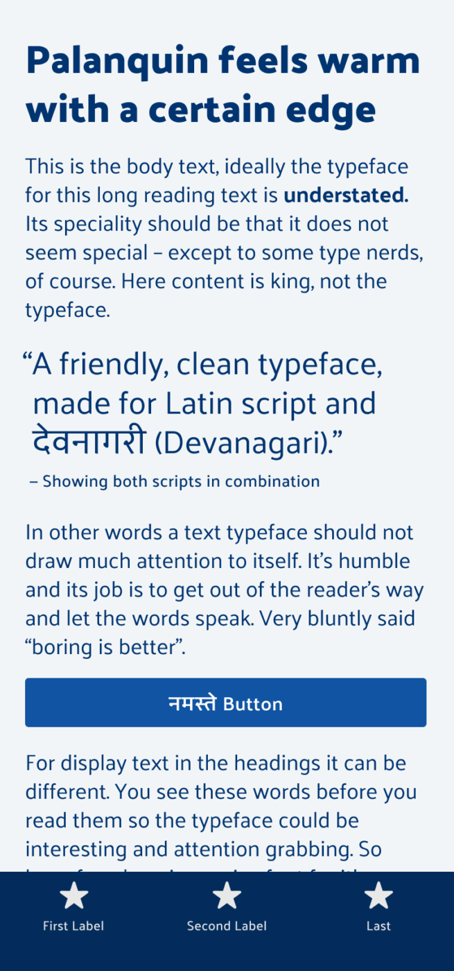
One of the first questions you should ask yourself when choosing a typeface is what languages should it cover? And here you might need to think beyond the Latin alphabet. This is why I also included typefaces from other writing systems in the UI Fonts Checklist. On Font Fridays I want to highlight this more as well, with Palanquin – a clean sans-serif typeface that is also covering Devanagari.

Strong & confident yet light and organic
Palanquin keeps the balance - unobtrusive enough in long format reading and yet interesting enough in larger text. Mixing simplicity with a certain twist, and narrow proportions.
Palaquin also performs well in smaller sizes, keeping its clear impression. This makes it a decent choice for UI design, when you set it a bit larger than other fonts.

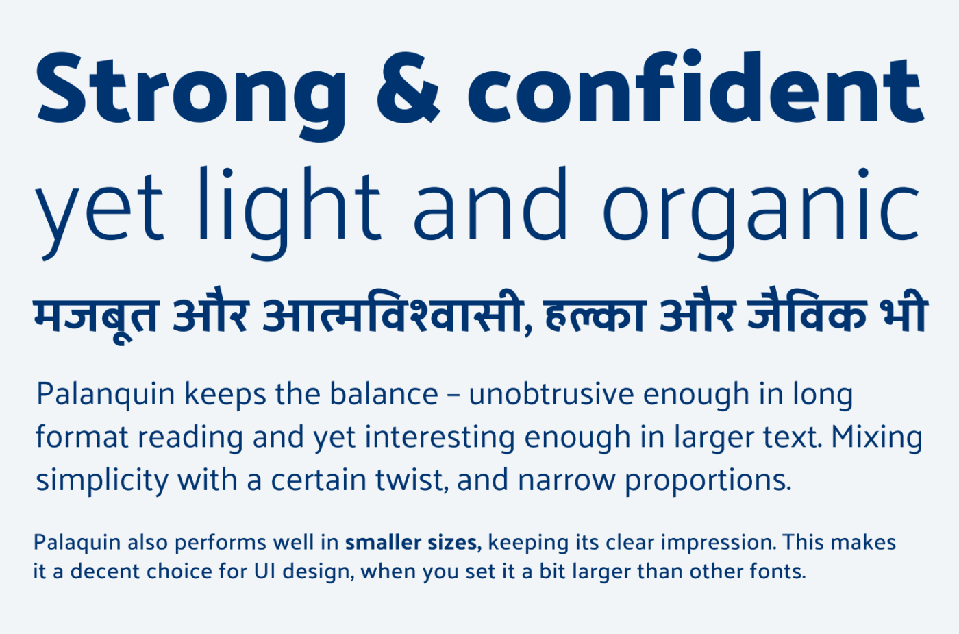
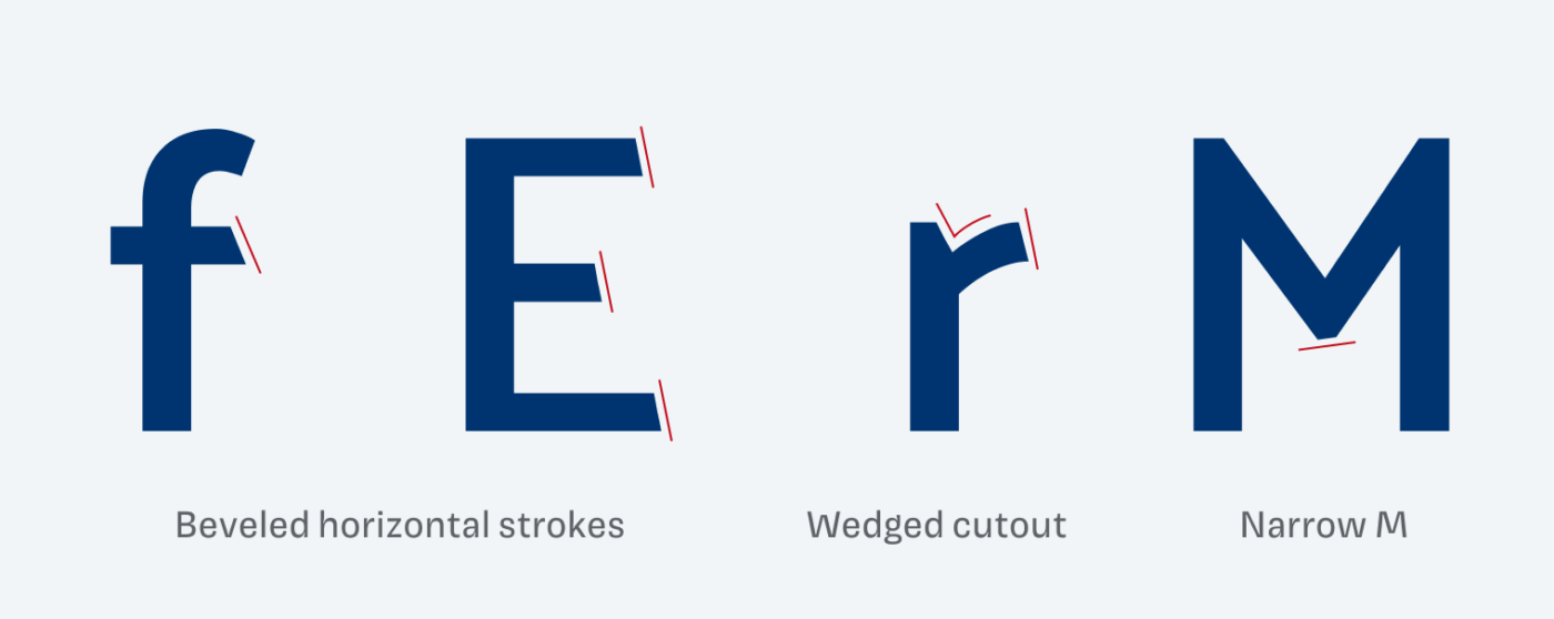
What I like about Palanquin most is that it keeps the balance. The typeface is unobtrusive enough in long format reading and yet interesting enough in larger text. It has rather narrow proportions, mixes simplicity with a certain edge. A recurring theme with Palanquin are the beveled horizontal strokes. They seem to be cut off with a sword or something, adding a unique dynamic to it. Even at the M you can discover this angle.

Beveled horizontal strokes at the f and E, Wedged cutout at the lower case r, Narrow upper case M
Some of my favorite characters – find angles everywhere.

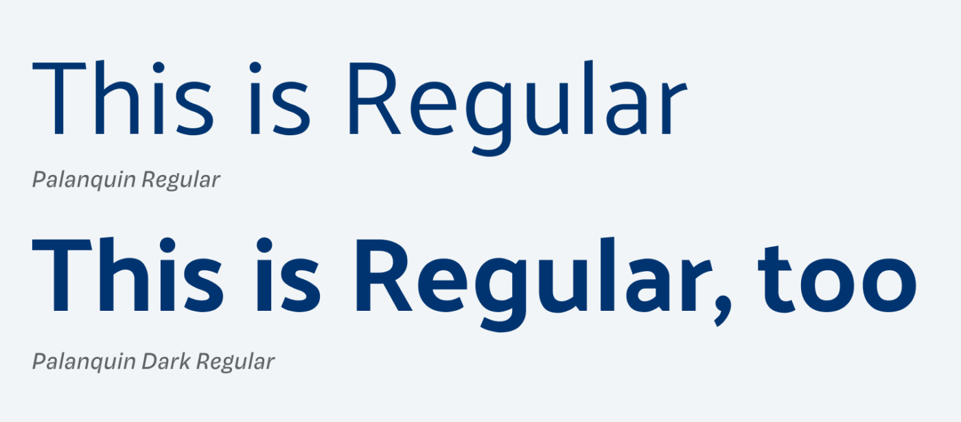
The typeface is grouped in two families, Palanquin and Palanquin Dark. The dark style is more contrasting and aimed towards headings or other, larger text. So if Palanquin is too light for some use cases, check out the dark family. Quick side note – When using it for Latin script only, set it a bit larger. The vertical metrics are a bit different, because it has to work with Devanagari in combination.

This is Regular set in Palanquin Regular
This is Regular, too set in Palanquin Dark Regular
Use Palanquin Dark for larger and stronger text

So compared to typefaces like Open Sans, Palanquin shows more character. I dive into this in the Font Friday Digest, which will be available to Patrons at the end of June.

Where Palanquin outperforms Open Sans. For Patrons in the upcoming June Font Friday Video Digest.

What do you think of this week’s typeface? Write it in the comments! Also, if you have a suggestion for an upcoming Font Friday 😉.

Typographic power to your inbox

  • Font Friday: I recommend one typeface per week, free fonts included.
  • Type Tuesdays: articles & videos that up your design game.
  • Join 2500+ typography enthusiasts, unsubscribe anytime.

Edition #120, published

Leave a Reply

Your email address will not be published. Required fields are marked *