

My thoughts on Muller Next
The sans-serif superfamily Muller Next is the successor of Fontfabric’s – who would have guessed it – Muller typeface. Covering over 216 styles in various weights and widths, upright and italic, Latin and Cyrillic script, it gives you so much room for typographic expression.
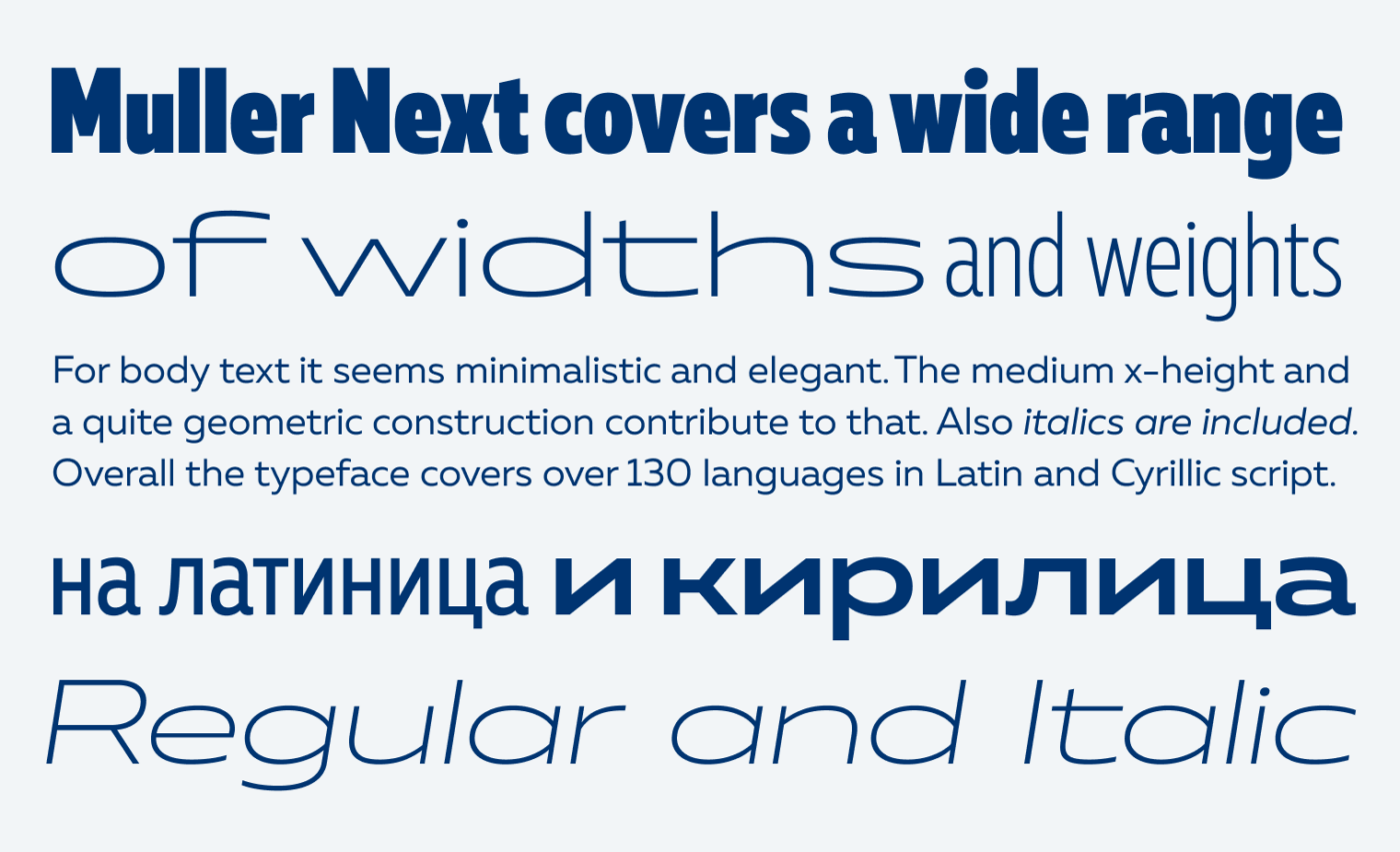
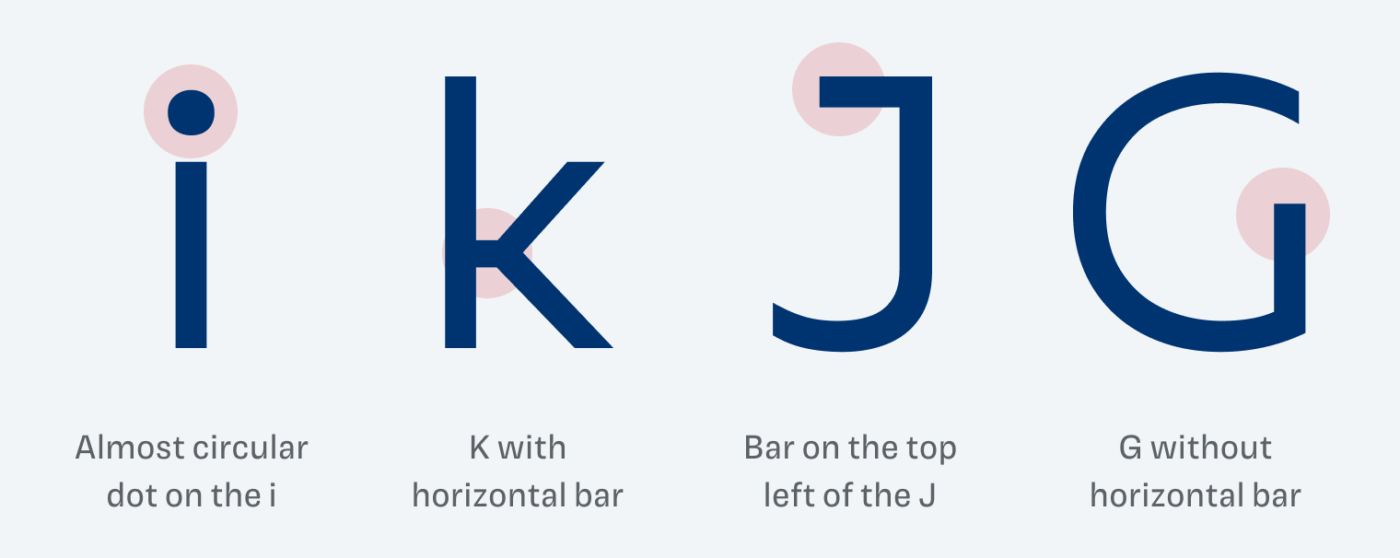
In the more regular weights and widths, it has a clean and clam feel to it. You can see hints of geometric influences (like the circular o and e), but Muller Next is more dynamic and warmer than something like a Futura. It also has a certain elegance, established by the medium x-height and amplified by particular details. Like by adding a horizontal bar at the k and J, or removing it at the G.
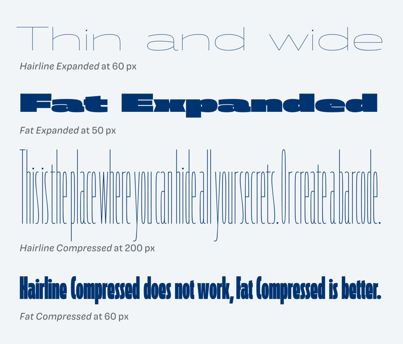
When a superfamily has so many weights and widths, the extremes can become little practical. But they have to be created, since the overall system demands them. The wide styles work very well, while the compressed, light styles, quickly turn more into barcode than text 😉. If you set it large enough for a poster or in animations, they still might be useful.
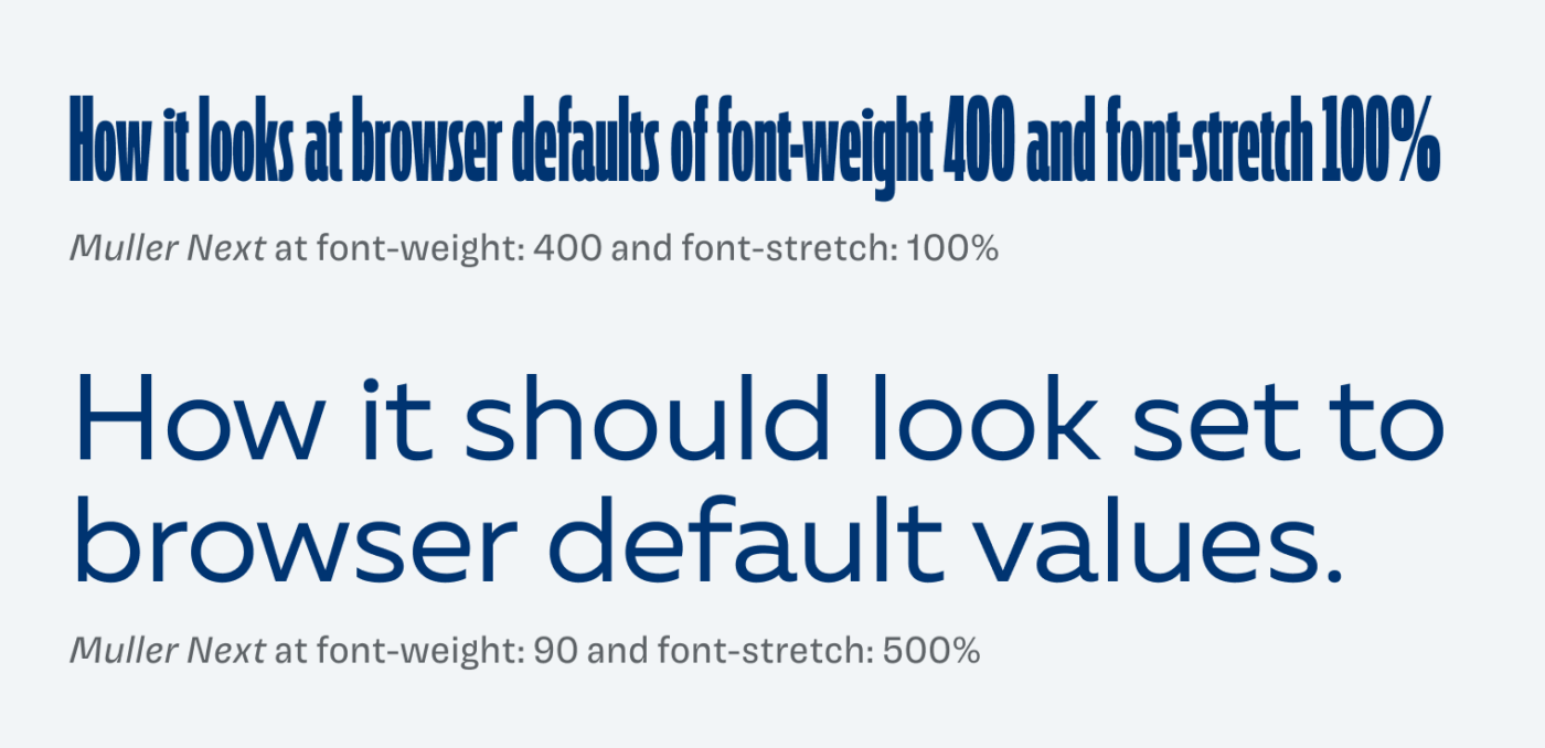
During testing Muller Next Variable, I discovered that the variable font does not come with any named styles. So you have to adjust weights and widths manually on the slider, leaving you a bit disoriented. This is more complicated by the fact that the axes don’t follow the familiar web standards. You would expect the Regular weight at font-weight: 400, but it is at 90, but the whole weight axis covers 10 to 900. The same goes for the width axis with different values. Maybe I missed some reasoning behind this, but for web design I hope it will be fixed in a future update.
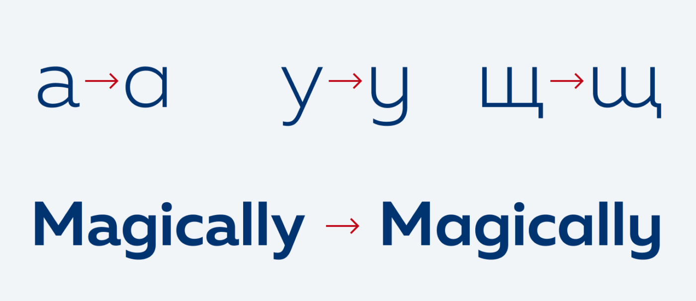
Another lovely bonus are the stylistic alternates, that make Muller Next softer and friendlier, even more so in Cyrillic script. They are a wonderful addition to an already very versatile typeface.
I recommend Muller Next for headings and body text. For smaller sizes or UI design, the x-height is a bit low, but in many cases it will work. Overall, a true workhorse typeface waiting for you to express yourself with it.
Recommended Font Pairing
Muller Next is a quite geometric, linear, sans-serif and would pair well with Newsreader, a quite dynamic, contrasting serif typeface.

- Headings
- Copy
- UI Text


Learn more about pairing typefaces using the Font Matrix.
What do you think of this week’s typeface? Write it in the comments! Also, if you have a suggestion for an upcoming Font Friday 😉.