My thoughts on Avería
What is this font? It’s neither sans, nor serif. Not really suited for body text, and not for larger display text either. I can tell you, what it most is to me – this font is about having fun while experimenting, and discovering new things. The story behind the superfamily Avería by Dan Sayers fascinates me. Dan describes himself as no type designer, but that did not stop him to follow his curiosity. So he created an average of all the fonts on his computer, by overlaying each letter at low opacity, read it here.

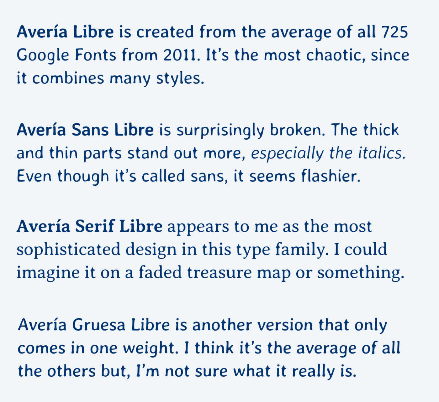
After a lot of learnings, the result was his first typeface, Avería. It is lively, weird, unbalanced and balanced at the same time. Everything, the characters and the metrics are the average of this generative process. Dan continued and created more versions, including Sans, Serif and Gruesa. Also, Avería Libre which is the average of all the Google Fonts from 2011.

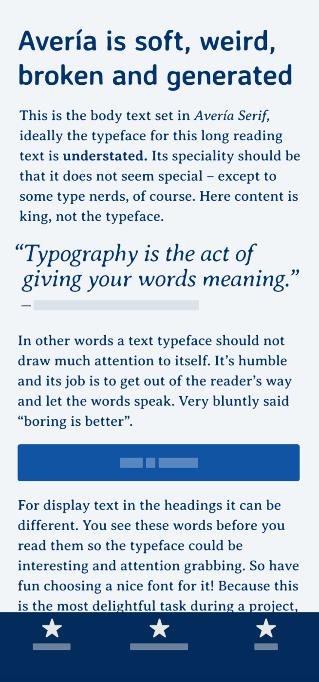
I’d recommend using it mostly for a little body text. Avería Serif is surprisingly readable, like you can see in the example on the phone. It has a rhythmical inconsistency. Here and there, some characters are too striking and stand out. However, overall it creates a smooth gray. But for really serious long reading text it’s not suited. For headings, it might be too dull, and the letter spacing definitely needs to be tightened, it seems to be more oriented towards text sizes.
To me, Avería is about exploring. The serif style seems to be the most polished or consistent with all its inconsistencies, which make it so alive. I vividly can imagine it on a faded treasure map or ancient document. Besides that, I’m not really sure what to do with it, but wanted to share it anyway. Thanks to Kel who pointed me to Avería. I always appreciate recommendations, so if you spot a cool font, let me know!
Recommended Font Pairing
Pair it with Courgette for interesting headings, if you need something more robust but similar for long reading text, I recommend Massilia.
- Headings
- Copy
Learn more about pairing typefaces using the Font Matrix.
What do you think? Is Avería something for an upcoming project, or have you used it in the past? Tell me in the comments below!


Hi Oliver! it’s a beautiful and creative exercise to create a font.
I’ve used in a project https://lamuda.design/autora/
I really love this font, it’s smooth and ethereal.
Caco, this is very cool 🤩! Love the combination with Josefin Sans, it perfectly fits the arty atmosphere of that project. Gives it the human touch. Thanks for sharing!
Thank you, this was interesting. I wondered if you might want to post on fonts for specialist purposes like education or other areas. For example, there is a free font called Atkinson Hyperlegible available from the Braille Institute created specifically for easy reading by those with poor eyesight.
I have a web client who teaches students with dyslexia and they also need to consider things like this, plus there are all those questions these days about accessibility that designers often have to consider.
That’s a really good suggestion! I’m joining this quest! ✌🏻 I have a friend who is autistic. And I’ve learned from her that not all the fonts are easy on them.
Thanks for bringing this up, Ashley. I plan on digging deeper into the topic of accessibility and typography later this year! Also want to cover, if those special typefaces make a significant difference. So stay tuned 😉. For now let me point you to the Readability Group.
Yep – this is a quirky one for sure. I like it. Haven’t found a use, but I just like knowing projects like this exist. Thanks for featuring it and sharing with everyone.
Oh.. and a minor note; In the author comments on the iotic.com site…
“I did mention this at the bottom of the article, but you might have missed it – 725. That’s for the Gruesa version, the others less as they are built from subsets (e.g. where the font metadata specifies italic and weight >= 500, for Bold Italic)”
Thank you for sharing it with me, Kel 😉!
Bravo for artistic endeavor! Averia Sans Libre looks like you have added a Feather effect in Illustrator. While Averia Serif is the only legible for anything functional, saleable on commercial websites. It’s not a statement-strong type, I see it’s useful in a few freestyle applications.
I bombarded you with type examples in the past. Hope to see one of them in some of your excellent reviews!
Glad you like it, Jana! You sure did, and really wanted to feature Role Serif Text but they don’t offer web/app licenses 😟, which is a requirement for me to feature it. So keep that suggestions coming 😀!