
My thoughts on Mona Sans & Hubot Sans
This free font super-family from Github is a true gift. It can be interesting enough to stand out, while being versatile enough for a range of applications. It consists of two families, Mona Sans, a clean, more rounded sans-serif with squarish influences, and Hubbot Sans, it’s eccentric companion ideal for headings and display text.
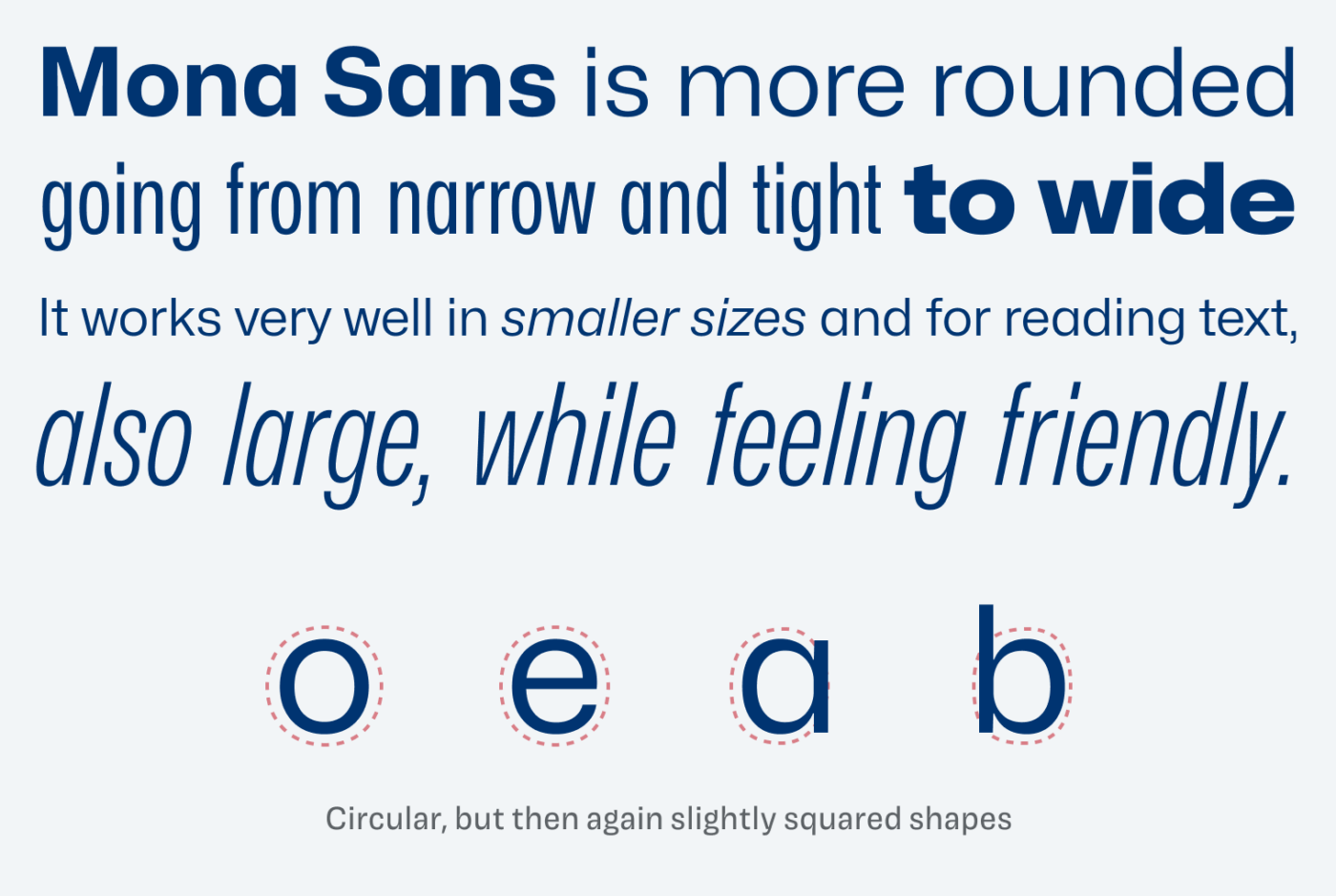
Mona Sans is more aimed towards reading text, but it also works very well in headings. Thanks to its capabilities as a variable font, you can seamlessly adjust the width, weight and even slant that typeface. The more rounded shapes convey a friendly feeling. It is not perfectly rounded still, more like a squicle in some cases. This makes it living between styles, connecting quite rational typefaces like Inter or IBM Plex Sans to geometric ones like Futura.
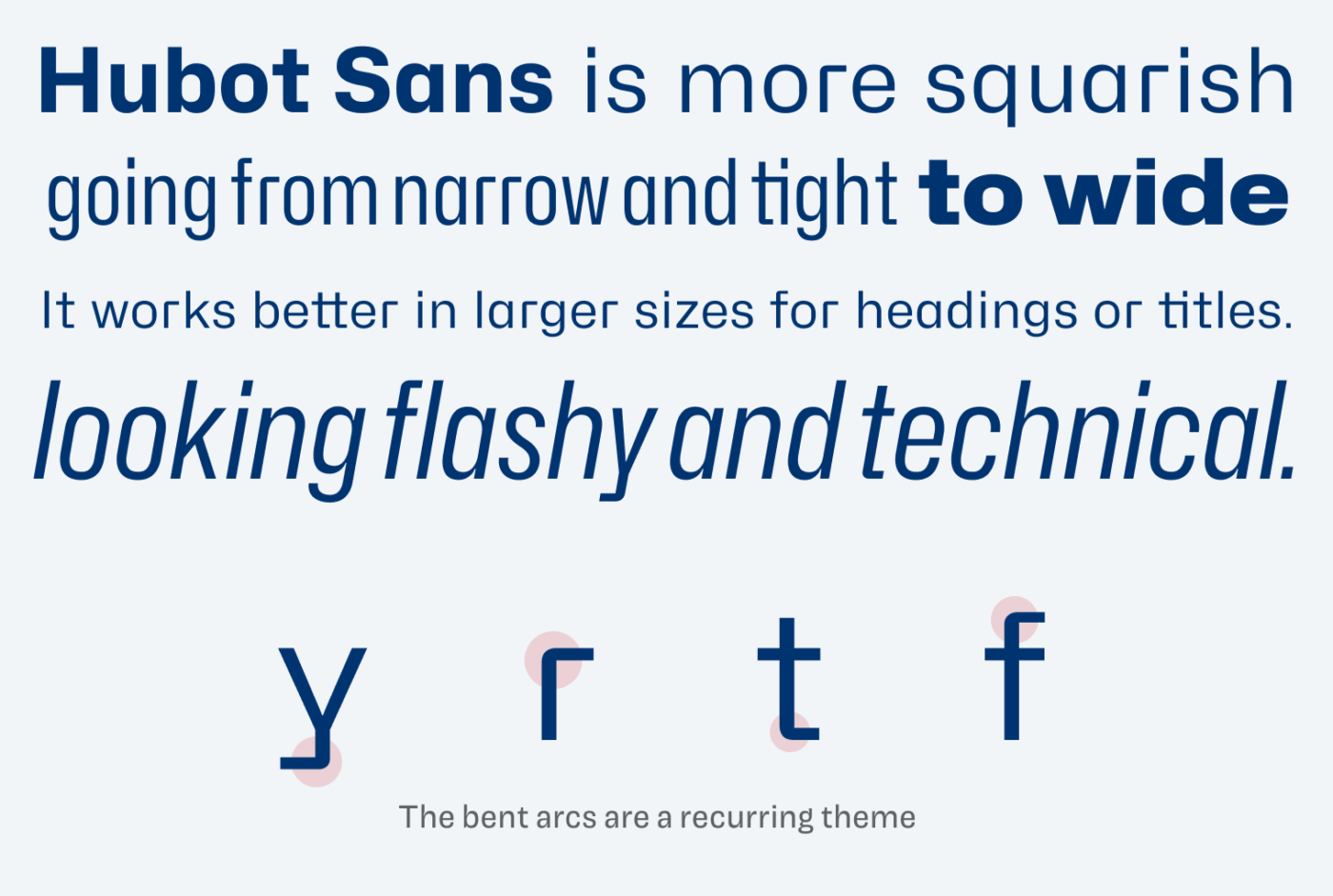
Hubot Sans is very attention grabbing. It is obviously a squarish design and has most striking features, like the bent arcs of some letters. Due to this I would not recommend using it for long reading text. However, for an interesting UI design, it might be the one cool thing you needed. Because Hubot Sans still is very legible even in smaller sizes.
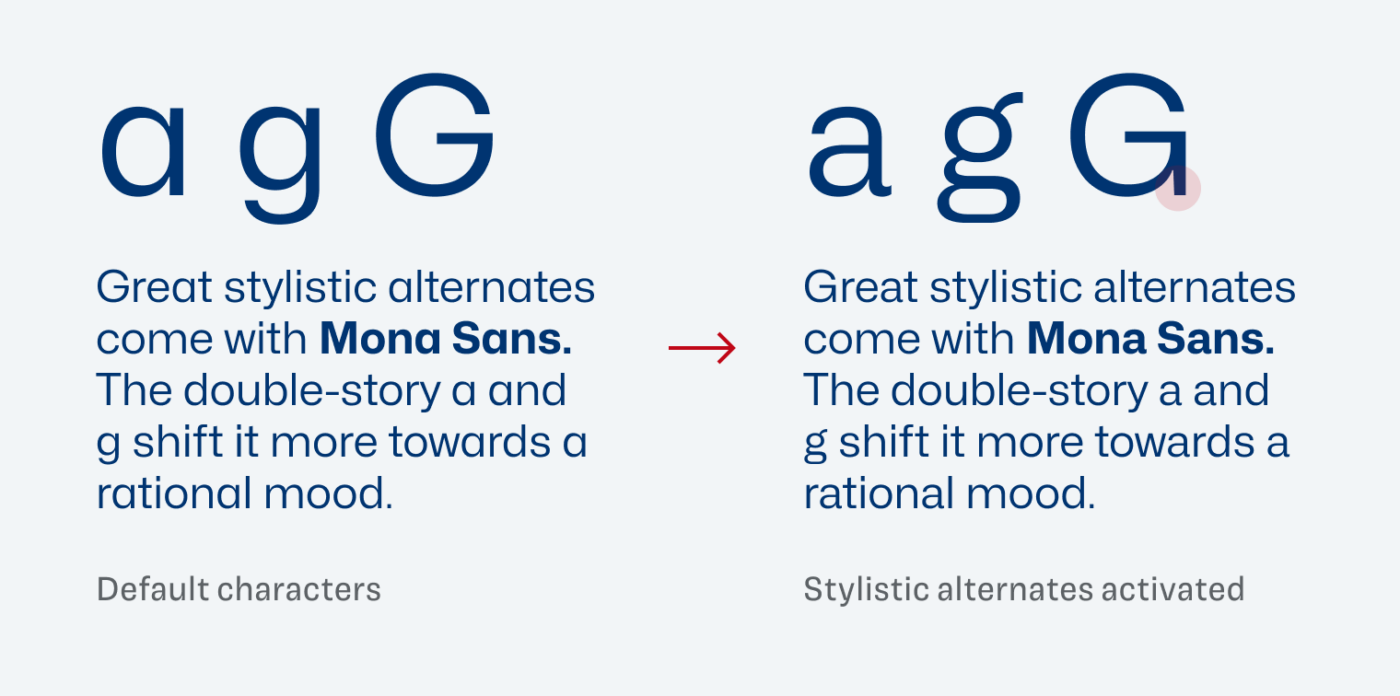
Now when it comes to stylistic alternates (you know, I love those), Mona Sans can be transformed into a more rational design by replacing out the single-story a and g with a double-story version. See how the mood of the short paragraph immediately changes and feels much mor restrained now.
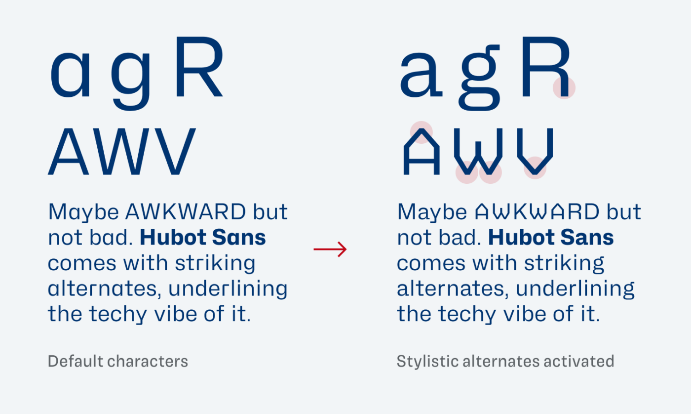
Hubot Sans can become even weirder when alternates are activated. Besides the double-story a, and g or R with a vertical leg, there is an additional stylistic set with some crazy caps. This one is underlying the idea of a bent wire, making it even more techy.
Overall Mona Sans and Hubot Sans are a wonderful modern interpretation of several styles. Because of their vast design space that provides you with a wide range of expression, I expect them to be very popular soon. So use them as long as not everybody else does.
Font Pairings for Mona Sans
You look for a stunning typeface for headings? Or classy intro trext? Choose playful and wild Majör Mono or quite rational, elegant Hanae.

- Headings
- Copy
- UI Text


Learn more about pairing typefaces using the Font Matrix.
What do you think of this week’s typeface? Let me know in the comments, and share it with me when you used it in a project!
I discovered these two a few weeks ago through a design newsletter and added them to my collection. I am glad to see we are thinking along the same lines.
I’m glad too! 😉
Expecting it to be almost a new IBM Plex or even Inter in a couple of years.
Could be definitely the case, Faith! And now since it’s also available on Google Fonts will spread it even more.