
My thoughts on Paysage
Paysage is a humanist (dynamic) sans-serif typeface, free and open-source, designed by Anton Moglia. It creates a very friendly and warm impression, conveying something familiar while still standing out with some distinct letters and a slight quirkiness. Paysage certainly was made for long reading text. It is quite wide spaced, so regular body text 18 and 24 px works well. This means, when you set it larger, you should decrease the tracking, as you can see below.
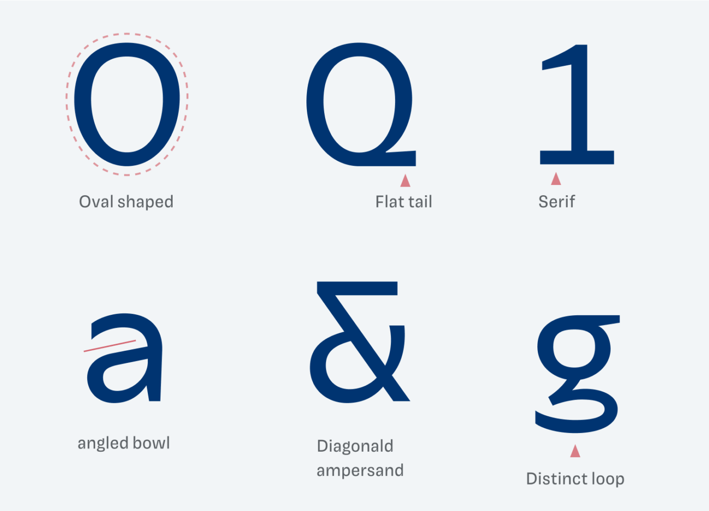
The most attention grabbing letter is obviously the lower case g – gee, really like the distinct loop! However, it might be too much for more than one or two paragraphs. This is why the Paysage comes with a single-story alternate. Other notable characters you can find below, overall subtle organic, oval shapes contrasted by harsh cuts and straight lines tie the design together.
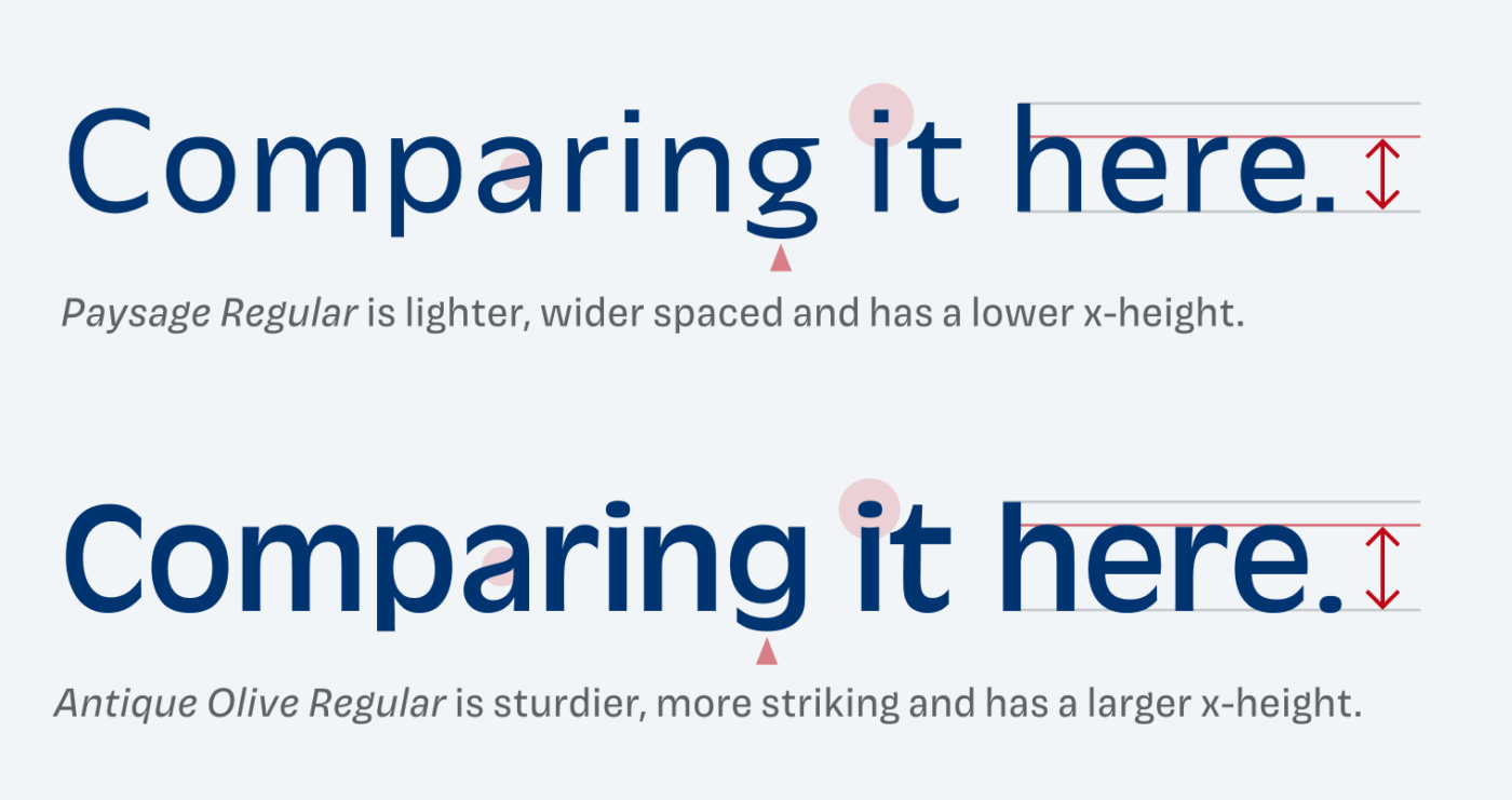
If you’re familiar with the popular typefaces from the past century, you might be reminded of Antique Olive, which was first released in the 1960s. I despise Antique Olive. To me, it feels so intrusive and distracting. Paysage is a fresher, less showy approach to the design, much easier to digest.
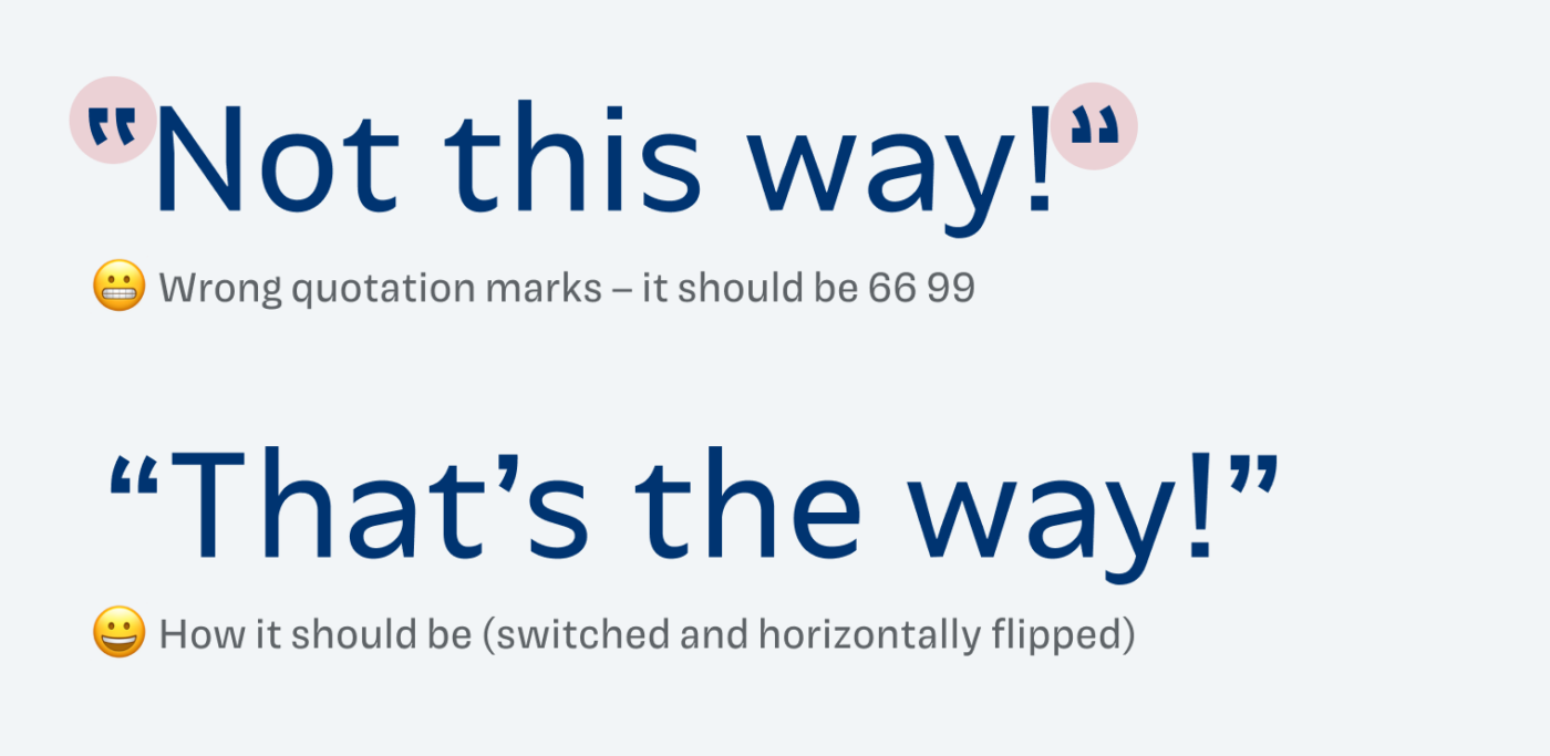
I only have one issue with Paysage – quotation marks are wrong. They are interchanged and flipped. But since it’s an open-source font, you could fork it and adjust it. Or use guillemets, the French quotes, which work fine 😉.
Font Pairings for Paysage
Looking for interesting heading font that pairs well with Paysage? Maybe emphasizing the soft touch of the typeface? Then try Search or one of my other recommendations.


Learn more about pairing typefaces using the Font Matrix.
What do you think? Is this typeface something for an upcoming project, or do you have a font recommendation? Tell me in the comments below!
Hi Oliver, thank you for this! Nice one. Hopefully, the quotation marks will get fixed. I didn’t know the Tunera type foundry yet either, they really have some nice and interesting stuff on offer!
They do, right? Happy you could discover something new! Isenheim and Manosque seem very interesting to me as well.
Don’t be so hard on Antique Olive, OLIVEr 🙄
Paysage seems to have just enough quirkiness to subtly bear our attention but serve in a long reading text without distraction.
Forgive me if you reviewed it, but Role, a superfamily by Matthew Carter is the recommendation to be featured.
Lol, yeah, taste 😅. Role is awesome! I’ll reach out to them again, let’s see if I hear back.