My thoughts on Figtree
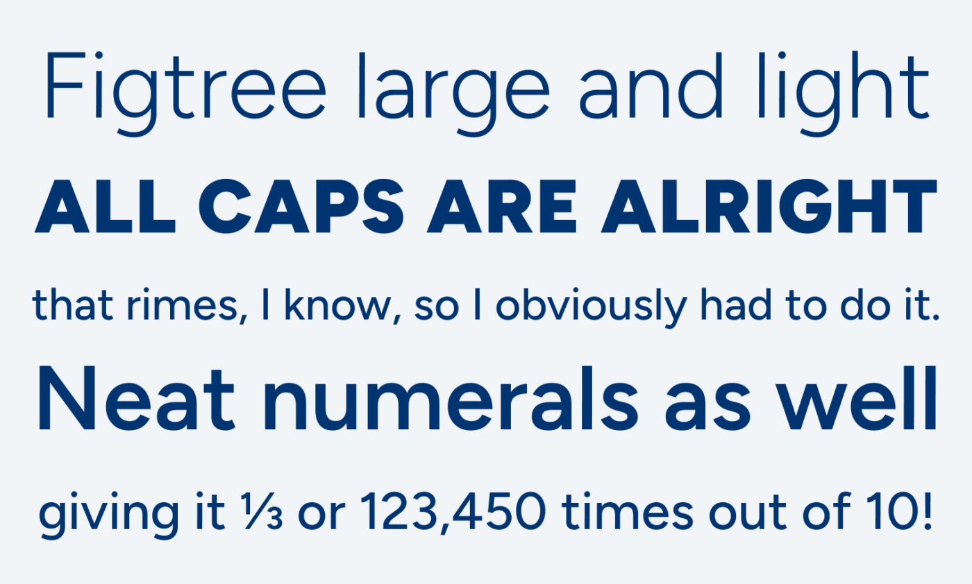
Figtree is a free geometric sans-serif typeface designed by someone I’m really very grateful to, Erik D. Kennedy. Erik is known for his extensive UI design articles, and I learned a lot from him when I started with iOS Design. So I was fairly surprised that he created a typeface. Figtree has curved simple shapes, with a monolinear stroke, that makes it seem very friendly approachable.

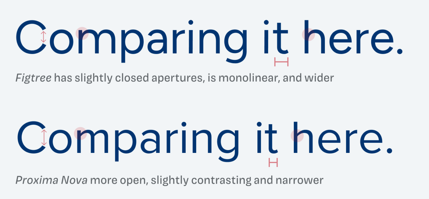
The genre of geometric sans-serif typefaces is very, very crowded. So what does Figtree contribute to that? At first, it does not really appear that original to me. It immediately reminds me of Proxima Nova. Both typefaces are very similar, when it comes to their proportions, and letter shapes (like the curved t). But Proxima Nova is a bit narrower, has more open apertures, is a bit more elegant and less stiff, due to its slight stroke contrast.

So, is Figtree a Proxima Nova clone? I hate it, when these allegations come up, since all typefaces are inspired by others, and it is definitely not a dull copy. It falls in the same category, but Figtree has sturdier strokes, and a more casual vibe to it. As so many times with type, it’s the details. And let’s put it that way: it could be a good free alternative to Proxima Nova, with a cheeky angle.

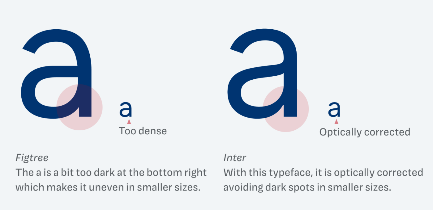
One tiny optical problem I see with the typeface is the lower case a. It becomes too dark and dense at the bottom right where the bowl meets the stem. Also, the letter leans a bit too much toward the left, which is more obvious in the context of a word (see “Comparing” above). Once I’ve seen it, I can’t unsee it. But hey, that’s me, and it should not be something that stops you from choosing Figtree for a project. It works well for a variety of applications. It soon will be very popular for its friendly aesthetic, so use it before everyone else does 😜.
Font Pairings with Figtree
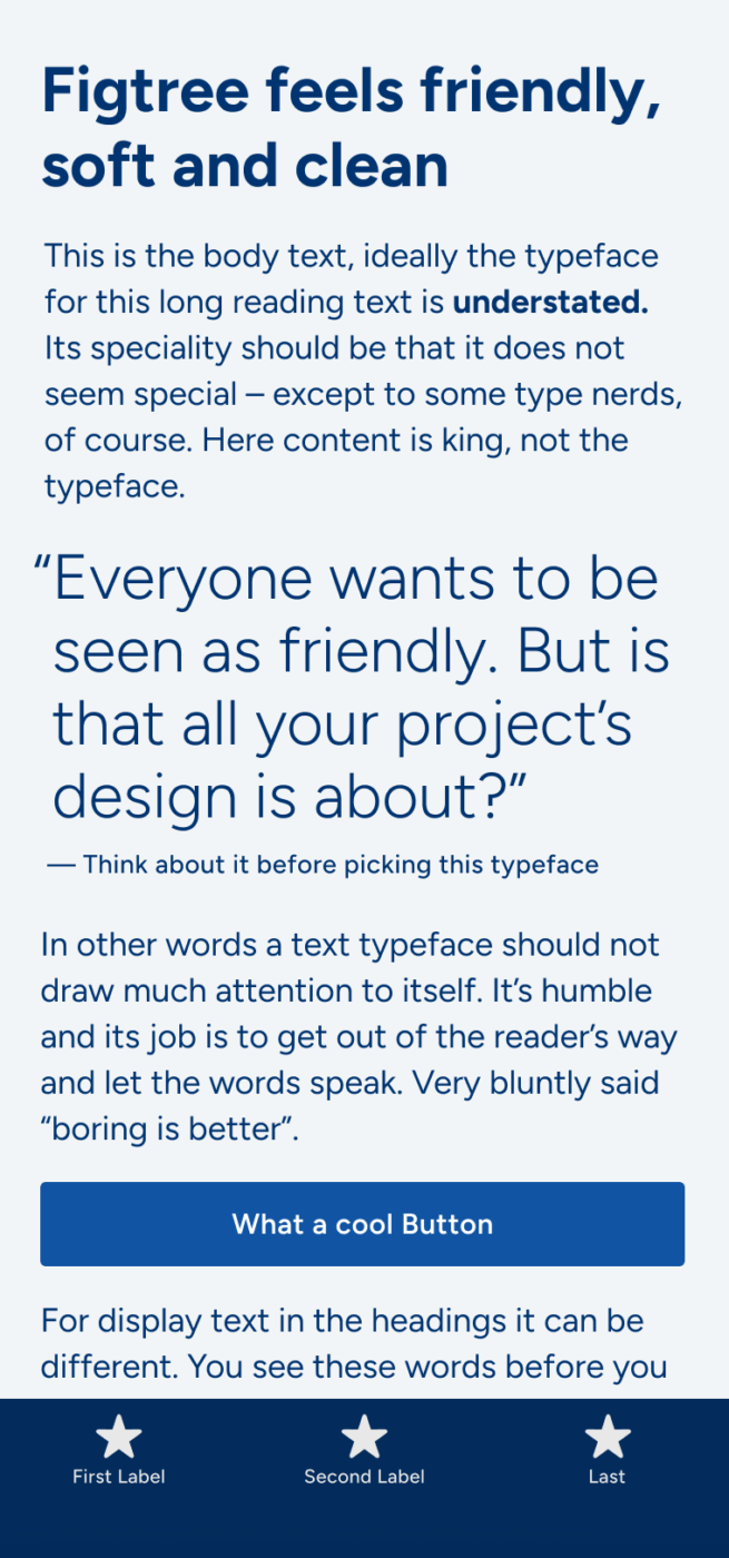
Figtree is a geometric, linear sans-serif typeface, working best in body text and UI text. Pair it with one of my suggestions for more engaging headings.
- Headings
- Copy
- UI Text
Learn more about pairing typefaces using the Font Matrix.
Thanks to Ashley again, who shared it with me. Do you have a font recommendation? Tell me in the comments below!


“if everyone looks nice, nobody looks interesting”… this font is a good option in a certain cases, it looks nice and sweet. Thanks for share your thoughts about Figtree! 👌
Yay, glad you found it helpful, Caco!
The moment I read FIGTREE’s text, I had a picture in my mind https://bit.ly/3Anw5Kf your wife ties a bow on your neck. It’s that tight, appropriate, fond type.
I love quirky, but sometimes we need kind ordinaries!
Definitely, one not to overlook.
Say no Proxima Nova😫
I just started using Figtree as the main font on one of my wife’s websites (which I am currently cleaning up a bit…). I love the way it looks and its versatility.
And I always find myself checking your suggestions first when looking for fonts for my clients’ websites, and usually, I do not need to check further options.
Thank you for providing this website and your excellent YouTube channel!
Thank you, Kjell! That’s the biggest compliment I could get! 🤩
Thanks for profiling this one, Oliver. Now I am tormented over whether to replace Inter with it! 🙂
Do it, Rich! If you replace it, it will definitely appear a bit smaller, so compensate for that, if needed. Regarding uniqueness, it will definitely stand out more 😉, unless it will become the next Inter.
Thanks for the tip on size, Oliver — ready to take the leap off Inter!
I don’t know if you check comments for old articles, but to me, figtree is more like a less extended Montserrat and therefore closer to Gotham, the a, whose bowl meets at a straigt angle is defenitely more like Montserrat, while proportions are closer to Montserrat. Proxima Nova has way more modulation, than any of them, but all these 4 are very close to me… I’m not very fan of the extra stroke the J of Montserrat has or how it’s a bit wider. So I like to think of figtree as a step closer to Gotham, but with the modern lowercase a of Montserrat.