
My thoughts on Pratico UI & Slab UI
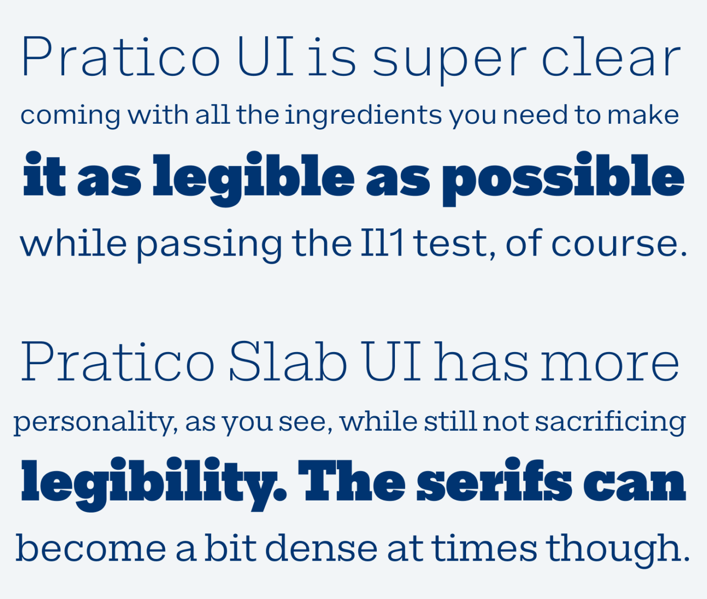
We need more unique, interesting and legible typefaces for UIs, bringing variety to our digital companions, while making our projects more memorable. Pratico UI and Pratico Slab UI contribute to that. I repeat it over and over again, that legibility is key (meaning distinct characters), especially in UIs. Pratico UI takes care of that. It’s clear, has a large x-height, passes the famous Il1 test, while having has a rather squarish design, and wider proportions.
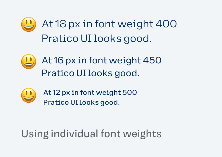
When designing for UIs or small text in general, always consider the right contrast. Font-weight: 400 might look good in 18 px, but it soon becomes too light in smaller sizes. Font-weight: 500 can be great for tiny text, but too dark for body text. And everything in between can be an edge case, as you can see below.
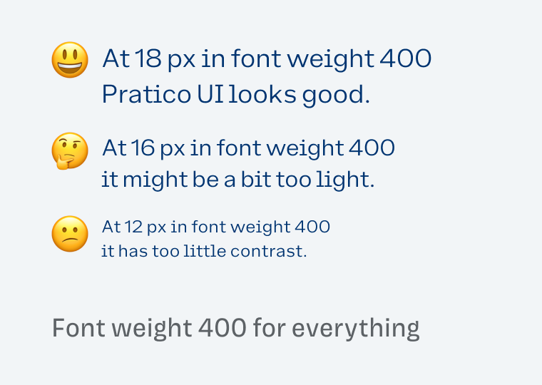
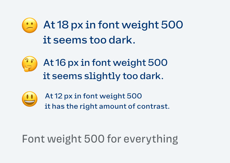
To solve that dilemma, I recommend adjusting the weight for each size. With Pratico UI you can even go between the common styles and apply font-weight: 450, so it always has the right amount of contrast. See it in this short video. I appreciate that DSType Foundry sells the typefaces as complete family only, so you will always be able to seamlessly adjustment the weights with the variable font.
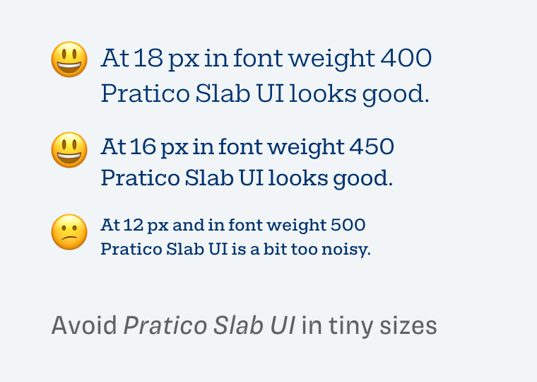
One more thing about Pratico Slab UI. It definitely is more unique, and striking, also well suited for small text. But in tiny sizes, the serifs create a very dense visual impression, so I would avoid that (see above). Also know that for body text and display text consider Pratico and Pratico Slab, while Pratico UI is aimed towards small sizes.
Font Pairings for Pratico UI
Of course, there is the complete Partico superfamily that works nicely for all sorts of text. But if you want a crazy heading font, choose Hand Stamp Slab Serif.

- Headings
- Copy
- UI Text

Learn more about pairing typefaces using the Font Matrix.
What do you think? Is this typeface something for an upcoming project, or do you have a font recommendation? Tell me in the comments below!
It was a time for one UI font to show up on Pimp My Type. Thanks, Oliver for this super Pratico star. ⭐
I don’t have a project for it (yet) but I have many designer connections on LinkedIn who complained about finding the perfect UI type. I can share this very helpful review from you.
Wow, wow, it’s so congruent. It’s hard to find a delicate Slab serif without being overly serious and reserved. This Slab version is friendlier than many out there.
And no, I don’t like Black and Italic, but everything in between, and Pratico UI and Slab UI are both very pleasant novelties on the type scene.
Now that you say it, yes, the slab serif is quite delicate. Glad you like it, Jana!