
My thoughts on Coline
I love pointy, edge, eccentric serif typefaces. And when they come with a striking alternative style for the italics, it ticks all the boxes! Coline is a type family that can be calm and noble for your body text, while letting your headings stand out in the more extreme styles. It comes in three different styles, Premiere, Cursive and Extreme.
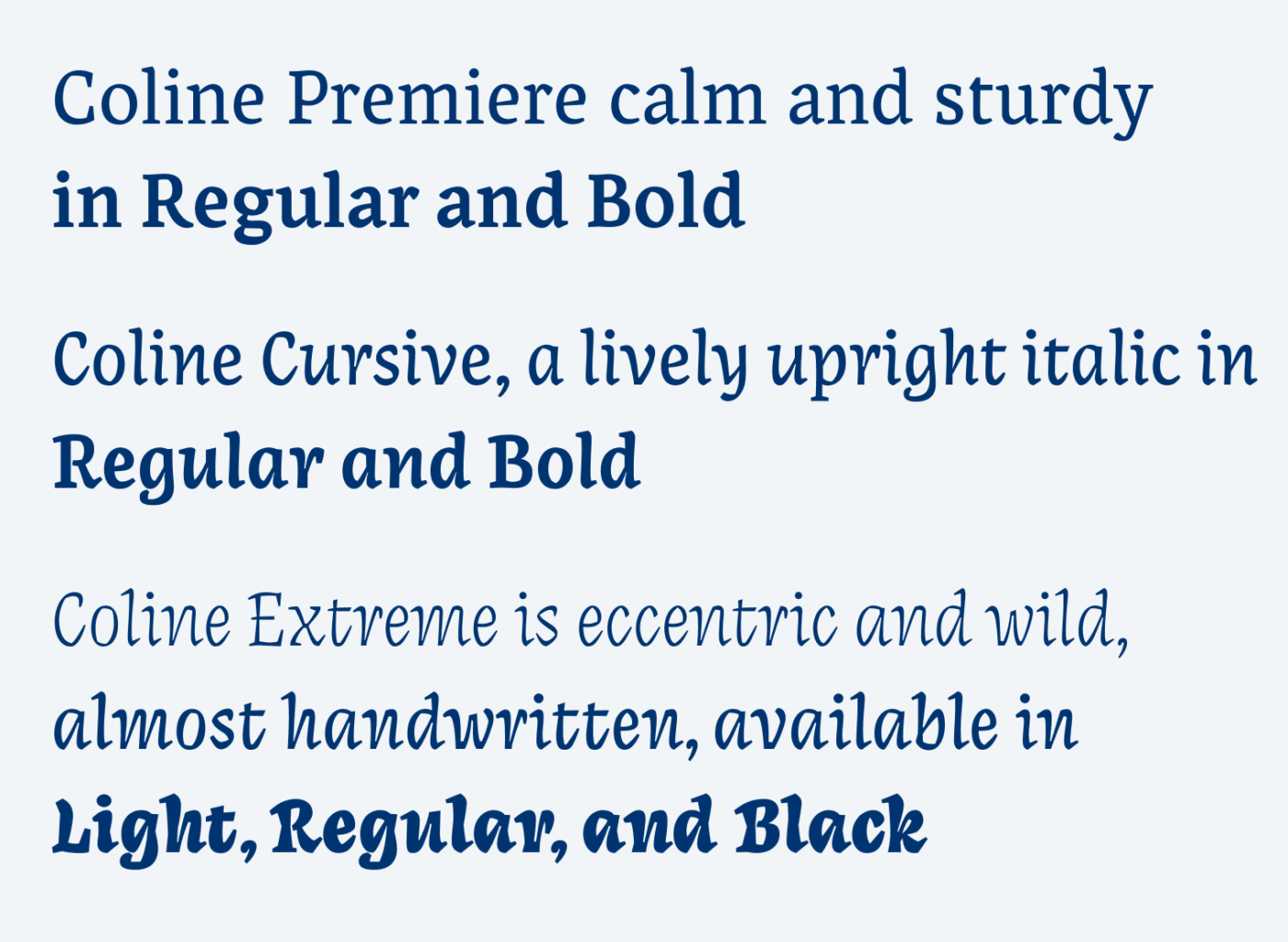
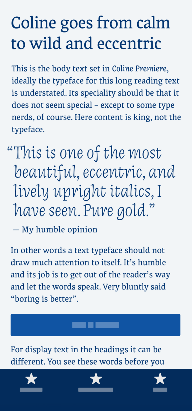
Coline Premiere should be your choice for body text. It works very well in small sizes, printed and on screen. Coline Cursive is a beautiful upright italic, which means it is not angled toward the right, while the letter shapes change (see the a or g) and become narrower. Finally, Coline Extreme takes this concept to the max, with a lot of contrast, wildness, and energy. It appears very spicy, sharp, playfully challenging expectations, while feeling almost handwritten.
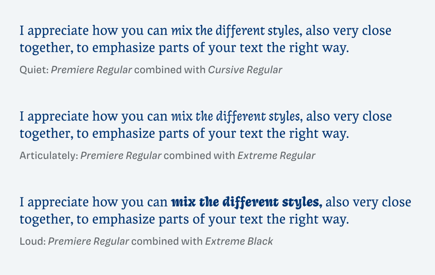
One of the coolest things is that you can combine the different styles, also in your copy. Set you emphasis from very subtle to very loud – how visible do you want it to be? When doing it, I recommend only Extreme Black and Light in larger sizes, so that it’s not too delicate.
Font Pairings for Coline
Snappy Coline is a dynamic, contrasting serif typeface. To calm it a bit down, pair it with Laca for softer and playful headings.

- Headings
- Copy


Learn more about pairing typefaces using the Font Matrix.
What do you think? Is this typeface something for an upcoming project, or do you have a font recommendation? Tell me in the comments below!
Wow, it’s beautiful, I love it!
Also, the detailed report about the font creation process on the type foundry’s website is fascinating.
Thank you for making me aware of this gem, Oliver!
Of course, Alex! Happy you like it. Anything interesting you came across recently?