
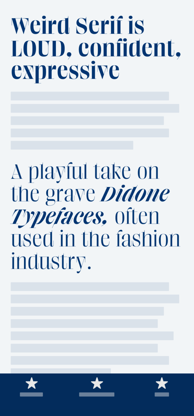
My thoughts on Weird Serif
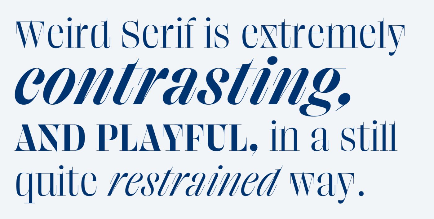
You know these super contrasting, fancy Didone typefaces often used in the fashion industry. Like in the logotypes of Vogue, Elle or Armani. Weird Serif by Alex Slobzheninov is a different take on these. It mixes up seriousness with a good amount of weirdness, resulting in playful expressiveness.
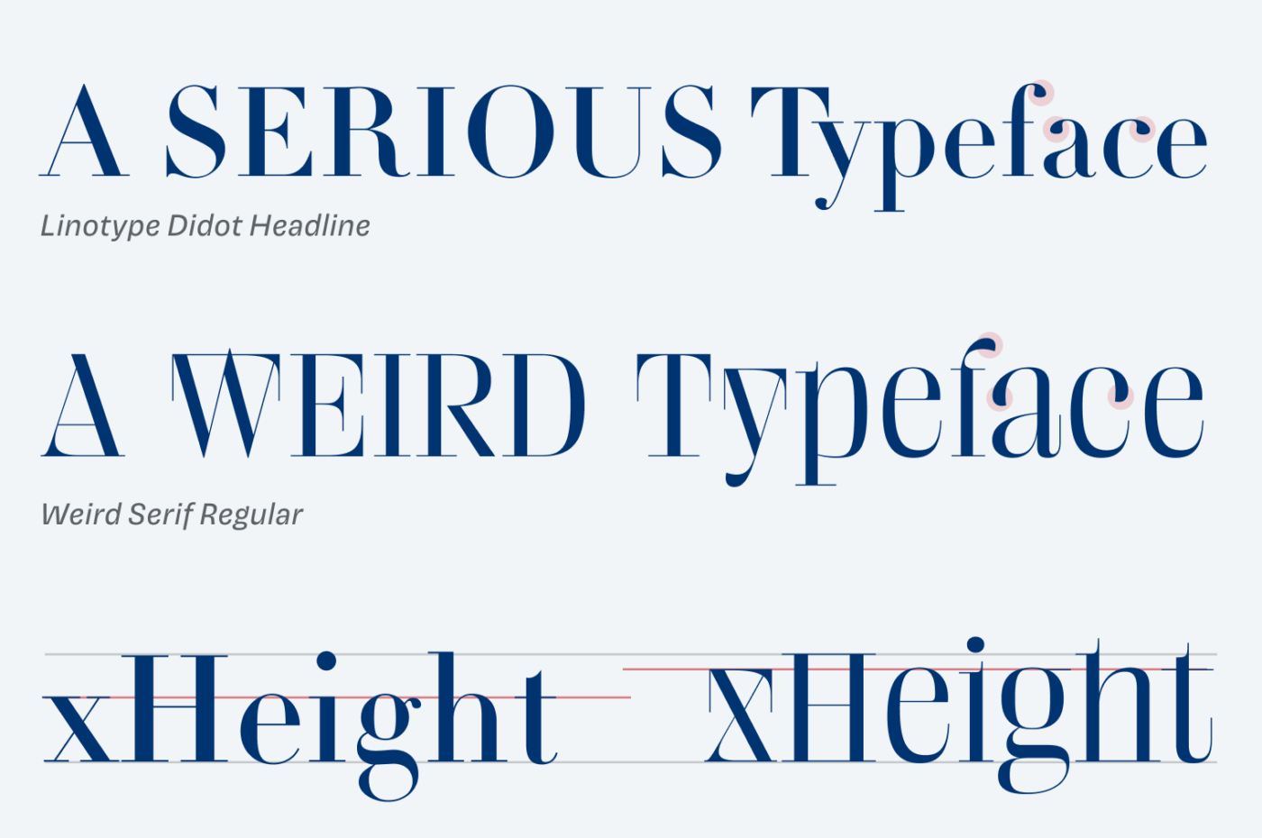
You see what I mean, when you compare it to Linotype Didot. Besides the exaggerated, sharp serifs, Weird Serif has much higher small letters and is a bit more organic and playful when you look at the leave-like overhangs of the f, a, c.
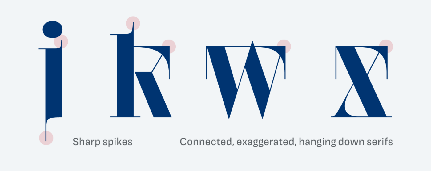
It fascinates me, that the typeface still feels somehow strict and restrained due to the quite abrupt transitions between the thick and thin parts, while breaking out of other conventions. The unusually connected and hanging down hairline serifs, the little spikes, and a very seep italic all contribute to that.
Weird Serif is made for display sizes. Set as large as possible and use it for as little text as possible. It convinces in poster design or in an impactful headline on the website of a fancy but cool brand. The typeface is till in progress, but already available on Future Fonts.
Font Pairings with Weird Serif
Weird Serif is a rational, contrasting serif typeface, best for large text. Pair it with one of my suggestions for UI text or copy.


Learn more about pairing typefaces using the Font Matrix.
Shout out to Jana, who recommended this typeface to me! If you have a suggestion for a typeface I should review, tell me in the comments!
Weird Serif? There is nothing weird in this Serif! This is super⭐ my friend. Even though bold letters are wrapped around they’re still legible. I should transition from Brand consultant to only naming writer because I see a lot of work for the typographers not giving their typefaces the appropriate name!
Congrats on your meaningful victory! 🥳Little by little, it adds up to your portfolio🙌🏼
You should definitely offer naming typefaces as a service, Jana! Thanks again for your suggestions and the kind words 😉.
oh goodie!
love the ideas. as editor enthusiast, I love type o’s. Also true for blood donors! That’s a joke but not really. 🙂
Anyway thanks for the tips.
Haha, happy you liked it 😊. Seems we share a similar sense of weird humor 😜.