My thoughts on Kyiv*Type Sans
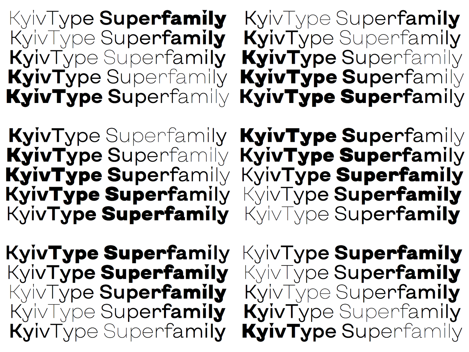
Kyiv*Type by Dmitry Rastvortsev is a fascinating type series designed for Kyiv city identification. It caught my attention as a variable font, offering a lot of room for typographic expression with a weight, width and midline axis. The letter forms are pretty distinct and some features are very unusual – like the g with its vertical ear, the triangular dots on the i, or the bend at the y. I love how contrasting it can become, especially in the bolder weights.

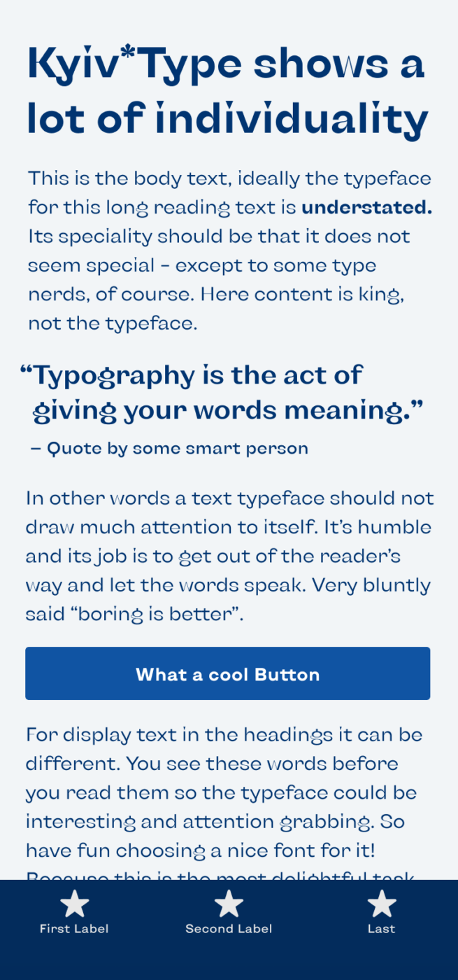
All this makes Kyiv*Type Sans ideal for expressive display text. For a little body text it will work, but since some letter shapes are very attention grabbing, I would not recommend using it for very text heavy applications. It will look very noisy very quickly and distract from the content. The same goes for functional text – it’s rather wide and also a bit too much there. Also check out the even punchier companions Kyiv*Type Serif and Kyiv*Type Titling, which truly make this a type super family.
Recommended Font Pairing
If this typeface is too eccentric for in body text, I recommend pairing it with Beatrice, that also has a lot of interesting contrast going on. Alternatively, a geometric linear sans-serif typeface like Figtree makes a good match.
- Headings
- Copy
- UI Text
Learn more about pairing typefaces using the Font Matrix.
But what do you think? Is Kyiv*Type Sans something for an upcoming project? Tell me in the comments below!


This Kyiv, especially Serif and Titling is very on its own. One of these personalities with strong statements, integrity. If I should choose a zodiac sign for Kyiv, it would be Aries or Taurus. I think I’m going to use some of the numbers or letter(s) alone, from the Serif, to serve not in a body text/headlines but as a design detail. The Sans version is okay for the copy!
St. Petersburg? And I’ve expected you in the South, where the Sun shines. Com’ ooon
Absolutely, Jana! And St. Petersburg is lovely! And maybe a bit cooler at this time of the year 😉
It’s a pity the download link for the font is not working at the moment as the server cannot be reached, but I will try later. I like the idea of a font that celebrates the spirit and style of Kyiv.
If anybody else is having problems downloading the font I found it on the fontesk site at https://fontesk.com/kyiv-type-typeface/
Thanks for sharing it, Ashley!