

My thoughts on Intel One Mono
Designed by wonderful Frere-Jones Type, Intel One Mono is a quite unusual monospaced font. The typeface comes across as expressive. The four different weights make it suited for various situations, while the exaggerated, steeps italics truly stand out.
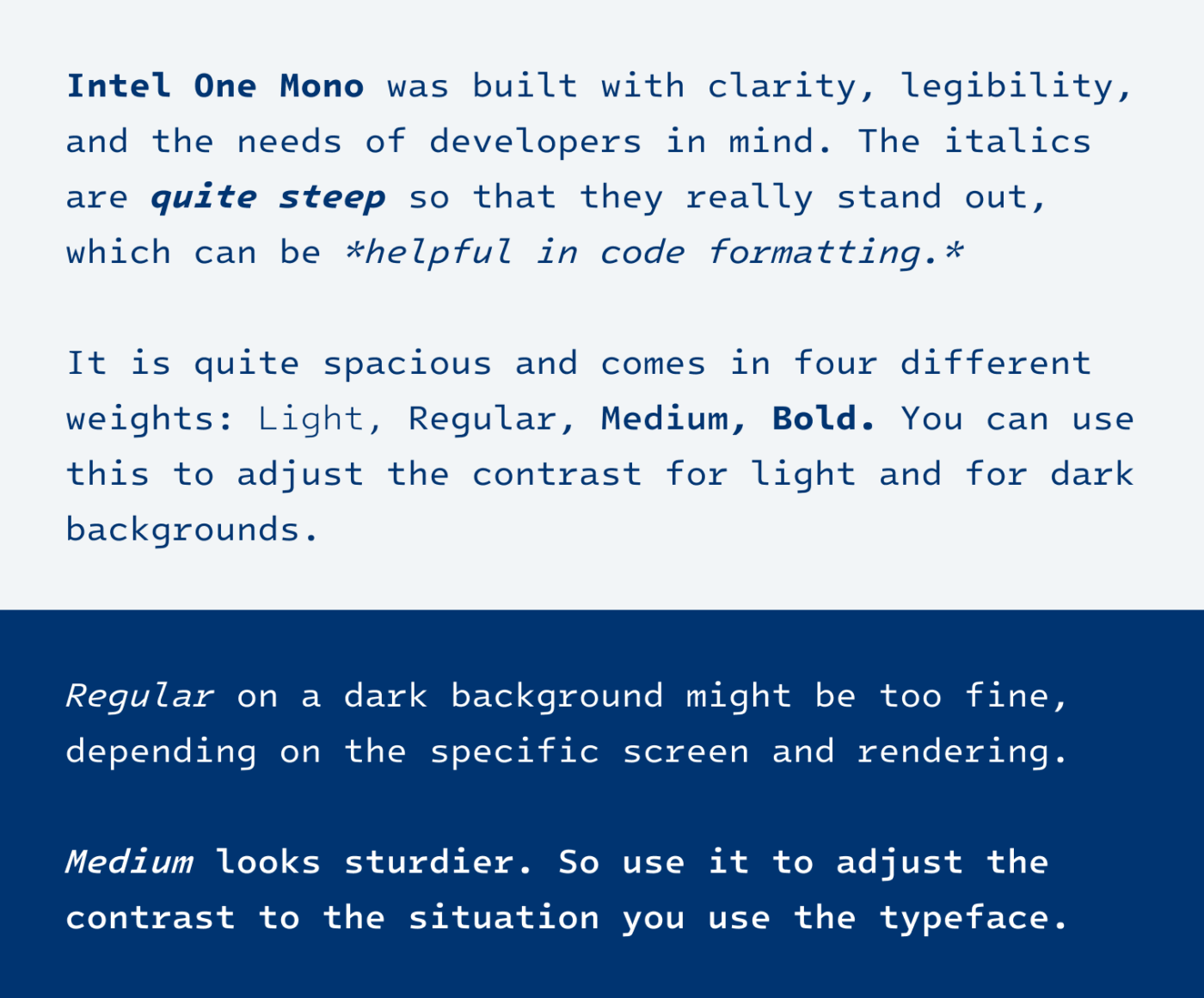
The goal of Intel One Mono is to reduce developer’s fatigue by enhancing legibility. The x-height is a bit decreased to better differentiate capital and lower case letters. The spacing is also quite generous. And to make every character as clear as possible, the typeface is sacrificing consistency over uniqueness, which results in some interesting details.
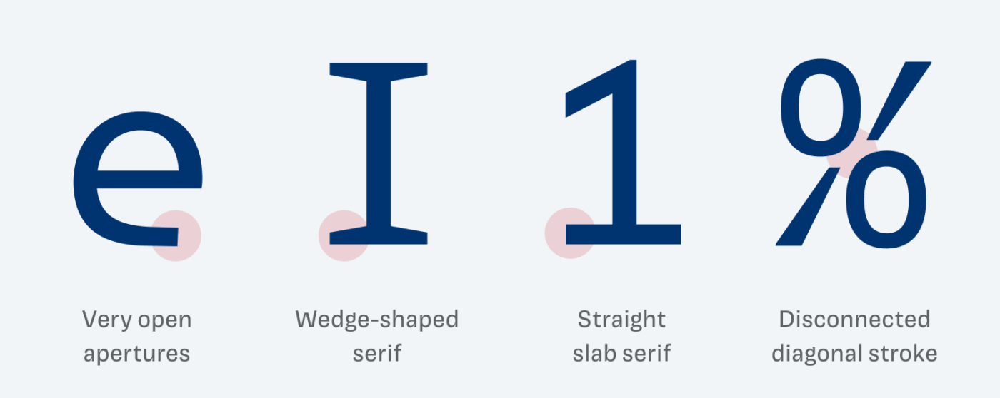
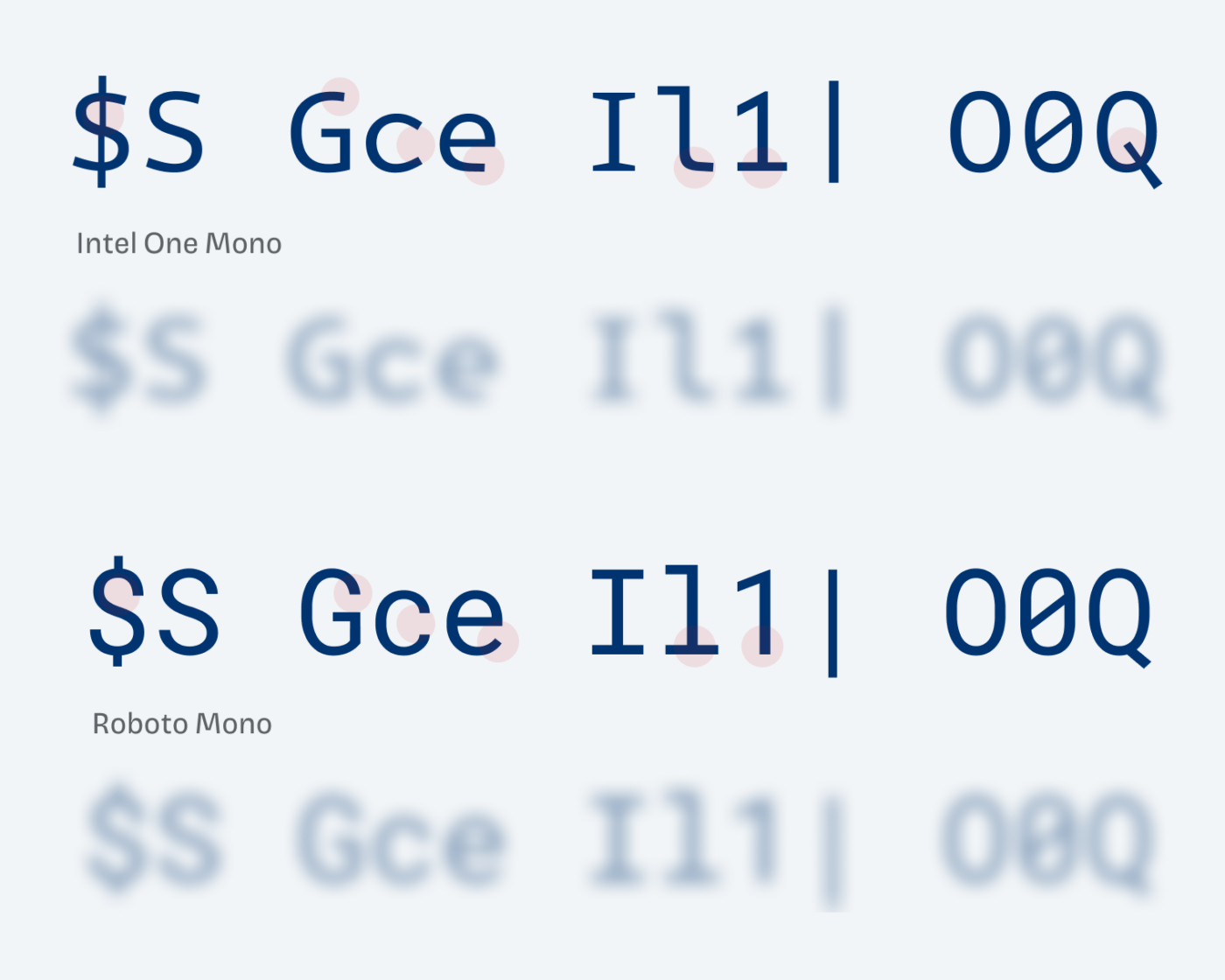
At times this means making shapes simpler, like the extremely open e, but sometimes more complex and darker, like the dollar sign, the capital Q or the percentage sign. This results in a more diverse word shape, which makes the typeface accessible, also for people with a visual impairment.
Besides for code, I would only recommend using Intel One Mono for a little text. Set it in one size only, which this could be quite small, like between 12 and 16 px. If you bear that in mind, it can be the cool additional typeface for captions or marginalia that your design needs.
Recommended Font Pairing
Even though Intel One Mono has a lot of unique features, I’d categorize it as a quite dynamic linear sans-serif typeface. When pairing it with another typeface in one line, you should pay closer attention to the x-height, which is quite similar with the following suggestions. I’ll go into greater detail on this on Patreon in the Font Friday Video digest at the end of September.


Learn more about pairing typefaces using the Font Matrix.
Would you use this font for coding? Or do you already? Tell me in the comments below! Also if you have a favorite font that I should review in an upcoming Font Friday.
Excellent font! I’ve installed as my default in BBEdit. Thanks!
Awesome! Tell me how you feel about it after a week or so. 😊
I know a coder whom I’m immediately sharing this post with. Other than that, I just came here to tell you that I’m grateful for that little l it’s so cute, little worm.🐛
Other pairs that I like: rk and ra (in this order of letters).
Oliver, have you covered Akkurat sometime before? I’d be interested to know.
No, I have not covered Akkurat, not such a big fan of it. It’s a bit too dense and Helvetica-like for me 😅.