My thoughts on Atkinson Hyperlegible
The typeface Atkinson Hyperlegible from the American Braille Institute is a fairly liked insider tip when it comes to quality free fonts. So it’s about time to take a closer look at what makes it so popular. As the hyper long name suggest, the typeface aims for ideal readability by making characters highly distinct while remaining a simple sans-serif design.
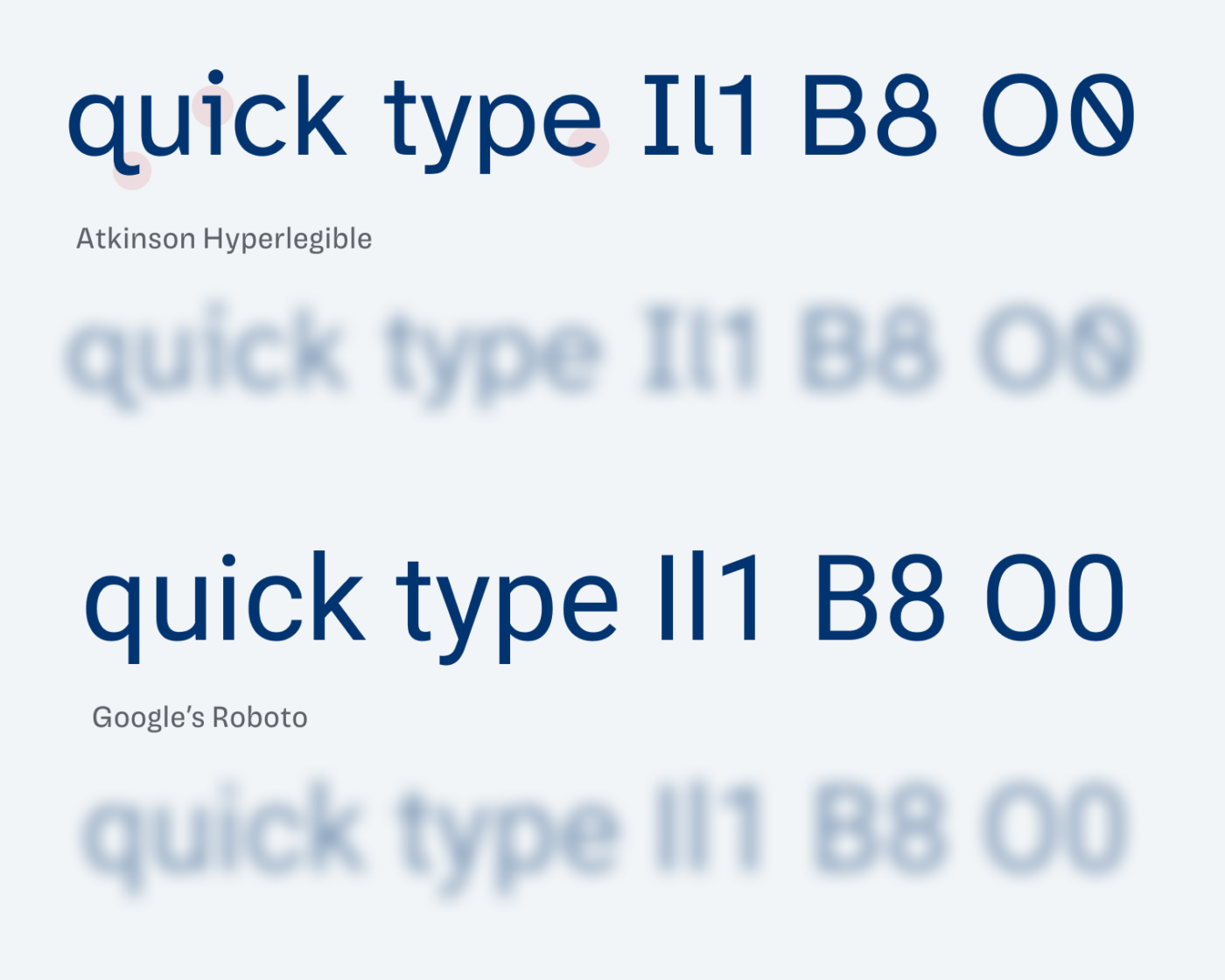
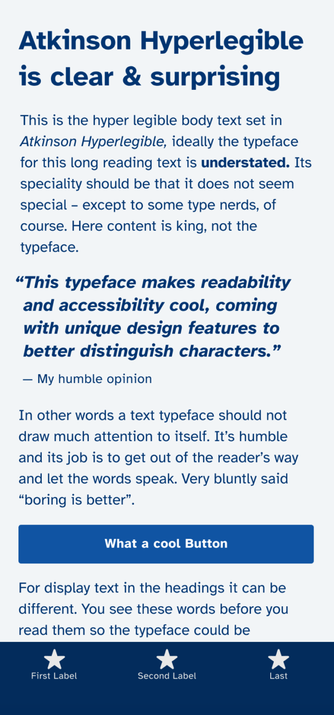
Specific design features help to tell characters apart that easily can be mixed up. Crucial for low-vision readers, but at the same time, it can give your design a more unique look. Everyone wins 🤗 yay! I’m particularly in love with the numerals, the tail at the lower case q, and the elegant serif at the small i. It all makes the typeface an ideal choice for copy and UI design.
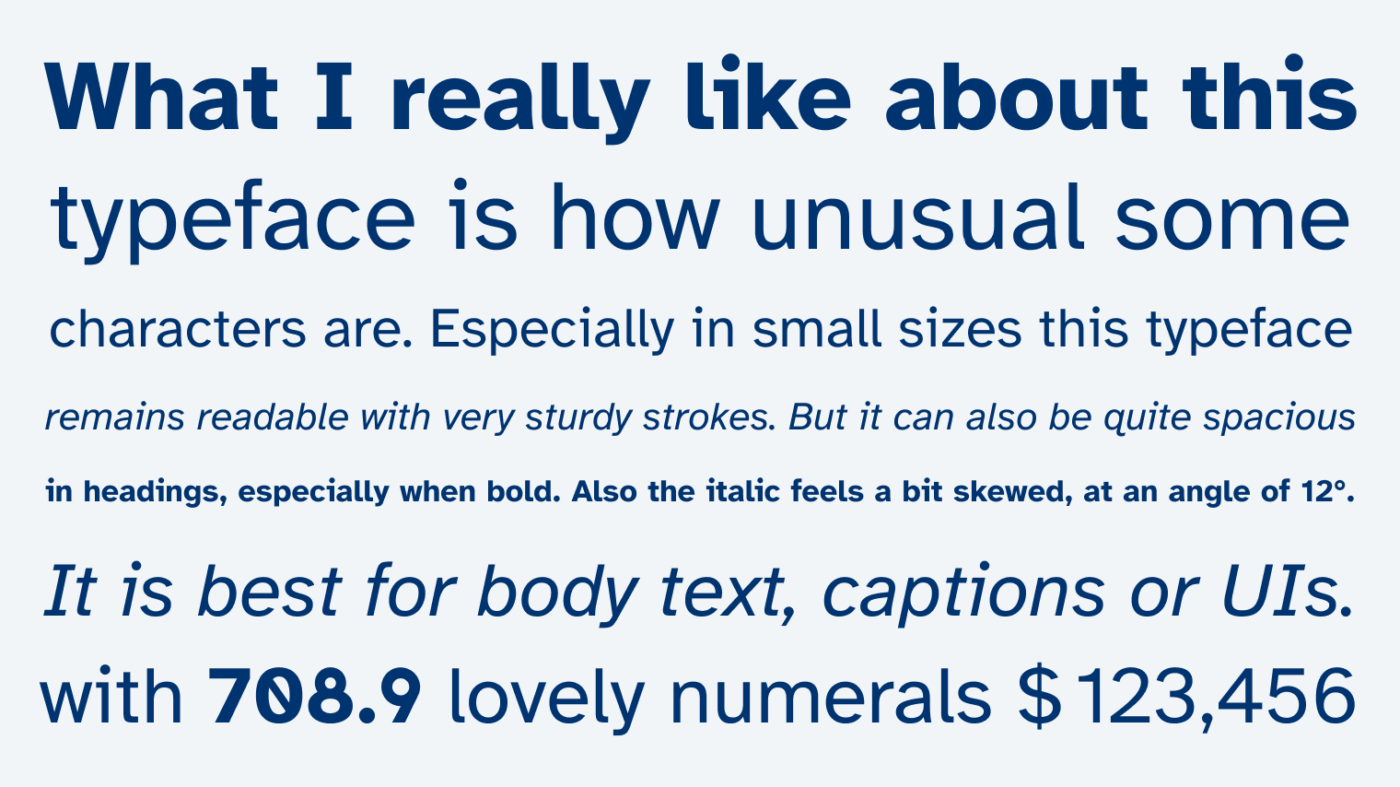
But not everything is perfect to me about Atkinson Hyperlegible – oh no! When used at larger sizes, it performs well up to 28–34 px. Larger than that, the typeface becomes very space consuming or even looks dull – especially in bold. Also, the italics are more angled than usual. I can see the benefit of making them stand out more, which is helpful for visually impaired readers, but they also feel quite skewed 🫤.
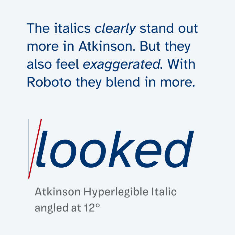
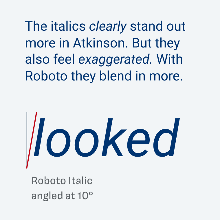
So when you’re choosing Atkinson Hyperlegible, I recommend pairing it with another typeface for headings or other display text. If you need some ideas, here you can find three free font pairings.
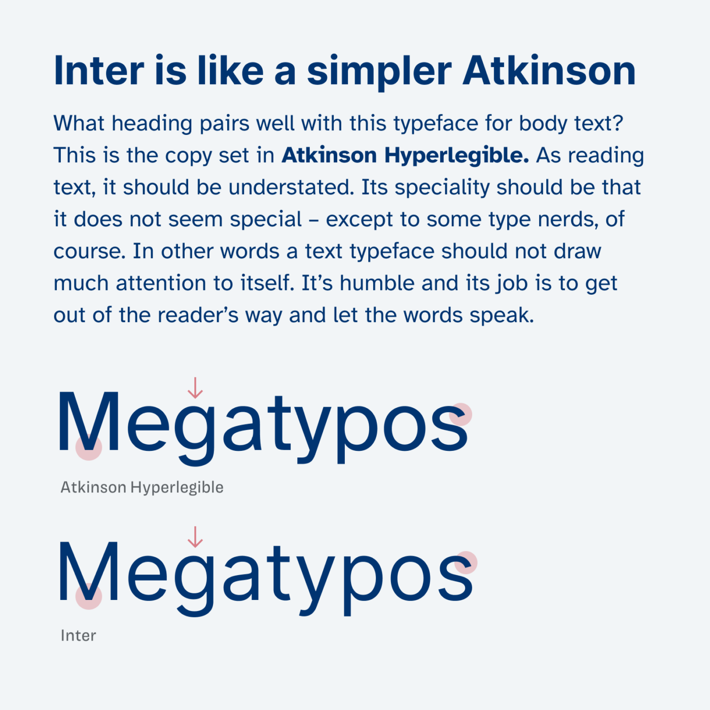
Recommended Font Pairing
Atkinson Hyperlegible sits between ration and geometric typefaces. If you want to pair it with something warmer for copy, pick the serif typeface Charter. Ideal for headings is quite similar General Sans.
- Copy
- UI Text
Learn more about pairing typefaces using the Font Matrix.
What do you think of this week’s typeface? Let me know in the comments, and share it with me when you used it in a project!

This is a gem, and the licence is quite reasonable. I’m not vision impaired (yet) but still like typefaces whose iIl1 and oO0 characters are clearly distinguishable without having to see them side by side.
Letdowns are the G (downward stroke) and 8 (very exaggerated size difference from top to bottom). Open counters are great though.
Very reasonable, Jeremy 😂. I like those typefaces too for running text, and especially UI design. Have you used it before?
No, I’m seeing it for the first time. Thank you for highlighting it.
I first discovered this font a couple years ago when I working with a client, who was a dyslexia teacher. We needed a font that would be easy to read and this is one of the options I suggested.
My daughter is currently working on a project to produce digital learning content for adult learners at a large college with something like 20,000 students across multiple campuses. I recommended Atkinson Hyperlegible as a safe option for the widest range of students and it is now being used for that purpose. I’ll be sure to pass on the link to this post, so she can read it.
Oh, that sounds awesome, Ashley! Great recommendation. Make sure she also sees the article about font pairs.
Already done! I received your newsletter a few minutes ago.
Thanks, Oliver! This is nicely done.
Happy you liked it, Scott!