Scott sent me a question about combining typefaces:
“What font pairs well with Atkinson Hyperlegible as a heading font, or does it serve just fine as both header and text?”
The free font Atkinson Hyperlegible is quite distinct and clean, ideally used for copy or in UIs (more in my review about it). But when it comes to larger sizes, it seems a bit dull and is too space consuming.
So in this short video and blow I show you three free fonts that will make a fine combination with Atkinson Hyperlegible.
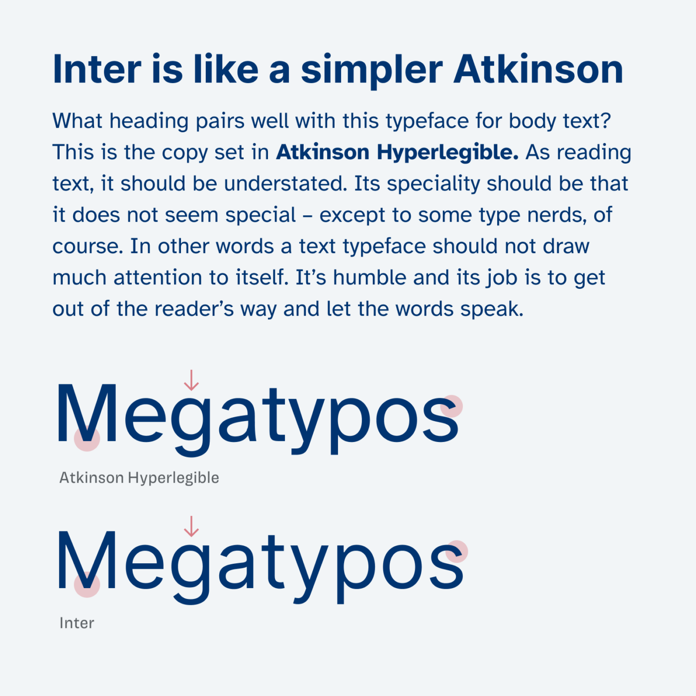
1. Inter
Not super original, but since Atkinson Hypelongname is a blend of a geometric and rational form model, the free Google font Inter works well as a typeface for headings. It feels like a simpler version of Atkinson Hyperlegible. Even though Inter is vastly popular, but this combination might be something that is not that often seen?
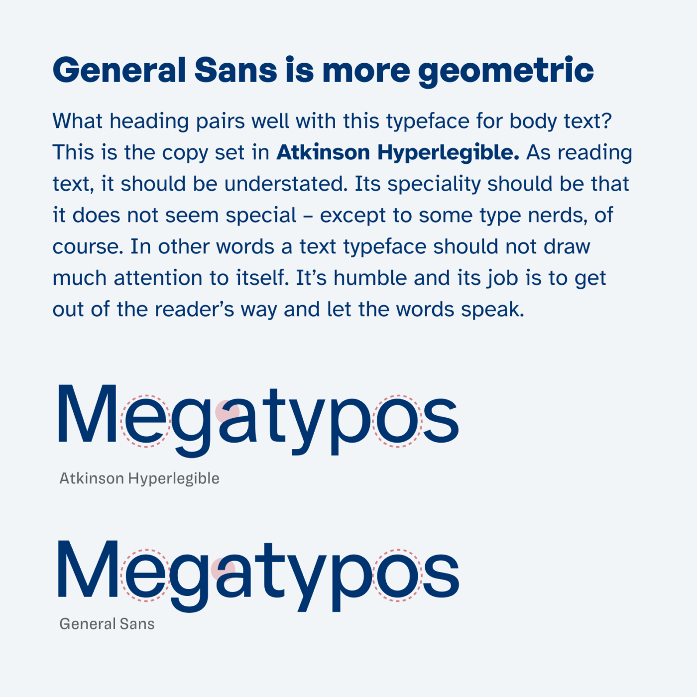
2. General Sans
The free font General Sans emphasizes the geometric construction of some shapes in Atkinson Hyperlegible. It is more striking and stronger in the bold weights. The typeface has very closed apertures (look at the c), which makes it quite the opposite of the idea behind Atkinson, so keep that in mind when using it. Learn more about this in my review here.
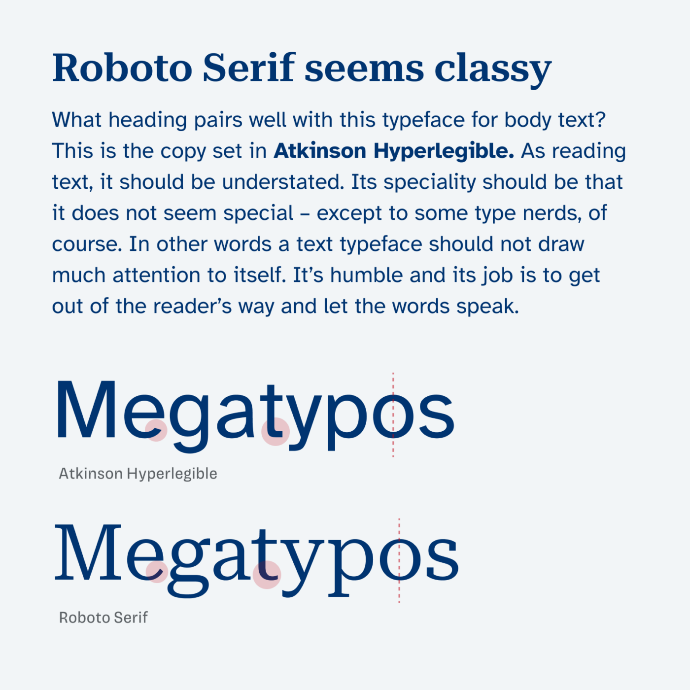
3. Roboto Serif
I really like Roboto Serif. It feels quite different compared to its infamous sans sibling, classy but in a contemporary way. This combination is very contrasting, but still the rational construction of both typefaces shines through. Also, Roboto Serif comes as a variable font giving you the opportunity not only to adjust its weight, but also its width and many other things.
How do you find a good font pair?
These were just a few possibilities, but there are of course a lot more out there. Which brings us to the question of how can you decide if a font pairing works or not? I use the ideas behind the Font Matrix. Watch this video to learn more about it, and there is also my online course that will help you to master that skill.
Do you have a question about pairing typefaces? Then post it in the comments below, I’m happy to help you out!
Thanks, Oliver! I also like a bold weight Hubot Sans with Atkinson Hyperlegible.
100%, Scott! That’s also a neat combination!
I really like this font, I’ll be using it on my next project. I found Xcharter works great for heading paired with Atkinson Hyperlegible as body text.
Agreed, Jacob! I’ll add a recommended pairing for Charter, which I also reviewed, once I update it.
I also found Hanken Grotesk, I believe it works better than Inter.
Very nice, Jacob! It definitely got some clean, geometric vibes going on!